
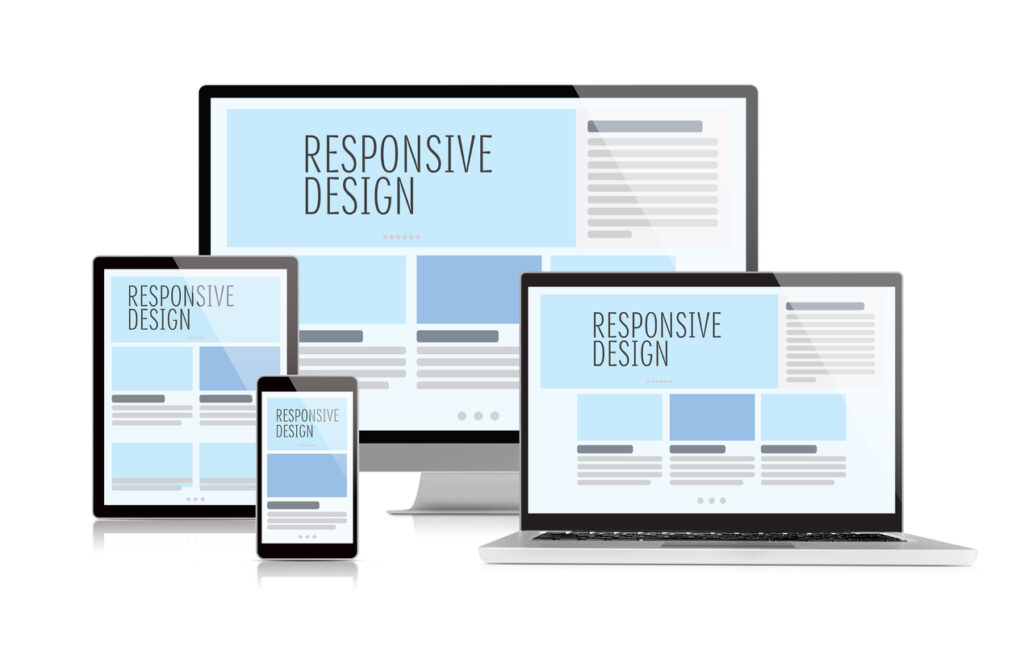
 Responsive web design is undoubtedly a hot topic in web design right now. To some degree, the popularity of the concept of responsive web design is well deserved because site users are increasingly diversifying their methods of accessing a website. iPad, iPhone, Android mobile devices, desktops, netbooks — we’re in a time where our web designs must function in a multitude number of ways.
Let us explore the meaning and principles behind responsive web design.
Key Features of a Responsive Web Design
In order for a web design to be considered “responsive,” it needs to have three key features. Web designer/developer Ethan Marcotte — the author who conceptualized responsive web design — describes these features as:
- The site must be built with a flexible grid foundation.
- Images that are incorporated into the design must be flexible themselves.
- Different views must be enabled in different contexts via media queries.
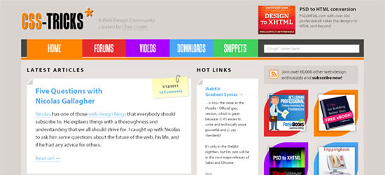 CSS-Tricks changes its web layout depending on the size of the browser’s viewport. It is important to note that all three features need to be implemented in order for a truly responsive web design to take place. Any design that lacks these features is simply not a responsive web design.
It is that cut and dry. Next, let’s dive deeper into these three features in order to better understand how they work together to bring us a completely responsive and effective web design.
Flexible Grid
The term grid as it pertains to web design is getting murkier. Saying that your site must consist of a flexible grid does not mean that you are restricted to choosing from one of the dozen or so great grid systems out there. Defining your own parameters for columns, spacing and containers is often the best solution for a web design and can be just as flexible as any existing system out there.
In fact, most existing grid systems restrictively use CSS classes to define size, space and alignment. Trying to superimpose these limits onto a responsive web design can be tricky and more time-consuming compared to coding your own grid. Whether you’re using a premade grid system or creating a custom solution, the truly important aspect of a flexible grid system is in the mechanics of your layout sizes and spacing. For web designers, this means abandoning our beloved pixels and replacing them with web layouts that use percentages and em’s, which are relative units of measurement.
Of course, this doesn’t mean we stop working with pixels in our image-editing software (i.e. Photoshop, Fireworks, etc.). Instead, an added step that involves a little bit of (totally basic) math becomes a part of the web design process as we convert our pixels into web layouts that use a relative unit of measurement.
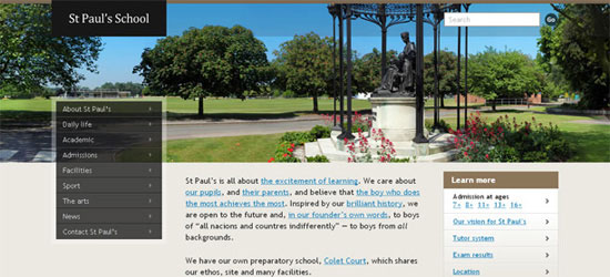 St Paul’s School website is on a flexible grid that changes the layout depending on the size of the browser’s viewport. A change in the layout is indicated by slick, smooth animation.
Flexible Images
Images that move and scale with our flexible grid is another key feature of a responsive web design. Flexible images often give web designers a bit of a headache.
Loading in huge, oversized images that we scale down using width and height HTML attributes when we want more space for text content on smaller browsing devices is not a good practice for faster web page load times. Of course, how big of an issue this is also depends on how image-heavy your site is. As web design evolves, we are constantly seeing sites that incorporate fewer and fewer unnecessary images and stock photos.
Perhaps this is a good time to evaluate whether your web design needs to be as image-heavy as it currently is. An alternative to scaling images is cropping them with CSS. The CSS overflow property (e.g.
overflow: hidden) gives us the ability to crop images dynamically as the containers around them shift to fit new display environments. We can also have multiple versions of the image on the server, and then dynamically serve the appropriately sized version depending on the user agent using server-side or client-side feature detection in tandem with DOM manipulation. Finally we have the option to hide images altogether if we really want to put focus on the non-image content, using media queries that serve a stylesheet which sets the display: none property for images (or a subset of images by assigning optional images a class like optional-img to allow for greater CSS selector specificity in your stylesheet).
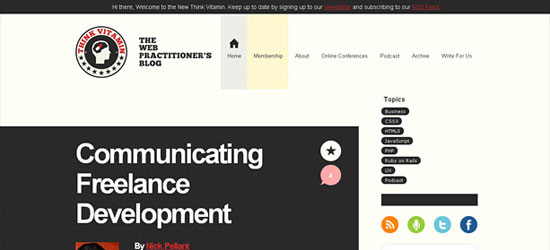 Image elements on Think Vitamin are flexible; they scale depending on the browser viewport’s size.
Media Queries
Media queries are arguably the most exciting (and most intimidating to web designers unfamiliar with them) feature of a responsive web design. Oftentimes, people get carried away with media queries, thinking of them as the core component of a responsive design and leaving flexible page components optional. The reality of the situation is that media queries are hardly useful without the existing implementation of a rock-solid HTML and CSS foundation that includes not only a flexible grid, but flexible images as well.
Media queries allow designers to build multiple layouts using the same HTML documents by selectively serving stylesheets based on the user agent’s features, such as the browser window’s size. Other parameters are orientation (landscape or portrait), screen resolution, color (i.e. how much color the screen can render), and so on.
Here is an example of media queries that serve a stylesheet depending on the width of the viewport:
<link rel="stylesheet" media="(max-device-width: 320px)" href="mobile.css" /> <link rel="stylesheet" media="(min-width: 1600px)" href="widescreen.css" />
Media queries are not specifically a mobile solution or a tablet solution (thought they’re often associated with them as such). Instead, media queries and responsive design allow us to think outside of the constraints of a screen size or resolution and start building websites that flexibly adapts to (theoretically) all the different mediums.  UX London uses
 meta viewport to set the scale and layout width.
What Responsive Web Design Really Is
As we look over the three features of responsive web designs, there really should be very little to be excited about.
The truth is that 90% of what makes up a responsive web design is simply good web design to begin with. Well-formed HTML and a flexible layout should be a part of the daily digest for the modern web designer. What Marcotte has done by advocating responsive web design is simply to show us a new way to implement the good design practices we should already be doing anyway.
In a modern context, given that the need for flexible layouts is even more imperative now so that we can better accommodate the wider array of browsing situations currently in existence, we need designs that are fluid and flexible. Responsive web design forces us to take the time to do things right, not just in how we code, but how we conceive new ideas and execute fresh designs. 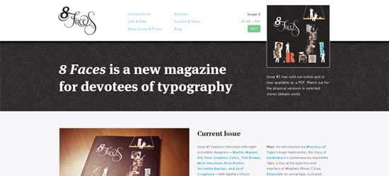 8 Faces magazine has a flexible web layout.
We’re Not There Yet
Anyone who has put some time into working with flexible content and media queries will have realized that this is still not the end-all, be-all solution to building websites that cater to every single user agent.
Users who browse to the web through different devices often have different wants and needs depending on the device they’re using. A user on a mobile web browser will most likely be interested in accessing core information as quickly as possible. For restaurants, this could mean menus, phone numbers to make a reservation, physical address, and so forth.
For situations like this, loading up an entire site and then hiding 90% of it clearly doesn’t present an ideal solution.
The Right Direction
What responsive web design becomes, then, is a step in the right direction. A lot of sites stand to gain a lot from a responsive design, and every designer should certainly be capable of executing this solution and searching for ways to optimize their designs.
While designers continue to make headway on solutions that allow our designs to be experienced as intended on every device and situation, the devices, in turn, should strive to display the Web in the most ideal and intuitive way possible. As both sides steer toward each other, we will inevitably have more and more of an opportunity to build a Web that is more dynamic, more engaging, and more beautiful. And that is something worth being excited about.
Related Content
-
 President of WebFX. Bill has over 25 years of experience in the Internet marketing industry specializing in SEO, UX, information architecture, marketing automation and more. William’s background in scientific computing and education from Shippensburg and MIT provided the foundation for MarketingCloudFX and other key research and development projects at WebFX.
 -

WebFX is a full-service marketing agency with 1,100+ client reviews and a 4.9-star rating on Clutch! Find out how our expert team and revenue-accelerating tech can drive results for you! Learn more
Make estimating web design costs easy
Website design costs can be tricky to nail down. Get an instant estimate for a custom web design with our free website design cost calculator!
Try Our Free Web Design Cost Calculator
Share this article


Web Design Calculator
Use our free tool to get a free, instant quote in under 60 seconds.
View Web Design CalculatorMake estimating web design costs easy
Website design costs can be tricky to nail down. Get an instant estimate for a custom web design with our free website design cost calculator!
Try Our Free Web Design Cost Calculator


