
From puka shell necklaces to planking, the power of trends is undeniable. In a digital age dominated by social media, memes, and an audience with an ever-shortening attention span, trends have become a part of Internet life. And as the Web continues to adolesce, web design is subjected to rapidly changing trends as well.
Continuously developing design and development technologies mean that trends in our industry quickly come and go. I’ll discuss some of the worst web design trends we have seen throughout the Internet’s history, many of which are — thankfully — not that common anymore.
Splash Pages
We’ve all seen a site that loads with sliding photography, illuminating status bars, and a cacophony of visual excess.
The thought behind a splash page is “Watch this long ‘short intro’ video to discover how wickedly-awesome our website is!” 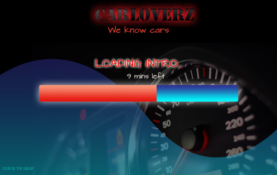 Hoping for a strong first impression, sites that adopt this practice of showing a splash page definitely make an impact. Unfortunately, it’s usually an overly negative one. Splash pages waste time and delay people from accessing the content of the website.
Site users just flock to the “click to skip” link, or, in some cases, can’t even find it and decide to bounce instead of waiting. Conclusion: A good homepage, information architecture and content strategy are all you need. Don’t waste precious time by showing users pointless filler content.
Web 2.0 Design
Rounded corners, reflections, drop shadows and gradients say one thing: 2005. As the Web moves toward a flatter, harder-edged aesthetic, don’t let your site get stuck with an outdated look. 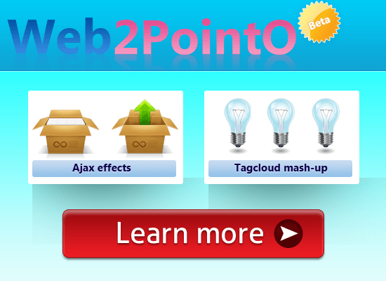 These days, dimensionality and drop-shadowing look soft and tentative. Skeuomorphism for skeuomorphism’s sake doesn’t really accomplish anything, other than potentially confusing your viewer with an overcomplicated design.
You can do better. Simplify your designs to make your interfaces more user-friendly and to improve UX. Conclusion: Though some argue that flat is not the right direction, with major tech companies like Apple, Microsoft, Google and others going flat, the reality is that this is what Web users will come to expect.
Stock Photos
Good stock photos don’t actually look like a stock photo, but they can be astronomically expensive.
So, instead, we’re often shown cold, lifeless photos of people who are smiling on the outside, but crying on the inside.  (Visit Awkward Stock Photos if you’d like to explore to dark, twisted world of stock photography.) Conclusion: If photos are needed on your site, try and produce them yourself. If this is not an option, be selective with your stock photography.
Use a critical eye to determine if adding the photo is actually going to improve the look of your site or make it look like a joke.
MySpace-ification
In the mid-2000s, the average Web-savvy user was defined by the amount of personalization on their MySpace profile. Some designers picked up on this trend, over-designing their sites to the point of complete chaos, whether the site was designed by a team of 10 different people, or 1 eager-beaver designer wanting to prove their worth by adding every kind of design element/texture/animation/etc.
into one page. 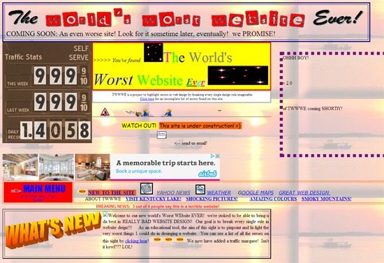 Source: theworldsworstwebsiteever.com Conclusion: Just because you can, doesn’t mean you should. Less is more.
Flash Sites
The strength of Flash is also its weakness. Though animations and movement enhance the look of your site and definitely get attention, they are also incompatible with many Web devices (such as those that use, ahem, iOS). What good is a large amount of visually-stimulating content if many of your users can’t even see it?
Who doesn’t hate seeing web pages like this?:  With the maturation of CSS3 transitions and HTML5 standards, we can create impressive animated sites without the use of proprietary, closed-source software. Even the company that owns Flash agrees that it’s an outdated technology and that HTML5/CSS3 is the future. If you’re still in the Flash bandwagon and are wanting to jump off, these posts might inspire you to take the plunge:
- 10 Interesting CSS3 Experiments and Demos
- How to Create an HTML5 3D Engine
- HTML5 Canvas Element Guide – allows for dynamic, programmatic drawing like ActionScript
- Introduction to HTML5 Web Storage – analogous to ActionScript’s shared object/local storage
Conclusion: It’s time to stop relying on Flash and get on board HTML5, CSS3 and JavaScript which accomplish many of the same things as Flash with less compatibility and performance issues.
Background Music
Some web designers want to engage their viewers’ senses, so they add some tunes to help build a connection. If you’re considering this, keep in mind two things: 1) some of your viewers have their sound muted and will thus miss out on your awesome jams, and 2) those that do have the sound on are likely listening to something else or looking to hear something specific.
Not to mention the potential issues with site loading speed, licensing, user experience, etc. Conclusion: Unless you’re a DJ company or a radio station, skip the music.
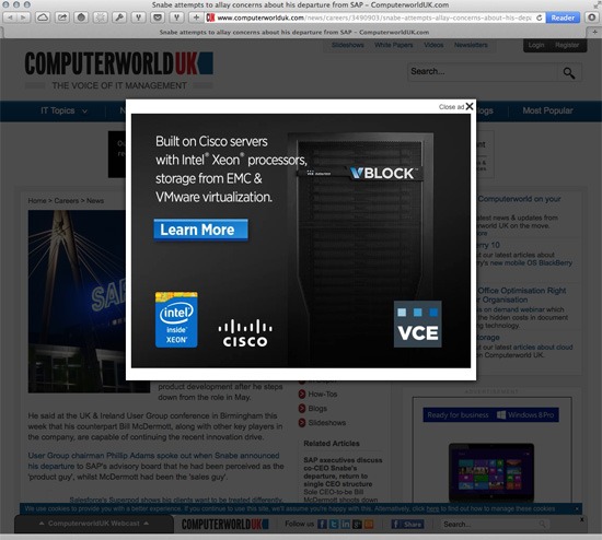
Popup Windows
We’ve all experienced the frustration of loading a webpage and immediately being bombarded with a gazillion un-closable pop-up windows.
It truly harms our experience on the site and makes us wary of coming back. Unfortunately, today, popup windows are being reincarnated in the form of modal window overlays that open automatically and interrupt our reading experience. Check out Tab Closed; Didn’t Read to see a showcase of disruptive window overlays.
 Source: tabcloseddidntread.com Conclusion: Ads are a part of life, and they’re an important way for many sites to generate revenue. That being said, no one likes an ad that’s overly disruptive.
Wrapping Up
Like any trend, what’s popular in web design comes and goes with the times.
If you have a robust development and design team, incorporating current trends can make your site look fresh and relevant. Just remember that trends have a shelf-life, and be prepared when it’s time to make a change. What’s hot right now could soon go the way of sparkly mouse pointers and site visitor counters.
For those who are more risk-averse (or strapped for time), it’s best to focus on more evergreen design ideas that will always look professional and be effective. [Some images courtesy of Picjumbo.]
Related Content
- Are Current Web Design Trends Pushing Us Back to 1999?
- The Evolution of Web Design
- The History of Computers in a Nutshell
- Related categories:Web Design and User Experience
-
 President of WebFX. Bill has over 25 years of experience in the Internet marketing industry specializing in SEO, UX, information architecture, marketing automation and more. William’s background in scientific computing and education from Shippensburg and MIT provided the foundation for MarketingCloudFX and other key research and development projects at WebFX.
 -

WebFX is a full-service marketing agency with 1,100+ client reviews and a 4.9-star rating on Clutch! Find out how our expert team and revenue-accelerating tech can drive results for you! Learn more
Make estimating web design costs easy
Website design costs can be tricky to nail down. Get an instant estimate for a custom web design with our free website design cost calculator!
Try Our Free Web Design Cost Calculator
Share this article


Web Design Calculator
Use our free tool to get a free, instant quote in under 60 seconds.
View Web Design CalculatorMake estimating web design costs easy
Website design costs can be tricky to nail down. Get an instant estimate for a custom web design with our free website design cost calculator!
Try Our Free Web Design Cost Calculator


