
 Minimalism is a word that gets tossed around in a lot of different contexts. Whether it be a lifestyle or an art form, saying something is “minimalistic” can take on a variety of meanings. In the web design field, minimalism is carving out an ever-increasing niche among designers that are looking to convey important content in a new way.
Like just about any trend or theory in the web design world, minimalism can be easy to get wrong. So what is minimalism in web design? Just as important, what is it not? It’s easy to see how a minimal web design can be misconstrued as something that requires less effort or time to create. After all, conveying the feeling of simplicity and a primary focus is really the purpose of a minimal design.
However, saying that it requires less work couldn’t be further from the truth. Minimal web designs are strategically stripped of excess features and gimmicks in order to deliver a clear and concise message to the target audience.
A Minimal Mindset
In order to properly execute minimalism in your design, a focus needs to be established. Being able to present a clear message to your visitors is the core function of a minimal design.
Trying to execute a broad scope of information while still maintaining a minimal style can have pretty disastrous results, so before you dive into the actual design process, having a project plan and narrow scope will go a long way. Take the time to consider what this site is going to be about. Not all sites can afford to dedicate themselves to a single mission and if this particular project is one of those sites, a different method of design may just be the best way to go.
If you have a clear focus, the next step is to consider what bits of information are going to be vital to your design and structure them in order of significance. You may be surprised at how little information really needs to be presented to the user at a time in order to get your point across.
The Art of Taking Away
French writer Antoine de Saint-Exuper once said, “Perfection is achieved, not when there is nothing more to add, but when there is nothing left to take away.” Designers are often praised for the ability to create. Starting from a blank screen or canvas, we sculpt beautiful works of art — often from scratch.
Because of these trained skills, the art of taking objects away from a design can be a hard one for some to master. Designers love to invoke visual stimulation anywhere they can, which usually spells out bad news for minimal designs. Sometimes the best practice can be to design out a full site — and once the design feels complete, start removing all of those objects that don’t fulfill a functional need for the site.
True, this can be a painful and time-consuming process, but if done right, the results can be stunning. Practice the concept of reductionism.
Smarter Color
Minimal web designs are notoriously black and white, but that certainly isn’t a rule written in stone. Minimalism in web design does not imply a lack of color; instead it calls for an intelligent use of well-planned color palettes.
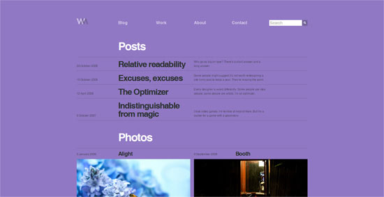 With that said, when it comes to colors, black and white do tend to be the weapon of choice. This is because it leaves the door wide open for pretty much any accent color, allowing designers to match an existing brand image. More unique color options can be just as effective.
The key here is not just that you use color, but rather, how you use it. In a minimal design, a continuous background color can be used to set the tone and emotion of a site while an accent color is used to capture the viewer’s attention and highlight the most important features of a web site. A properly used accent color will be used sparingly and never draw the user’s eye to more than one bit of information at a time.
 The colors embedded in a minimal web design play a huge role in the feeling a site conveys. From sleek and sophisticated black and white designs to vibrant and bold colors across the spectrum, minimalistic web design is not prejudice to any color.
Typography
Designs that have been stripped of all the unnecessary bells and whistles place extra emphasis on the content. Naturally, this magnifies the importance of well thought out typography.
With fewer distractions for the user, it comes down to the text to maintain attention and develop the flow of the web site. 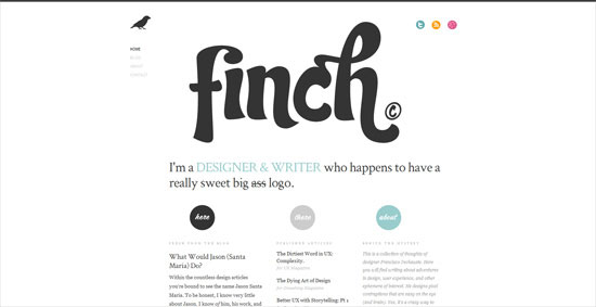 As the internet grows to embrace more flexible options for typefaces, the art of typography is finding a major foothold in the hearts and minds of web designers. Minimal designs are some of the best ways to showcase what can be done with well-selected type, as they should be.
The typefaces that you decide to use — and the way that you implement them — will leave a lasting impression of your design. Typography has the power to convey structural importance and will add a lot of personality to any site. The basic choice between using a serif or sans serif font can be anything but a simple one.
Be sure to embrace the variety of text styles available to you. Going beyond changes in size and color and into leading, kerning, weight and style will open up a wide array of possibilities for your content to help build up your site structure. 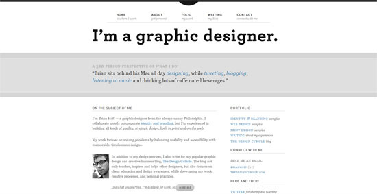
Layout Structure
Having a minimal design does not always imply a simple site structure.
Oftentimes, dialing back the visual overload of a site means turning up the effort put into an intelligent layout. Not many things can destroy the effectiveness of a minimal web design quite like a poorly thought out site structure. Is your logo in a relevant location?
Is your site navigation easy to find and convenient to use? These are huge questions that will make or break the functionality of your site without over-the-top graphics to back these important elements up.  If your design requires users to think about how they should use it or look around for the content they need, then you are breaking one of the cardinal rules of web design.
Even though we see many well-executed minimal designs are brilliantly easy to navigate and visually index, they are not inherently that way. Instead, a massive amount of effort and great visual sense is required to pull off such a natural flow that seems effortless. 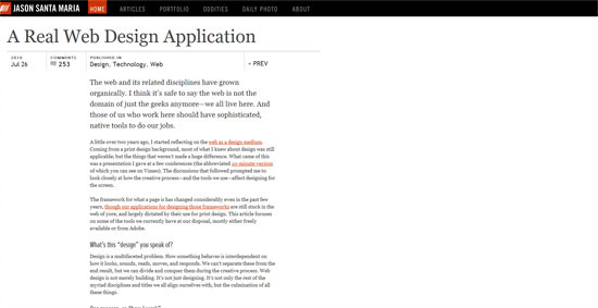
Negative Space
The art of properly spacing content will separate the men from the boys in any area of design — and when the goal is to make less mean more, negative space becomes one of the most powerful tools available to designers.
 Varying amounts of negative space acts as a subconscious visual guide, giving us important feedback on what items on the screen are the most important. Simply put: The more an item stands alone, the more attention it is going to get. Additionally, negative space is used to group similar bits of information together which helps to solidify the structure of a design.
The empty space between these information groups gives our eyes and brains a needed break from information. As a designer, it’s easy to want to fill this space with graphics and pretty doodads to look at, but acting on these urges will quickly result in a cluttered and disorganized design. 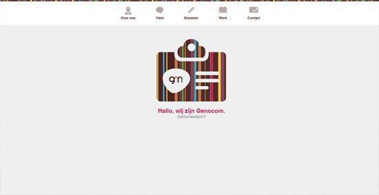
Find the Balance
With all of this talk about taking away and avoiding graphical gluttony, it may seem as though images are the enemy here.
On the contrary, a minimal design allows images to hold even more meaning. The increase in negative space and the use of simple color palettes in a minimal web design provide images with a real opportunity to shine as true focal points of the screen. 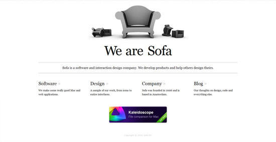 An important concept to remember when placing graphics or images is the need to maintain a balance.
Does your image work to support the content at hand? Avoid placing images for the sake of consuming space or displaying color, make sure they hold relevance to the content and support what your users are reading. In some cases, elements such as infographics, charts or pictures can serve to clean your site up even more.
They say “a picture is worth a thousand words” — and if you can use a picture to replace a thousand words, then do so! 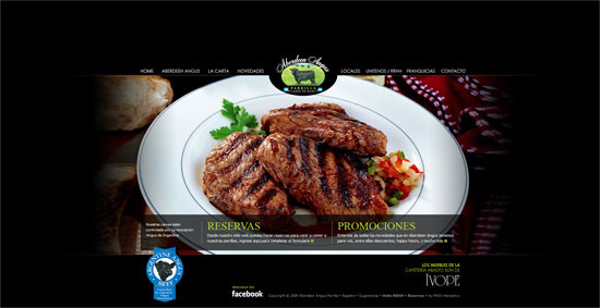 Along the same lines, charts and graphs can be a more intelligent way to display information and actually be less sloppy in your minimal design than several paragraphs of verbal explanation.
What to Take Home
At the end of the day, it is most important to understand what goals we hope to achieve with a minimal web design. If you are building a minimal web design for the sake of trying out a new trend, then you have all of the wrong reasons.
More than just another trend, minimalism transcends the medium of the internet or the computer and holds a place in art, architecture and even philosophy. Minimalism is the practice of putting forward only the most important message and removing unwanted distractions. Having an entirely minimal design will not always suit the needs of a design project.
As a matter of fact, more often than not, you will find that minimalism will not be the right fit for the task at hand. However, it is always important to underscore the principles of communicating information in a minimalistic nature.
How About You?
Have you tried to express minimalism in your projects? Or have you found some of the theories behind minimalism important in executing parts of more traditional projects?
Related Content
-
 President of WebFX. Bill has over 25 years of experience in the Internet marketing industry specializing in SEO, UX, information architecture, marketing automation and more. William’s background in scientific computing and education from Shippensburg and MIT provided the foundation for MarketingCloudFX and other key research and development projects at WebFX.
 -

WebFX is a full-service marketing agency with 1,100+ client reviews and a 4.9-star rating on Clutch! Find out how our expert team and revenue-accelerating tech can drive results for you! Learn more
Make estimating web design costs easy
Website design costs can be tricky to nail down. Get an instant estimate for a custom web design with our free website design cost calculator!
Try Our Free Web Design Cost Calculator
Share this article


Web Design Calculator
Use our free tool to get a free, instant quote in under 60 seconds.
View Web Design CalculatorMake estimating web design costs easy
Website design costs can be tricky to nail down. Get an instant estimate for a custom web design with our free website design cost calculator!
Try Our Free Web Design Cost Calculator


