
The homepage is what many people see when first encountering a website, and it can lead to a lasting impression (negative or positive) that can affect their decision to return to it. In this article, we’ll go over some web design tips for designing homepages and uncover some of the vital steps required to construct a powerful and successful front page.
Identify the website’s purpose/goal
A designer should understand the purpose of the site in order to build an effective homepage design.
 The homepage is a website’s initial chance to make an impression, so a site visitor must see exactly what they’re looking for the moment they arrive. Defining the purpose of the website will help you see what will attract users to the site. Keep in mind that the website’s purpose is different from the website’s topic.
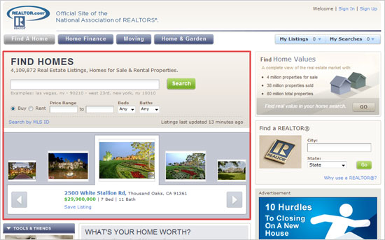
For example, “real estate” is not an example of a purpose. “To sell homes” also cannot be the purpose — what is the likelihood that someone will buy a house off a website without seeing the property firsthand? Keeping in line with the real estate example, the purpose of a realty website might be one of the following:
- To showcase new or featured properties for sale
- To help visitors find the business or realtor contact information
- To assist visitors in finding the right realtor for their needs
Each of these purposes can lead the visitor to an action and can guide them to take further steps in acquiring property as a direct result from visiting the website. In this example, the website is a gateway to making a home sale. Therefore, an effective real estate homepage will have property and real estate agent locators to help users quickly find what they’re looking for in order to take the next action to purchasing a home.
Another example we can use is an online portfolio site. What is the purpose of a portfolio? Saying “to get clients/a job” is too broad, and instead you should define your site purpose as tangible and realistic goals.
Examples might be:
- “to encourage a potential client to make contact with me”
- “to impress the fellow designers and gain a positive reputation in the community”
- “to impress a potential employer”
If your purpose is “to get a client to make contact,” you can make a web form readily available on the front page. If the main purpose is to display your works or impress a potential employer, the homepage could showcase thumbnails of portfolio pieces in a manner that will entice the visitor into checking out more pieces. Ultimately, all of these purposes will lead to more clients or jobs, but it is important to identify your tangible goals so that you can understand how to strategize your front page layout.
Differentiating goals of the homepage vs. goals of the website
One point to keep in mind is that the goal of the entire website may be different than the goal of the homepage. How can this be? A homepage is an entry point, and while the overall goal of a website may be to sell a product, the homepage’s goal may be to lead users to the web pages that enable them to buy the product.
Trying to “make the sale” for a website right on the front page can deter a visitor.
Learn the difference between a new vs. returning visitor
An important part of planning the design of a website, and especially the front page, is to realize that there are two types of visitors: people who haven’t seen the site before, and people coming back for more. A website can’t function very well without any repeat visitors, so we must think of ways to promote reoccurrences. Two ways of doing this are:
- Get the visitor interested in the content enough to revisit
- Provide resources that remind the visitor to return. (An RSS feed, for example.)
Designers can easily assume new or repeat visitors will find their way around a website if it has an intuitive user interface. User-centered designs is the concept that a design revolves around the reason why people visit the site. A design is user-centered if it can answer “yes” to the question, “If I come here to do X, can I accomplish it quickly without much thought or effort?” With a solid understanding of User Experience design, it’s easy to create a great website with excellent user-centricity.
Subscriptions and memberships
Having subscription options on your homepage can encourage repeat visits. One of the most frequent subscription points on a website is via the home page. When users come to your site from a landing page other than the front page – the next action is usually to go to the homepage to see what other things might be of interest and to understand what the site is about.
Flickr is an excellent example of a website whose front page design is effective in increasing their membership, and whose design is changes depending on whether you are logged on as a member, or not. When logged out, Flickr assumes that you’re a new visitor or that you have yet to start a Flickr account. Thus, it draws attention to a “Create Your Account” button to entice you to sign up.
It is highlighted with plenty of whitespace around it. This promotes first-time users to sign up for an account. 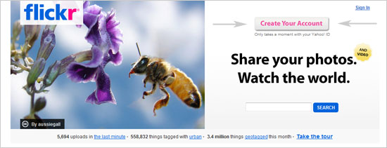 For user’s that are logged in (i.e.
existing members of the site), the homepage is much different. Flickr leads you to ways you can participate in the community and helps you easily perform site functions only available to people how have user accounts (such as organizing your Flickr stream). 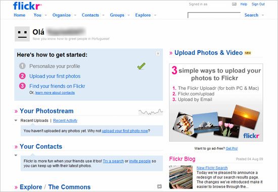
Selling products or services
Some websites are geared primarily to selling you their product or service.
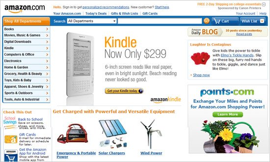
Amazon is an excellent example of how to treat new and repeat visitors effectively in order to get the most sales. A look at the logged-out version of the Amazon homepage will show the most popular products or products that culturally popular. In the figure below, you’ll notice the recommended products are geared towards an “Earth-friendly” goal.
 Now, let’s compare the homepage for logged-in users: it looks very much the same, but with recommended products based on recently purchased items.
 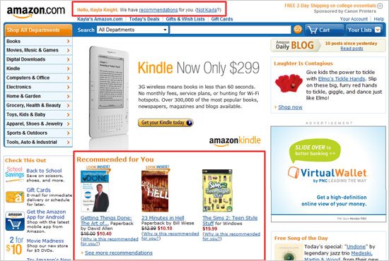 Amazon is able to customize their home page to cater to both new and repeat visitors.
Highlight Content Effectively
When choosing what content is the most important, keep in mind the following steps.
Step 1: Prioritize
Determine what components and content are most important for achieving the site’s purpose: arrange them in order of priority on a list. Things you can consider highlighting are certain types of content (“featured works or featured posts”), your RSS feed, and your contact information. The importance of these components depends on the purpose you wish to achieve.
With this information in mind, you can better understand how to craft a design in a way that draws attention to the most important elements.
Step 2: Create a Content-Only Layout
Now, with no other design elements in the way, take the list constructed in the first step, and organize the content in a manner that draws the eye in the correct order. Don’t think about web design, think about how to piece together the layout components.
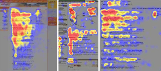
The F-shaped pattern is often used to determine the order of content organization on a website. The top left is where the eye lands first, then to the right and down. The farther down the user gets on a page, the less they become interested and the less they read.
Step 3: Make Attention Happen
Beyond the general layout, there are a number of other ways to bring attention to certain pieces of content. To enhance attention to crucial layout components, investigate the following possibilities:
- Increase the component’s contrast from its background and surrounding elements
- Increase its size relative to surrounding objects
- Provide plenty of whitespace around it
For example, Problogger uses a contrasting color to bring attention to the subscribe button. 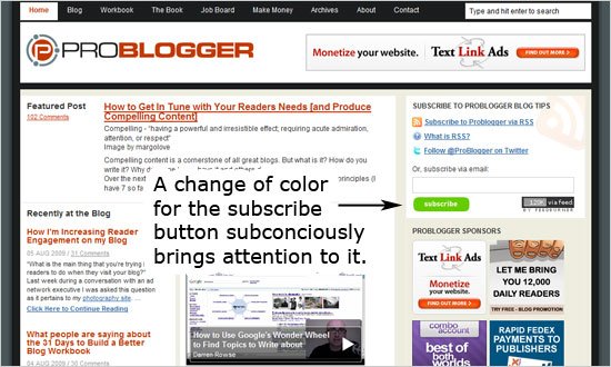
An Example: Horizon Business Coaching
A recent client project brought me to consider the above options. Crystal from Horizon Business Coaching wanted a website that emphasized their newsletter, contact/social networking methods and focused attention on their brand as well.
Having multiple items to focus on can be confusing, and one must prioritize, lay out, and highlight features as needed. In the following example, you can see that the important features are highlighted in order of importance/priority. 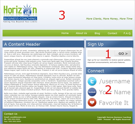 The “Sign Up” and “Connect” areas have larger/bulkier elements, which move the eyes of the visitors towards them.
On top, the brand is given importance by its location and excess whitespace. Headings are also highlighted by contrasting colors.
Remember to include the necessities
As we designers know, there are important site components that users expect to find in a website.
Because most sites have them, spending time on their design and strategic positioning in a layout can be effective in creating a functional and memorable homepage. These “necessities” include:
- logo/site tag line
- site search feature
- navigation menus
- contact information
In the example I presented above, the client wanted their logo and slogan (brand) to stand out, so they were highlighted appropriately in the layout. Find what’s needed on the front page, prioritize them, and make them noticeable.
Have a rationale for everything
A common mistake among web designers concerning homepage design is placing random widgets, excess navigation, and random pieces of content right on the homepage with little thought to their function and contribution to the overall site design.
You must keep in mind that simplicity is very important in a usable and functional web design. A design that is cluttered can turn off the user and make things hard to find and use, as well as slow down your page response times. Question every element that you’ve decided to include your homepage: what does it do?
will people use it? how does it help your site’s purpose?
Use meaningful graphics
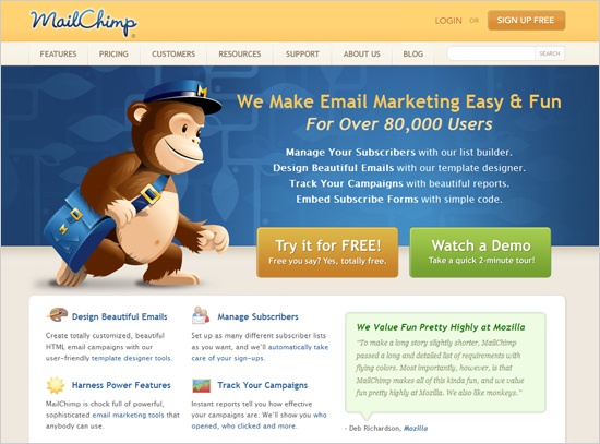 MailChimp’s graphics are incredibly suitable for leading the visitor’s eyes to locations of interests.
The chimp mascot provides a strong brand identity for the company and draws the user’s eyes to the direction the chimp is facing: to the site introduction, a demo, and the sign-up feature. In addition, icons are used throughout the homepage to draw attention to the service’s most popular features, helping to make “the sale”. 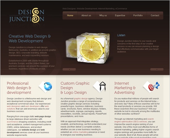 All of the graphics on Design Junction lead the eye towards need-to-see content. First, the largest image on the page, which rotates throughout different projects, showcases the featured portfolio pieces. Below are smaller icons that highlight the services.
The images in this design are being used to create a step-by-step hierarchy for the visitor:
- They see (and are hopefully impressed) by the featured work
- They see the services being offered by the company
- They continue through the website to see what else is in store
Use meaningful content
In addition to using meaningful graphics, you should make sure that your content has a purpose and aids you in achieving your homepage and site goals.
Know the importance of page response times
Since a homepage is typically the first stop for many users, it needs to be accessible quickly. A slow-loading website will frustrate the visitor and increase the possibility that they will leave before your web page finishes rendering.
While efficient loading time is important throughout the entire website, it is especially necessary on the front page. Below are the basics for reducing the load time of a web page.
Minimize and optimize the amount of graphics
Evaluate the need for all of your graphical elements.
When you’ve pared down to the bare minimum, consider using tools to shrink down their file sizes. Also consider using CSS image sprites to group your images together. This reduces the number of HTTP requests a web page needs in order to render your web pages, thus lowering page response times.
Combine JavaScript and CSS files
If there are several JavaScript files or CSS files the website has to load before working properly, this will also slow down a website. If possible, combine them into one file. Loading one bigger file is quicker than loading five smaller files when talking about response times.
Minify your scripts
You can minify your scripts in order to reduce their file sizes. This can make your code readable, so it’s ideal that you use an application that can un-minify your scripts: for CSS minification and compression, check out this article. 
Wrapping Up
Designing a homepage is as much a science as it is an art form.
It requires attention to detail, paying heed to the site’s purpose and goals, and taking into account web page performance. I hope that this post has given you some insight into some of the things to consider when designing a homepage. Feel free to share your thoughts and your own tips on designing homepages in the comments.
Related Content
- Five Types of Effective Headers in Web Design
- 10 Things Every Web Designer Just Starting Out Should Know
- Why Designers Should Learn How to Code
-
 President of WebFX. Bill has over 25 years of experience in the Internet marketing industry specializing in SEO, UX, information architecture, marketing automation and more. William’s background in scientific computing and education from Shippensburg and MIT provided the foundation for MarketingCloudFX and other key research and development projects at WebFX.
 -

WebFX is a full-service marketing agency with 1,100+ client reviews and a 4.9-star rating on Clutch! Find out how our expert team and revenue-accelerating tech can drive results for you! Learn more
Make estimating web design costs easy
Website design costs can be tricky to nail down. Get an instant estimate for a custom web design with our free website design cost calculator!
Try Our Free Web Design Cost Calculator
Share this article


Web Design Calculator
Use our free tool to get a free, instant quote in under 60 seconds.
View Web Design CalculatorMake estimating web design costs easy
Website design costs can be tricky to nail down. Get an instant estimate for a custom web design with our free website design cost calculator!
Try Our Free Web Design Cost Calculator


