
[T]here are no bad fonts — only inappropriate ones. — Jason Beaird
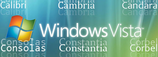
The majority of computer users became aware of Microsoft Windows Vista on January 30, 2007, when the company released the new operating system publicly. You and I of course knew about it well beforehand.
Once Vista was available for beta, many web designers adopted it early to begin trying — with varying levels of success — to figure out if they can incorporate Vista fonts into their designs. Three things quickly became clear:
- They are beautiful typefaces.
- They are unusually — and, for designers, unacceptably — blurry unless you have ClearType or another anti-aliasing protocol enabled; but there are serious issues with ClearType.
- With some exceptions, they are markedly smaller in size than most fonts, making them difficult to incorporate into font stacks.
Trust Microsoft to create something attractive and potentially valuable like this set of spiffy new fonts (or an operating system like Vista), and then take steps to ensure they can’t be used easily. But I like these fonts: they’re beautiful and they are available in many of our user’s computers (as much as 92% of all PCs use Windows as of May 2010[1]). In addition, the design community deserves some thought as to how to use them in their work.
Let’s see what we’re up against.
Breaking Down the Fonts
 Vista “C” fonts. Let’s examine the fonts themselves, starting with the best known of the group: the 6 “C” fonts — their nickname derived from the fact that all their names start with the letter C, and officially, because they are part of the Microsoft ClearType font collection. John Hudson, the font designer who made one of the C” fonts (Constantia), shares some insights on how the “C” font names were picked:
“One of the Microsoft managers had come up with the idea that all the CT [Vista] fonts should have names that started with C.
I can’t remember all the possible names I came up with, each of which ended up rejected after international trademark searches. Microsoft probably spent more money on lawyers doing trademark searches than they spent on the typeface development! As I recall, the day before the penultimate choice came back rejected, I’d been singing some psalms during vespers, and noticed the word constantia.
Hey, I thought, that starts with C!”
If you have Vista, Windows 7, MS Office 2007 for Windows, or MS Office 2008 for the Mac, you have these fonts already. If you don’t have them yet, keep reading!
The “C” List
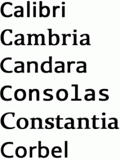
Here is a bit of information about each of the “C” Vista fonts.
Calibri
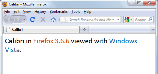
The new default font for MS Office apps — replacing the tired old warhorse, Times New Roman — Calibri is a softer, more rounded sans-serif font. Calibri’s designer Lucas de Groot says, “Its proportions allow high impact in tightly set lines of big and small type alike.” When anti-aliasing is applied, it is an attractive and very reader-friendly font; when it is not applied, Calibri looks like something I’d draw with my foot. Font maven Megan McDermott observes that Calibri “looks terrible in Opera and Firefox,” an observation I don’t agree with, but since I respect her work, I’m passing along her opinion.
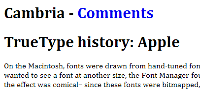
Cambria
There are only two serif fonts in the “C” collection, and Cambria is, to my eye, the lesser of the two. Microsoft states that Cambria was “designed for on-screen reading and to look good when printed at small sizes. Designer Jelle Bosma calls it a “robust, all-purpose workhorse text face.” Van Wagener calls it “sturdy” and “formal.” I think the font lacks a certain elegance, though it is solid enough and is very strictly spaced.
If you’re interested in rendering mathematical equations, check out Cambria Math.
Candara
This sans-serif font incorporates some decorative flourishes, along the lines of Trebuchet MS and therefore is less useful in body text.
Consolas
The only monospace font of the set, Consolas is as appealing as any monospaced font out there.
I cordially despise everyone’s default monospace fault, Courier New, much preferring Andale Mono and other more stylish monospaces. Like Calibri, Lucas de Groot designed this font.
Constantia
The other serif font of the collection, Constantia, is elegant without being overtly ornate.
It’s clean, readable, and overall an excellent and versatile font. Creator of the font, John Hudson, says he designed it to work in both print and electronic display formats. On the screen, it looks very similar to Palatino Linotype or Book Antiqua, but with a bit more modern feel.
Dan Cederholm of SimpleBits — in his quest to provide the best ampersand ever for use in your designs — finds Constantia’s ampersand (&) works well as a companion to Palatino/Palatino Linotype in the ampersand beautification code.
Corbel
Corbel is the last of the sans-serif fonts in the collection. It is clean and readable, but to me, it suffers from some of the same design limitations as Cambria.
Microsoft calls Corbel’s appearance “uncluttered and clean” on screen, and claims it is “legible, clear and functional at small sizes.”
“C” Fonts On Mobile Devices
It’s worth noting that mobile/handheld advocate Alexander Turcic says the “C” fonts are “gorgeous” on handheld devices. In 2005, he submitted 6 screenshots of the fonts in use on his iSilo device, including this example of Constantia in use below. 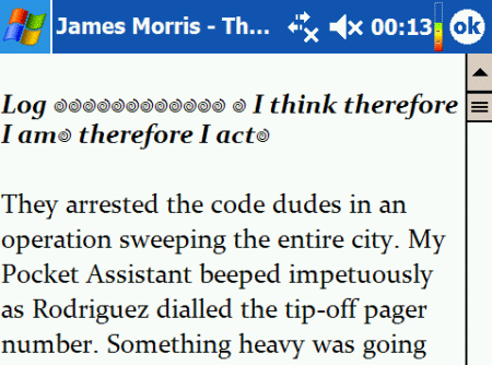 Constantia on iSilo.
The Odd Ones Out: Segoe UI and Nyala
The Vista font collection contains two more fonts that are often forgotten in discussions of the collection: Segoe UI and Nyala.
Segoe UI
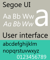 A sans-serif font, Segoe UI is a member of a larger “Segoe” (pronounced “SEE-go” according to Microsoft designer, Jensen Harris) family of fonts. It has a lighter and more rounded feel than the “Swiss” fonts such as Helvetica and Arial, and is less linear than Tahoma. It is Microsoft’s designated system font, replacing Tahoma in most Windows displays.
Microsoft blogger Saveen Reedy calls it a “beautiful” font, an assessment I agree with. Some controversy over the font erupted in 2006, when the European Union declared Segoe UI to be a ripoff of another font (Frutiger Next) and refused to accept Microsoft’s registration applications for the font. To be sure, there are slight but discernible differences between the two, but most people believe that Microsoft admitted some form of plagiarism when it decided not to appeal the EU’s decision.
Designer Steve Matteson says Segoe UI is an entirely original design. All legalities and disputes aside, Segoe UI is a terrific design choice if you have ClearType enabled, and if you’re comfortable with the heavy-handed anti-aliasing the technology provides. Without proper anti-aliasing, Segoe UI goes from strong yet delicate, to almost brutishly crude.
Nyala
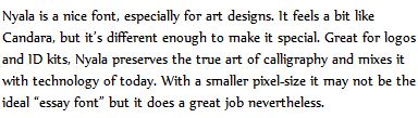 The least known of the eight Vista fonts, Nyala, is supplied with Windows Vista and Windows 7, as well as with Windows Server 8. It’s a restrainedly ornate serif font that — to my rather blurry eyes — appears a bit jagged in many displays. It’s also the only one of the eight Vista fonts that is virtually impossible to find for free if you don’t have it as part of your Windows installation. According to Microsoft, “[t]he Nyala typeface is named for the mountain nyala (tragelaphus buxtoni) a species of great African antelope native to the highlands of Ethiopia.” It was created by veteran font designer John Hudson (who, just as a reminder, also created Constantia) and is designed to reference native Ethiopian typography and lettering.
Design Issues in Using Vista Fonts
Designing with Vista fonts — both the “C” font collection and the two redheaded stepchildren — is problematic at best. Certainly, by looks alone, most all of the fonts make excellent design choices, being elegant, attractive, and readable at a variety of font sizes. And since they’re not the same old Web-safe font choices we see every single boring day, it gives both designers and users something fresh and different to see on their screens.
Market Penetration is Decent
Font embedding aside, we all know that it’s all but pointless to design with a font that no one has. Microsoft is probably the only computer technology company in existence that can introduce a font — or in this case a group of fonts — that will achieve serious market penetration in the Windows user community within only a year. That’s because the Vista fonts were included with Microsoft Windows Vista, Office for Windows 2007, and Office for Mac 2008. Suddenly, hundreds of thousands of potential Web users were gifted with almost a dozen new fonts. So how many Windows users have them? The savants at CodeStyle can answer that question.
Periodically, they issue an update of their survey of the fonts being used “in the wild” and what percentage of what users have what fonts. As of CodeStyle’s June 2010 font survey results, the various “C” fonts seem to have a 60-61% market penetration among Windows users. Segoe UI has a bit less, at around 51%.
Nyala comes in a good bit lower, at around 43% of Windows users having that font on their machines. A small but significant number of Mac users — about 13-15% — have the “C” fonts on their systems. For some perspective, that’s twice the percentage of Windows users who have Helvetica (the Mac equivalent of Arial) on their machines.
Linux users, which accounts for around 4.8%[2] of all Web users, pretty much don’t have any of these fonts: even the most common of the fonts, Calibri, doesn’t show up at all on the Linux font listing. Is market penetration growing? The numbers for Windows users went up about 5% in just a month (from May to June) — a significant increase.
This tells us that market penetration for these fonts is going up. Quick recap: We can expect well over half of our Windows users to have the Vista “C” fonts, about 14% of our Mac users to have the “C” fonts, and our Linux visitors won’t have the fonts, period. There are signs that this will increase relatively rapidly.
What this means for web designers, though, is that while you can lead off with a Vista font in your font stack, you should have it followed (backed up) by fonts that are more universally available (Web-safe fonts) until these numbers reach higher percentages.
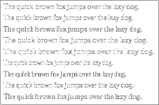
Size Really Does Matter
Unfortunately, the Vista fonts are tremendously small (think x-heights) in comparison to fonts that would ordinarily be used in font stacks with them, making it tough to design for them. Or at least seven of them are; Segoe UI is larger than its seven siblings, and in its size, compares fairly well with fonts that it would likely be paired with, such as Verdana, Helvetica/Arial, and Tahoma.
Also, the size differential seems more pronounced on the “C” sans-serifs: Calibri, Candara, and Corbel. Some of the Vista fonts are so much smaller than their confreres that using them in front of your font stacks might throw off your design, especially if you’re designing a tightly structured, “count-the-pixels” layout. You’ll probably find yourself compensating for their small sizes by increasing the font size of your designs, which may come back to bite you when your site displays on machines without these Vista fonts.
That’s a problem that has no real solution just yet, though it may be somewhat addressed when the @font-size-adjust property becomes more widespread. Unfortunately, even @font-size-adjust won’t allow for adjustment for different fonts within a stack. The guys at NeoSmart observe:
“They just don’t fit.
The new fonts are mostly too small to be plugged right in to an existing CSS file. If you tweak the CSS so that it looks right for, say, Calibri; ten minutes later someone that doesn’t have that font is going to come around and ask your server for that CSS file — but since they don’t have Calibri installed, their browser will use the next one on the list, and unfortunately, your sizes are going to be all wrong.”
They eventually did tweak some stylesheets to accept Vista fonts, but it took some time, some testing, and a willingness to compromise on font sizing. They do note that Consolas works nicely in their designs without a lot of tweaking.
Brownspank at SixThings observes: “It may seem trivial for some, but if you’re aiming for consistency within your font-family, or are relying on subtle font size differences to enforce hierarchy, Vista fonts may adversely affect your layouts.” McDermott notes: “It does make you wonder why this came about. Was it just ignorance on the part of their type designers? Negligence?
Some underhanded way to make web pages look bad in other browsers so everyone has to use IE?” Brownspank advises designers to set their font-size at a minimum of 14px or even 16px to ensure readability, and try to use Vista fonts that match their non-Vista cousins as closely as possible.
The ClearType Issue
 Then there’s Microsoft’s ClearType. ClearType (CT for short) is an anti-aliasing (sometimes called font smoothing) utility first developed for Microsoft Reader in 2000, and is incorporated (turned off by default) in Windows XP.
It is enabled by default in Vista, Office 7, IE 7, and Windows Live Messenger. If you’re familiar with Adobe’s CoolType, Microsoft’s version is relatively similar. Microsoft made the decision — foolishly, in my opinion — requiring ClearType to be enabled for these fonts to display properly, and designed them to CT specifications.
By doing so, they took 8 very usable fonts and made it much more difficult to justify using them in font stacks that are constructed to work on 99.9% of the browsers and displays out there. Web designers, whether using Vista fonts or not, absolutely need to test their designs in Windows displays with ClearType enabled and again with it disabled. Mac users have font smoothing operating all the time, so it will be less of an issue (or at least the same issue) for Mac folks.
Mac font smoothing is pretty standard, with OS X using the Quartz anti-aliasing filter and Mac OS 8 and 9 systems using an older utility, QuickDraw[3]. Mac blogger Matt McErvin gives some more detailed information on both Quartz and QuickDraw’s anti-aliasing techniques. 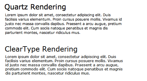 The difference between fonts rendered in Quartz and ClearType.
Source: Smashing Magazine. ZDNet’s George Ou, writes that CT is superior to Quartz in rendering fonts on-screen. Blogger, Joel Spolsky, disagrees to an extent, positing that Quartz does a better job of rendering the typeface as it was originally designed, at the cost of a bit of blurriness. This debate addresses why some Safari for Mac users find the font displays unacceptably blurry.
Opinion is strongly split for and against anti-aliasing in general — and ClearType in particular. Personally, I like font smoothing because my eyes are bad and both my computer monitor and my glasses are old. I’ll take what I can get to help me see clearly.
Those with sharper vision and better monitors can, and do, disagree. Notable designer, Jon Tan, has a particularly acerbic take on ClearType, especially how it is implemented in IE 7. He concludes, “ClearType fails to deliver good anti-aliasing. In my view it is a backward step from the old Windows Standard rendering. I am at a complete loss to explain why it is allowed to persist.” I might agree with Tan if my eyes were better.
ClearType For Programmers
Blogger, Jeff Atwood at Coding Horror would love to use Consolas as his default fixed-width programming font, if it wasn’t for the ClearType issue. He writes, “I’ll definitely agree that Consolas is one of the best looking ClearType fonts I’ve ever seen. That’s probably because it is part of the first font family designed from scratch with ClearType hinting in mind.
However, I prefer not to use font smoothing on my programming fonts. And Consolas looks like crap without ClearType! Consolas appears to lack any kind of hinting for reasonable display at small point sizes.
Consolas isn’t just optimized for ClearType, it can barely be used without it.” Programmer Rick Stahl agrees with Atwood’s position, saying Consolas works for him only with ClearType enabled, and then only at 15pts. However, programmer and math professor John Cook has a different view, saying that Consolas is his “favorite monospace font” in part “because it exaggerates the differences between some characters that may easily be confused.” He does not address the ClearType issue; presumably he’s enabled it and moved on (or he doesn’t use Windows).
Tweaking ClearType For You
It’s worth mentioning that Microsoft has a “power toy” available to fine-tune ClearType for XP and Vista users.
Windows 7 folks have the utility in their Control Panel’s Appearance and Personalization applet. XP users also have an online version of the CT Power Toy available for their use.
Not For Printing
With the possible exceptions of Constantia and Corbel, these fonts are designed for the screen, not for print. I wouldn’t run to change my print stylesheets to incorporate these fonts.
Using the “C” Fonts to Set the Theme of Your Designs
[W]rite down a general description of the qualities of the message you are trying to convey, and then look for typefaces that embody those qualities. — Jason Santa Maria
Designers should also recognize their visitors’ perceptions of the fonts they select. Most designers and users agree that the font, Helvetica, projects a cool, somewhat detached, mood when used in designs while Times New Roman projects a solid, if perhaps a bit stodgy, feel.
A 2006 Microsoft-funded study by the Software Usability Research Laboratory had subjects detail their feelings about a list of 20 fonts, including all of the “C” fonts, with an eye to the implications towards their use in Web designs and other areas. After sorting through the responses, the 6 fonts were classified as follows:
Calibri’s Usability
- An “all purpose” font.
- 70% of subjects said they would use this font on the Web.
- 70% said they would use this for texts.
- 64% said they would use this font in Instant Messaging software.
- 63% said they would use this font in emails.
- 62% said they would use this font in magazines.
- 54% said they would use this font in a PowerPoint presentation.
- 53% said they would use this in advertisements.
- None said they would avoid it entirely.
Cambria’s Usability
- A “traditional” font; “stable,” “polite,” “mature,” and “practical.”
- 76% said they would use this font for business purposes.
- 70% of subjects said they would use this font on the Web.
- 70% said they would use this for texts.
- 66% said they would use this font for their assignments.
- 65% said they would use this font in magazines.
- 64% said they would use this font in textbooks.
- 64% said they would use this for news articles.
- 63% said they would use this font in letters.
- 61% said they would use this for short stories.
- 61% said they would write tests with this font.
- 59% said they would use this in books.
- 59% said they would use this for scientific purposes.
- 53% said they would use this font in brochures.
- 45% said they would use this for math.
- 41% said they would use this font for computer programming.
- None said they would avoid it entirely.
Candara’s Usability
- An “all purpose” font.
- 61% said they would use this font in emails.
- 55% said they would use this in advertisements.
- None said they would avoid it entirely.
Consolas’ Usability
- A “plain” font; “unimaginative” and “dull.”
- None said they would avoid it entirely.
Constantia’s Usability
- A “traditional” font.
- 59% said they would use this font in letters.
- 58% said they would use this for short stories.
- 55% said they would use this font in brochures.
- 54% said they would use this in books.
- None said they would avoid it entirely.
Corbel’s Usability
- An “all purpose” font.
- 61% said they would use this font in emails.
- 54% said they would use this font in IMs.
- None said they would avoid it entirely.
What This Means for the Usability of “C” Fonts
The researchers noted, “The results from the online survey resemble previous research based on print samples. Users consistently attributed personalities to fonts displayed onscreen.” For what it’s worth, my take on the data: All of the fonts — with the possible exception of the monospace font Consolas — came across as appealing to one degree or another. Calibri, Constantia, and especially Cambria, are rated as useful for a wide variety of applications.
Calibri seems the most popular for electronic (screen) uses, while Constantia is more popular for print media. Cambria appeals to both electronic and print displays. Candara and Corbel made less of an impression.
Vista Fonts in the Wild
 Screenshot of an Itst.org site using Cambria. Source: Sascha A. Carlin. I was somewhat surprised to find very few sites using any of the Vista fonts as their primary font in their font stack.
Here are a few sites that use Vista fonts. Because context matters in this case, I should say that I took these screenshots using Firefox on a Windows XP machine with ClearType enabled.
bright creative
 Dave Shea’s site uses Candara in some of its headings.
The h2 heading (“welcome”) is set in Candara.
NeoSmart
 Like Shea above, NeoSmart Technologies uses Candara as part of its logo font, in the “connecting ideas” text line. The secondary text line is set in Candara.
MSDN Blog
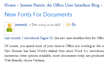 Microsoft project director Jensen Harris used Segoe UI and Constantia in a December 2005 Microsoft blog post touting the new fonts’ arrival on the scene.
  Microsoft project manager Scott Hanselman used Consolas for some program code in a blog post. Not a great example, but as you might imagine, there aren’t a lot of sites using Consolas in their design at all.
HiTechy
 Web designer Alex Dawson uses Constantia for his headers and Candara for his body text.
AriWriter
 Social media marketer Ari Herzog uses Corbel as the font for the body text on his blog.
Stop Bullying Now
 I’ve used Segoe UI as a text font in several of my own designs, including my redesign of the Stop Bullying Now site.
Other Uses in the Wild
Microsoft uses Segoe (a variant of Segoe UI) in its text font stack, behind Tahoma. With Tahoma’s 99%+ market penetration among Windows users, few, if any, Windows users will see Microsoft’s site displayed in Segoe. According to Web designer Amrinder Sandhu’s February 2010 article on A Way Back, the typography site I Love Typography had Cambria in its font stack, behind Georgia, which means that with Georgia’s near-99% market penetration among Windows users, virtually all of them would see it in Georgia, not Cambria.
However, a check in May 2010 shows Cambria no longer in the ILT font stack.
Obtaining Vista Fonts
As noted above, you have these fonts if you have Windows Vista, Windows 7, MS Office 7 for Windows, and/or MS Office 8 for Mac. However, if you’re running a non-Vista Windows OS, you can still obtain the fonts in several ways.
You can get the 6 “C” fonts by downloading and installing the free Microsoft PowerPoint Viewer 2007. You can obtain the other Vista font, Segoe UI — not available through most font providers, even those who make the other Vista fonts available — by installing the free Microsoft Word Viewer. Mac users can obtain the Vista fonts freely and by installing the Open XML File Format Converter; Rémi Plourde tells how to do it. Ubuntu Linux users can figure out how to install the fonts from this post.
Fedora Linux users can install Vista fonts on their machines by following the instructions found here.
Pairing Off
If you do decide to bite the bullet and incorporate Vista fonts into your design, here are some suggested pairings. These are just suggestions, subjective and idiosyncratic; you may find that different fonts, or different combinations, work better for your designs.
Keep in mind the issues of size and anti-aliasing, and test, test, test.
Calibri + Arial or Helvetica
To my mind, this is the most drastic example of size differential. Calibri is small.
Sandhu recommends using Gill Sans with Calibri.
Cambria + Times New Roman/Times and Georgia
Cambria pairs off well with Times New Roman, but is a bit narrower than Georgia. Also, it pairs off well with Linux’s Liberation Serif.
Candara + Trebuchet MS, Helvetica/Arial, Verdana, or Geneva
Canadara pairs fairly well with Linux’s Liberation Sans.
Consolas + Monaco, Andale Mono, or Lucida Console
Really, any monospace font could work with Consolas. Sizing is an issue, but not as much as with some of the others.
Constantia + Times New Roman/Times, Apple Garamond, or Georgia
Also pairs off well with Book Antiqua, the Palatino font family, and Linux’s Liberation Serif. Patrick Hunlock provides an excellent comparison (in PDF format) between the 6 “C” fonts and their non-Vista cousins. Web designer Christian Montoya provides another such chart, also very good, and with the added bonus of some Linux fonts in the mix.
Advocating the Use of Vista Fonts in Designs
As noted above, most design-based criticisms of the use of Vista fonts center around the ClearType/anti-aliasing issue. But others don’t see that as a deal-breaker. Christian Montoya is a strong advocate for using Vista fonts in design, explaining that he is tired of “star[ing] at the same ugly set of Windows fonts I’ve had to endure for years …
as far as I’m concerned the new Windows Vista fonts are far better designed than their predecessors.” Stephen Coles, the co-editor of the influential typographical blog Typophile, wrote in 2008 why he believes Vista fonts aren’t being used more widely in site designs: “The Vista fonts are hampered by the anti-Microsoft sentiment common among designers. Perhaps there is also a segment of type users who see C[a]libri and the other C-fonts as made specifically for ClearType — for the screen — not for professional print design. Personally, I think the series is one of the brightest things Microsoft has done in years and they continue to school Apple on commitment to typography, but I haven’t seen much of the Vista fonts in offline use.” Typeface designer, James Arboghast, predicts that Vista fonts will become widely used “[a]bout a decade from now.
These things take time to catch on.”
References
- Microsoft Windows – Versions – Wikipedia
- OS Statistics – W3Schools
- Daily Report – Jeffrey Zeldman Presents The Daily Report
Related Content
-
 President of WebFX. Bill has over 25 years of experience in the Internet marketing industry specializing in SEO, UX, information architecture, marketing automation and more. William’s background in scientific computing and education from Shippensburg and MIT provided the foundation for MarketingCloudFX and other key research and development projects at WebFX.
 -

WebFX is a full-service marketing agency with 1,100+ client reviews and a 4.9-star rating on Clutch! Find out how our expert team and revenue-accelerating tech can drive results for you! Learn more
Make estimating web design costs easy
Website design costs can be tricky to nail down. Get an instant estimate for a custom web design with our free website design cost calculator!
Try Our Free Web Design Cost Calculator
Share this article


Web Design Calculator
Use our free tool to get a free, instant quote in under 60 seconds.
View Web Design CalculatorMake estimating web design costs easy
Website design costs can be tricky to nail down. Get an instant estimate for a custom web design with our free website design cost calculator!
Try Our Free Web Design Cost Calculator


