
Typography in web design plays an integral part in setting the tone, theme, and message of a website. For example, you can convey a site’s focus on modernity or traditionalism simply by choosing to use sans serif or serif fonts, respectively. You can call attention to particular parts of the content, and deemphasize others, by changing the font’s color, line-height, style, and size.
An effective palette of fonts not only makes a design attractive, but also contributes to the readability and usability of the content. In this collection, you’ll find a variety of sites that showcase creative and functional uses of typography.
1. Jason Santa Maria
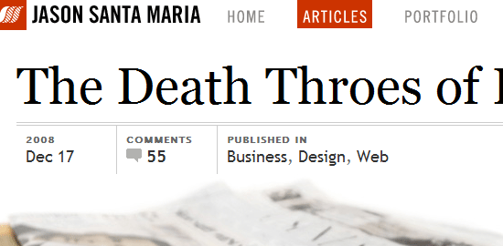
 In Jason Santa Maria‘s personal site, the typography selection and styling plays a large part in the minimalist design. Article titles are large, drawing your attention to them right away. sIFR is used in several places (such as the footer headings) to allow the use of non web-safe fonts without using images for text.
2. Elysium Burns
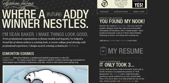
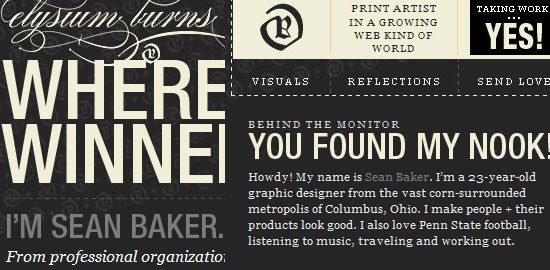 Elysium Burns infuses large, bold, sans serif fonts with traditional serif fonts to create a stunning design. CSS image backgrounds are used for the articles’ titles and site headings.
3. GOOD
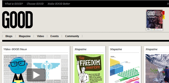
 GOOD uses clean and excellently-spaced fonts to form a beautiful and readable design.
4. Web Design Ledger
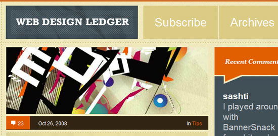
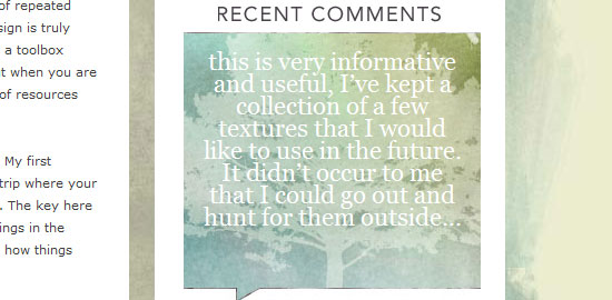
 Web designer and developer Henry Jones combines the use of serif and sans serif fonts to create a unique web design. The design of Web Design Ledger showcases the readers’ recent comments with large, emphasized type not only as a functional element in the design, but also for creative purposes.
5. Future Of Web Apps
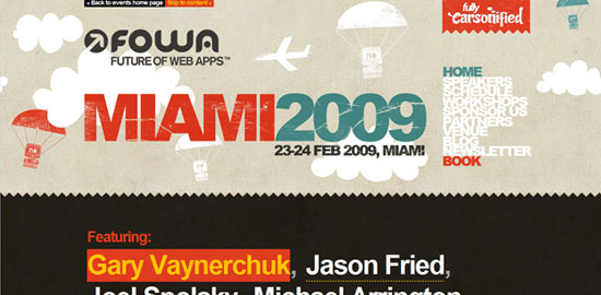
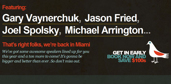 The Future Of Web Apps website uses a variety of large and bold text with bright colors. The main navigation’s font is bold with negative letter-spacing and a short line-height, creating a compact and unique text-based navigation menu.
6. VigetInspire
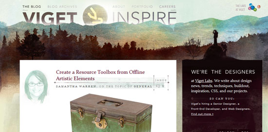
 The VigetInspire blog has an array of gorgeous font usages. A large line-height value for the content’s text allows them to use smaller fonts without sacrificing readability.
7. Diaroogle.com
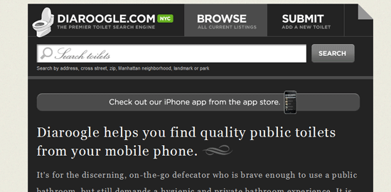
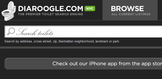 Diaroogle.com is an excellent example of using both serif and sans serif fonts in a web design while still keeping a tight and complementary composition. The search input box uses a calligraphic font making it stand out while still being unobtrusive.
8. The Morning News
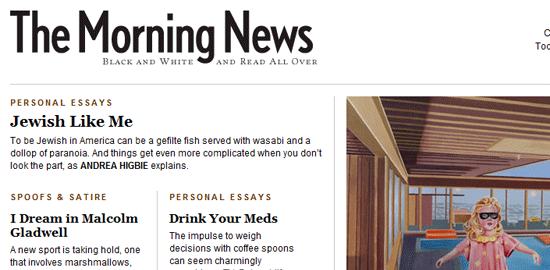
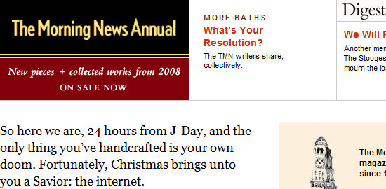 In minimalist designs, typography plays a large part in the layout and theme of the design. The Morning News uses clean and appropriately-spaced fonts with subtle colors to create a clean and crisp atmosphere.
9. Ordered List
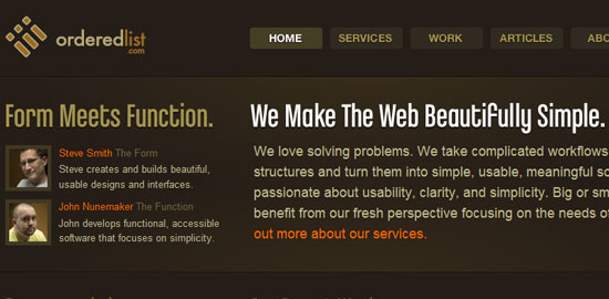
 Ordered List utilizes a variety of big, bold sizes and colors to compliment the rather dark background. By using CSS background images for headings, the font used can be a non web-safe font face while still retaining the site’s accessibility and indexibility.
10. Words Are Pictures
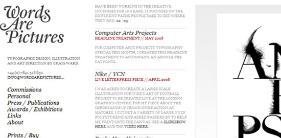 Words Are Pictures stays true to the name of the site by using its typography as the main design element. Simple styling of serif fonts sets a classical look-and-feel.
11. Meagan Fisher
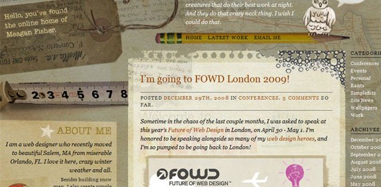
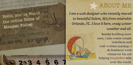 Meagan Fisher employs a variety of serif font faces and styles in her personal site. The hang tag image on the top left corner of the web design quickly tells the visitors where they are; using a unique font in this case can call the user’s attention to the tiny blurb.
12. The New Yorker
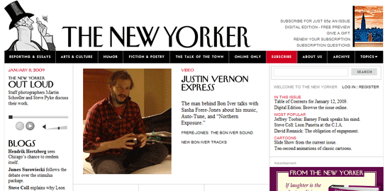
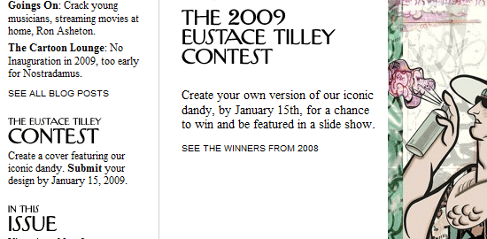 The New Yorker brings their magazine’s trademark font on the web, maintaining their brand in both print and web mediums. The use of serif font gives the reader a sense that The New Yorker is a traditional and long-established magazine.
13. Black Estate Vineyard
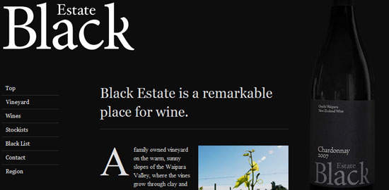
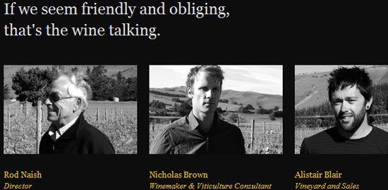 It’s a difficult feat to use a dark background without being associated with the non-mainstream and underground class of websites. Black Estate Vineyard is able to use a black background (their brand color) – while still maintaining a sense of sophistication – by using big, bolded serif fonts. Using a high-contrast color (white) as the foreground color allows for better readability.
14. Ad Fed MN
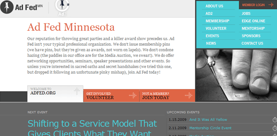
 AD Fed MN successfully mixes sans serif and serif fonts in the design. A simple and bright navigation menu on the top right of the design allows for an attractive and compact primary navigation scheme. The sidebar features image replacement headings so that they can utilize non web-safe fonts while still retaining accessibility and indexibility.
15. What a Lovely Name
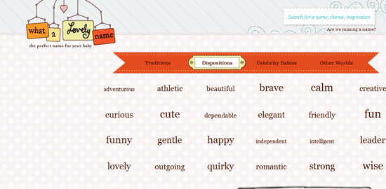
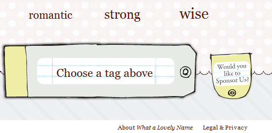
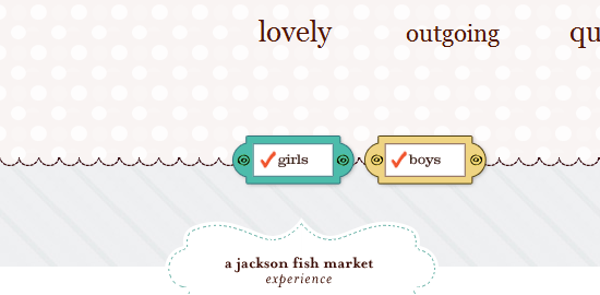 What a Lovely Name is a simple web application that helps users choose a name for their baby based on keywords (“tags”). The keywords are arranged in a tag cloud with more popular tags being larger and bolder than less popular tags.
16. Rustin Jessen
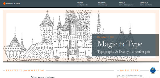
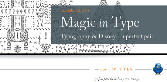 Rustin Jessen‘s site is minimalist for a reason: to direct the reader’s attention towards his wonderful works of art.
17. The Darling Tree
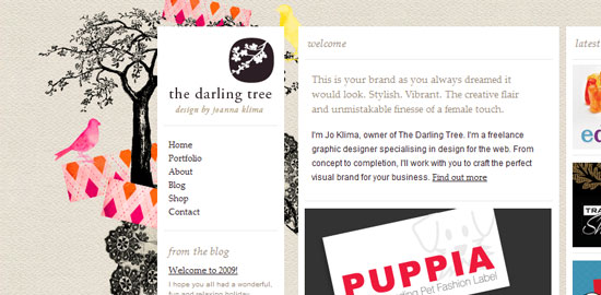
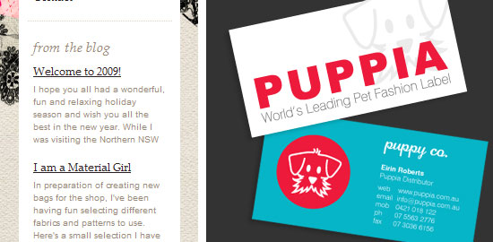 The Darling Tree‘s use of various font styles and sizes contributes greatly to the design theme.
18. I Love Typography
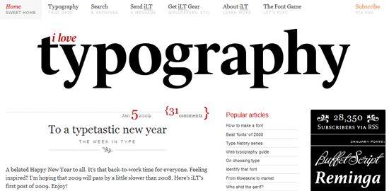
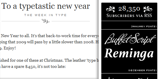 With a site named “I Love Typography“, it’s no wonder that the web design is highly-conscientious about its font selection and usage.
19. A List Apart
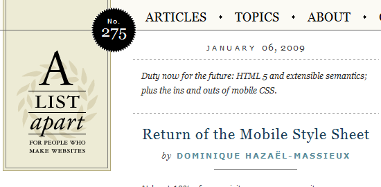
 A List Apart‘s minimalist design is centered on the attractive and functional application of typography. Adequate line-spacing in the content’s text makes their articles more readable and different colors of the titles and headings create a visual relationship between articles in the same topic.
20. Training by Collective Idea

 A beautiful upcoming events section on the top right of the design showcases their meticulous attention to typography.
Let’s talk type
Have anything interesting to share regarding typography in web design? What are your favorite fonts? Do you know of a site with great typography that’s not featured here?
Please share it with all of us in the comments section.
Related content
-
 President of WebFX. Bill has over 25 years of experience in the Internet marketing industry specializing in SEO, UX, information architecture, marketing automation and more. William’s background in scientific computing and education from Shippensburg and MIT provided the foundation for MarketingCloudFX and other key research and development projects at WebFX.
 -

WebFX is a full-service marketing agency with 1,100+ client reviews and a 4.9-star rating on Clutch! Find out how our expert team and revenue-accelerating tech can drive results for you! Learn more
Make estimating web design costs easy
Website design costs can be tricky to nail down. Get an instant estimate for a custom web design with our free website design cost calculator!
Try Our Free Web Design Cost Calculator
Share this article


Web Design Calculator
Use our free tool to get a free, instant quote in under 60 seconds.
View Web Design CalculatorMake estimating web design costs easy
Website design costs can be tricky to nail down. Get an instant estimate for a custom web design with our free website design cost calculator!
Try Our Free Web Design Cost Calculator


