
 Web designers should regard every user who comes to our websites as potential newcomers, providing enough instruction and guidelines for them to complete their tasks and get familiar with the site. Almost every type of website has to help its users, but in different ways. The type of website will determine the type of help system you should be providing.
Moreover, the effectiveness of a help system has a direct relationship to the quality of the site’s design. A poorly designed help system — however good its content — makes for a shoddy user experience. In this article, we’ll study some approaches to designing effective help pages through examples, which might inspire you in your work.
What Is a Help System?
We see many terms and types of help systems used in the context of site design: “Help,” “Support,” “FAQ,” “Docs,” “Knowledge Base,” etc. All of these web pages are intended to provide assistance to users. Help systems should be conveniently accessible in locations where users can possibly need answers to their questions, e.g., when they get started using a website, and when they could benefit from useful information.
They’re critical because they are one of the last places a website visitor will look before deciding to give up and search for another website that will fulfill their requirements. Therefore, help systems can be crucial in retaining your site visitors. While help systems are important and oftentimes indispensable, many website designs overlook the usefulness and importance of them.
The reason for this is usually a lack of awareness by the website owner of the need for help content or of the benefit of integrating it into the content of the website. For example, in the case of an online shop, you could put purchasing instructions on the home page or somewhere where users could easily find them, instead of creating a separate help section. This would also increase findability.
Some Examples of Help Systems
To help with the discussions that will follow, let’s look at just a few examples of help systems. As you can see below, the site, Marie Catrib’s, puts its contact information and hours of operation in the footer of its home page. This subtly embeds the content for what is sometimes a completely separate page right into the footer.
This information can be considered a part of the site’s help system. 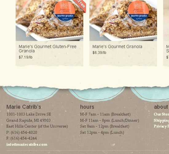 An FAQ (which stands for frequently asked questions) is a place to answer questions that many users repeatedly ask or think of. In other words, it could be a subset of guidelines from a top-level category like Support or Help for larger site help systems.
In most of cases, “Help” would be a better name for a top-level page. “Support” is usually used on commercial websites that offer some sort of technical service. Some sections are named “Help/support center.” Below, you can see Josh Lockhart’s websiteuses a “Help” link as an entry point to his help pages.
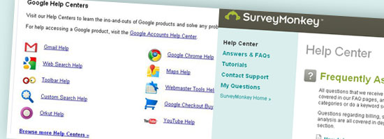
The help pages is further subdivided into sections such as “How to Install,” “How to Buy,” “FAQ,” and so on. 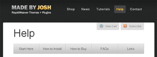 What follows is another example of a help system. Given its content (which is various categories), “Help Centers” is the right name for this section of Google’s site.
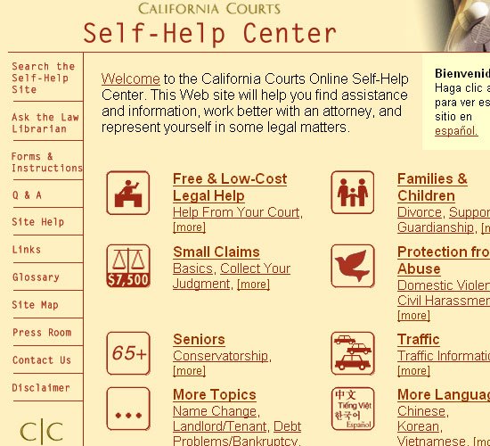
Because they have many products, their system is very comprehensive and must be organized well in order for it to be effective and usable.  California Courts has a suitable help center, with well-defined categories. Icons are used to facilitate visual cognition of the different sections of the help system.
 Survey Monkey‘s help center has well-crafted categorization.
 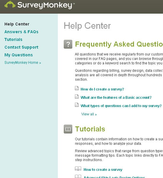 Ten Little Monkeys lists some help pages under the heading, “help & information” on the footer.
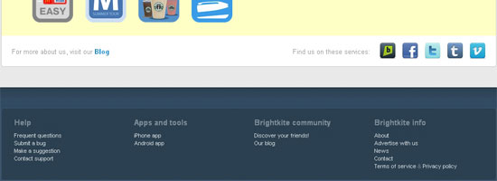
 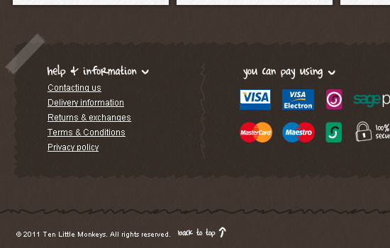 BrightKite, like Ten Little Monkeys, uses the “Help” heading on the footer, and then lists some useful help pages that are part of their help system.
 As a counter-example, Fine Point puts only their contact information in its help center, a lesson in misnaming and of an incompletely designed help system. As a good convention to follow, “Contact” or “Contact us” should be the label of this web page.
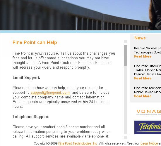
Help Page Features
All help pages, whatever their individual characteristics, have some common features.
- The pages must be clear and illustrative.
- They should have a short, descriptive explanation of each topic that can be read quickly. Users who come to help pages are usually already confused, so they aren’t inclined to read long blocks of text.
- Following good scanning aids (such as bolding keywords) can increase readability.
In the example below, you can see that Maverick Label bolds important parts of the text and so helps the user along. 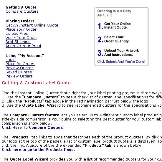 Despite the simple design, the links on System 7 Today work well to highlight important subjects.
 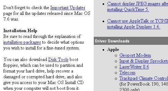 In addition to these features, some other attributes deserve consideration.
Let’s review them.
Accessibility
One of the most important aspects of any page is accessibility, but it’s even more critical for help pages. Help pages should be simply and quickly accessible.
Link to them in the header and footer, especially on long pages and the home page. Users shouldn’t have to dig into deeply buried pages. The experience should be straightforward.
For example, Traffik puts clear links on a plain background to increase readability. 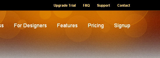 ProWorkflow places a direct link to its support page in their primary navigation bar.
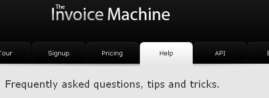
 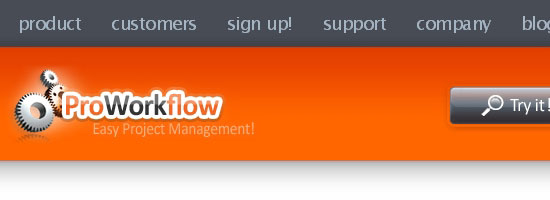 Invoice Machine follows the pattern we’ve seen above but also shows what can be found on the help page with descriptive text.
 Constant Contact uses appropriate wording (“Learning center”) for its resources and distinguishes it aesthetically from other links.
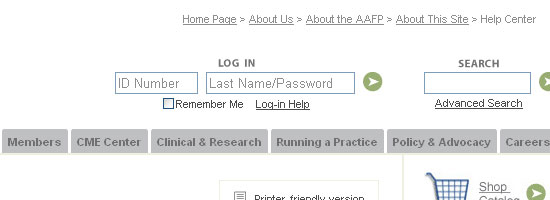
 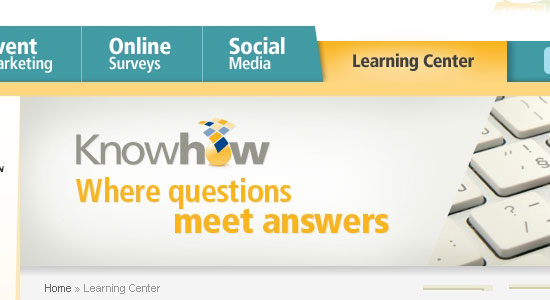 AAFP‘s breadcrumb shows the long path to the help center. Being so buried, the section could escape the attention of users.
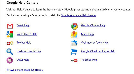
 Finding Google‘s help center from the home page is rather difficult. In fact, Googling it is quicker.
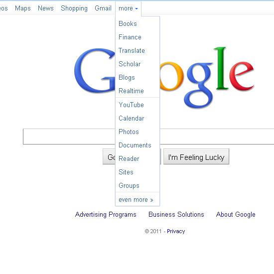
Categorization
To prevent confusion, help systems with a lot of content should be carefully structured by topic.
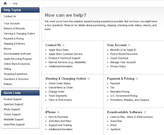
For a help system to be effective, you must spend time in information architecture. Have a small number of main categories, each of which can have sub-categories. There are different ways to categorize, but in general, put more important topics and common issues higher up in the structure.
Also, consider using icons to increase visual cues for the categories, as well as add life to the page. In the example below, Apple‘s help center is brilliant, like its products! The topics are well categorized and cover all areas users might need help on.
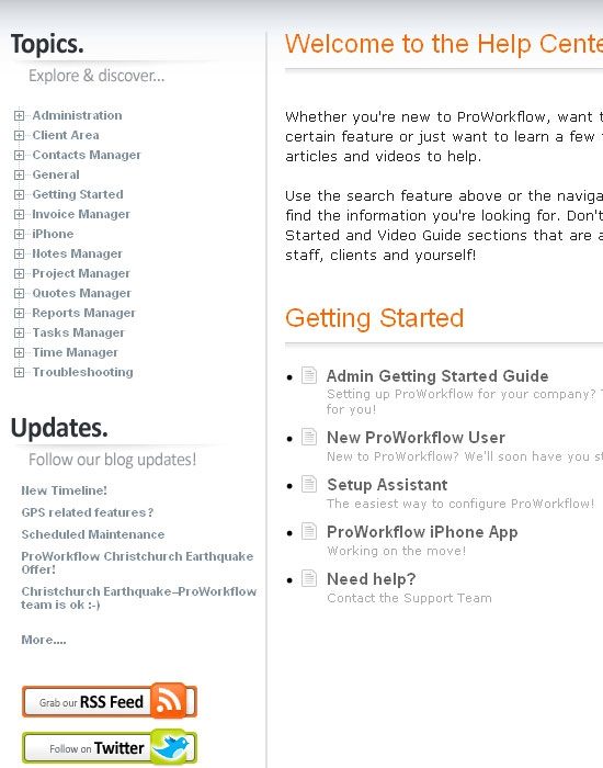
 ProWorkflow organizes its help content into several categories, each containing sub-categories.
 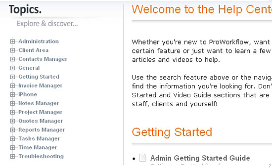 Campaign Monitor uses icons to support its categorization, putting everything in the right place.
 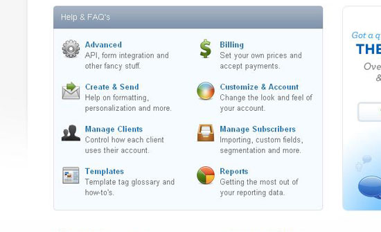 To prevent congestion, Google puts less important items on another page, accessible by a link.
 Hostway is another example of classification with icons but with its own style.
 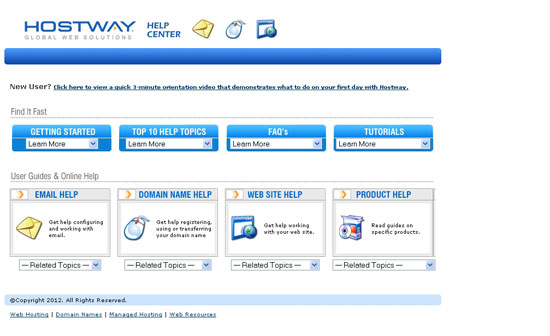 HWG’s FAQ page has very simple categorization, without anything superfluous.
 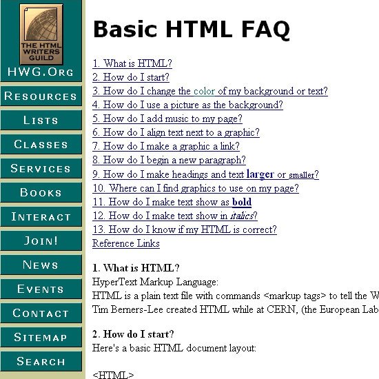 Apache’s help system is another page of pure HTML.
It’s simple but gets the job done. 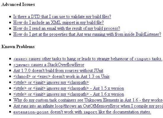
Searchable Content
For extensive help systems, being able to search can be very useful. Search results should display all of the information about a topic at a glance.
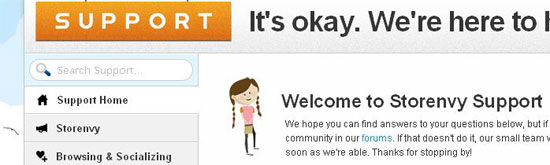
But to be truly useful, it should display only pages from the help section and not the rest of the website so that the results presented doesn’t get overwhelming or confusing. Google‘s help center has section-specific search appropriately labeled “Search Help,” to indicate that you’re only searching the help center. 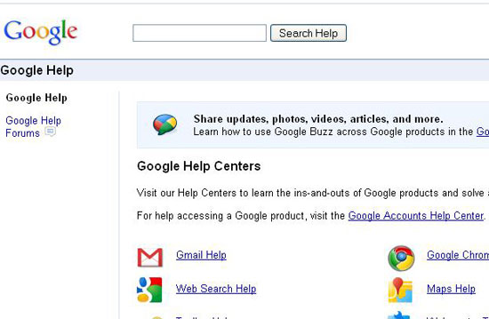 Storenvy‘s search feature is well positioned and well labeled (i.e., “Search Support”).
 TiVo also shows good positioning and creates a distinctive space for the search box. The colors add to the beauty.
 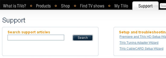 ProWorkflow, despite good categorization, lacks search, which could cause difficulty.
Link to Other Resources
Sometimes users end up in the wrong place or can’t find what they’re looking for. Provide them with other useful options, like other help topics, a forum and so on via relevant hyperlinks. The usefulness of such links will depend on their location: visible, nearby and distinct is best.
ThinkGeek lists almost every other place a user might want to go, and they put it in the right place and with a good heading.  Notable links to the latest forum posts, a good idea to introduce new resources and improve discoverability.
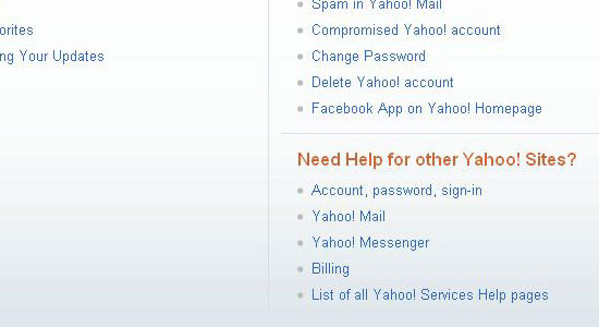
 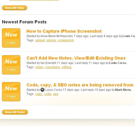 Like ThinkGeek, Yahoo organizes links under informative headings, which are helpful.
Contact Information
Putting contact information in the right place is another way to help users. When users can’t find what they’re looking for, they’ll ask, so you should be accessible in some way: phone, email, online chat, etc. While contact information commonly appears on the home page and, of course, on the contact page, putting it on the help page is a good idea for fallback in case the user can’t find what they’re looking for.
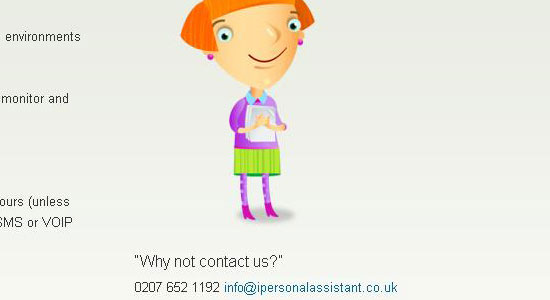
Contact information on Crazy Egg is well presented and well positioned. 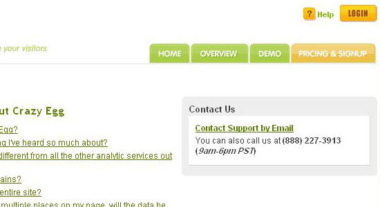 iPersonalAssistant offers simple contact information, without any unnecessary decoration. Like Crazy Egg, it also welcomes email.
 TiVo offers live chat, an invaluable feature for a website.
 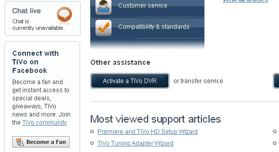 ThinkGeek provides thorough contact information. And it is well positioned.
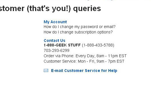 Help.com invites users to submit a ticket, which is handy, but perhaps less so than live chat. Of course, both methods require enough staff on hand to satisfy demand.
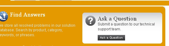
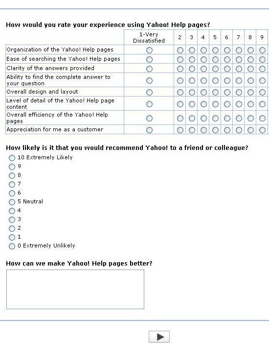
Getting User Feedback
To improve help material, assess its efficiency and gauge user satisfaction, feedback is important.
The process shouldn’t be time consuming, or else users won’t participate; star or numerical ratings work better than forms. A very simple survey by Microsoft asks whether a help resource was helpful or not.  Help.com asks users to write their suggestions, complaints and other feedback.
While the feedback may be more detailed, analyzing it is tiresome work. And given the time required to participate, users might decline anyway. 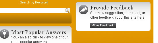 Yahoo‘s complex form seems overly burdensome on users.
 A cosmic survey by NASA! Displaying the average rating and number of ratings is smart. And they even provide help (see the question mark).

Putting It All Together
We’ve reviewed some essential elements of help pages. Many help pages don’t have any of them, while some present them concurrently. Nearly perfect help sections are rare, and the ones out there tend to belong to the most successful companies on the web.
Campaign Monitor exhibits all of the traits of a perfect help section. 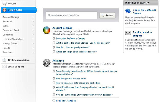 Like its other features, web giant Yahoo has a great help area.
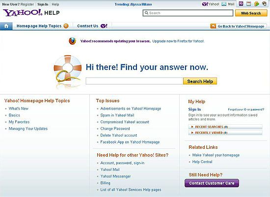
Conclusion
This guide has introduced some essential tips and best practices for designing effective help pages.
I hope that you’ll be able to heed the rules that apply to you and not pay too big a price for bypassing the rest. So start experimenting, while remembering the basics.
Related Content
-
 President of WebFX. Bill has over 25 years of experience in the Internet marketing industry specializing in SEO, UX, information architecture, marketing automation and more. William’s background in scientific computing and education from Shippensburg and MIT provided the foundation for MarketingCloudFX and other key research and development projects at WebFX.
 -

WebFX is a full-service marketing agency with 1,100+ client reviews and a 4.9-star rating on Clutch! Find out how our expert team and revenue-accelerating tech can drive results for you! Learn more
Make estimating web design costs easy
Website design costs can be tricky to nail down. Get an instant estimate for a custom web design with our free website design cost calculator!
Try Our Free Web Design Cost Calculator
Share this article


Web Design Calculator
Use our free tool to get a free, instant quote in under 60 seconds.
View Web Design CalculatorMake estimating web design costs easy
Website design costs can be tricky to nail down. Get an instant estimate for a custom web design with our free website design cost calculator!
Try Our Free Web Design Cost Calculator