
 When I finished building my first web app (CompVersions, which allows you to collect feedback from clients), I was surprised at the number of user interface decisions and considerations I hadn’t accounted for at the beginning of my journey. I’d like to share some of those things with you. Many of these design considerations might seem superficially obvious, but once you’re going through the design and development process, it’s easy to forget about them because they’re like condiments — you hardly notice them when they’re there, but if they’re missing, your food just doesn’t taste right.
Blank State
The blank state is how your app will look and function when the user hasn’t entered any data yet (except perhaps their email address after signing up for an account). This is the first interaction and scenario that your user will encounter with your app and it can make or break their first experience and impression. This state is a critical time for retaining users, because, at this point, users haven’t had enough invested into using the app for them to be discouraged to look for another solution.
One way of dealing with the blank state is to use media to show the user how to use your interface, e.g., a video or a product tour with screenshots. For example, upon signing up for a Fitbit account and logging in as an authenticated user for the first time, you’re presented with a slideshow of the different components of the app.  You can also provide your UI with cues, tips, and hints for first-time users, pointing out features in-line.
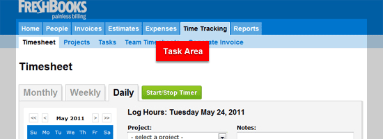
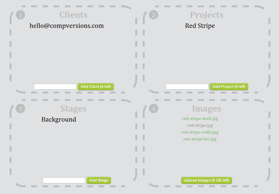
For example, below, you can see that FreshBooks displays a message that tells you that you haven’t created any estimates yet, and then provides you with a link for creating one. 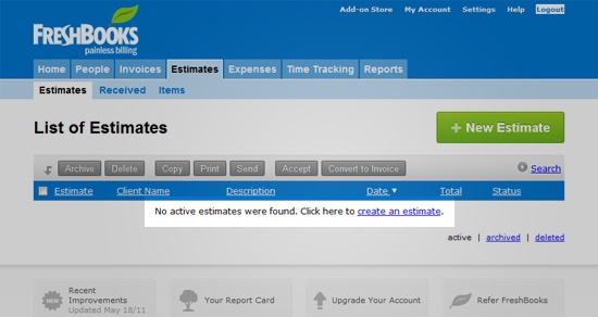 For my web app, the first time you log in, you’ll see four boxes that are numbered sequentially. You can’t progress to the second box without completing the first one so that there’s no guessing and the user immediately knows what to do to get started.
There’s also only one textbox and button visible at the blank state, so there’s no ambiguity about what the next step should be. As users complete each step, the next box is unlocked for them, and they can proceed. 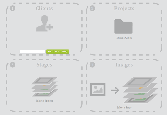 Let’s look at a couple more examples of blank states.
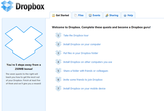
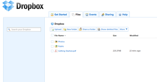
At Basecamp, the first thing they show users is a video that gives you an overview of the way the web app works. 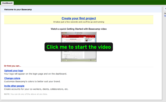 Dropbox has an interesting approach. They start you at a “Get Started” tab that has a numbered list of action items that steps you through what you need to do to get maximum value from using Dropbox.
 As you complete the action items, they’re crossed out, and the box on the left incrementally fills up until you are complete.
 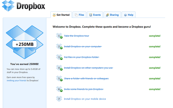 Dropbox incentivizes exploration and use of the app by giving you rewards for completing items in the “Getting Started” tab, effectively gamifying the training and familiarization stage of their product.
Quota/Usage Information Displays
If you have limits to things such as storage, number of projects you can create, etc.
you should constantly give users visual cues of how much they have left so that, if needed, they can upgrade their account before they reach the limit. It’s best to include some visible measurement of the unit that has a cap. You don’t want to blindside your users by suddenly telling them they’re out of storage space or whatever it is that has a limit.
Imagine that you’re working under a tight timeline, and you’re composing an email that has large file attachments. You hit the Send button only to find out that your file quota has been reached. You’d be one frustrated user.
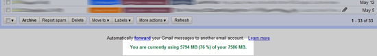
Let’s go through some examples of quota/usage information displays. On Gmail, you can see simple textual information showing how much storage you’re using and how much storage you have (in MB), as well as a percentage of how much storage you’ve used up. They’ve located this at the footer of the layout using a distinct color (green) for prominence.
 Dropbox goes with a simple visual display showing you a bar with the percentage of storage you’ve used up.
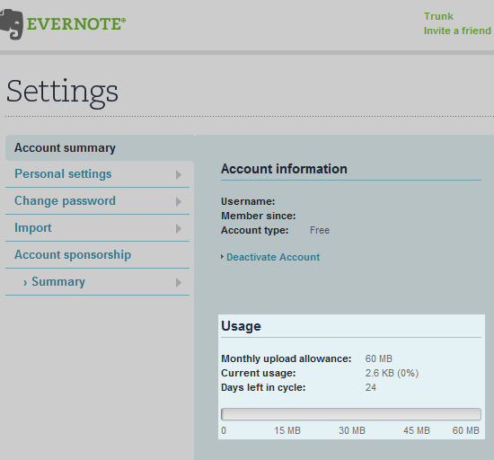
 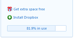 On Evernote, the quota/usage information isn’t persistent in the interface; you have to visit the Settings page in order to see it. This isn’t as intuitive to locate as having it displayed persistently on the user interface (or providing a shortcut link to the usage information).
 For my app, I went with a simple text display that shows storage space allotment and the quotas for the number of clients and projects the user has.
Plan Upgrading/Downgrading
How do you design the UI to remind users that they can upgrade their plan without interfering with their workflow? Once a user has bought a plan, they may want to upgrade or downgrade, and you don’t want to send them out of your app to do that.
It should be seamless and convenient, so changes to the user’s plan are best done within the app. Let’s go through some examples of how apps deal with changes in the user’s plan. The FreshBooks upgrade reminder is persistent, positioned at the web app’s footer.
It’s a constant reminder without being an obstruction to the workflow of the user, as it’s located outside of the task area of the UI. 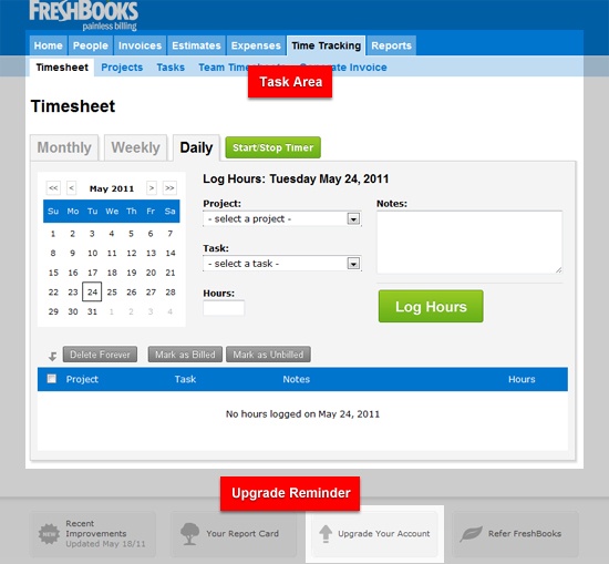 The upgrade screen on Basecamp shows you clearly what you get from changing your plan.
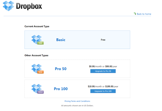
 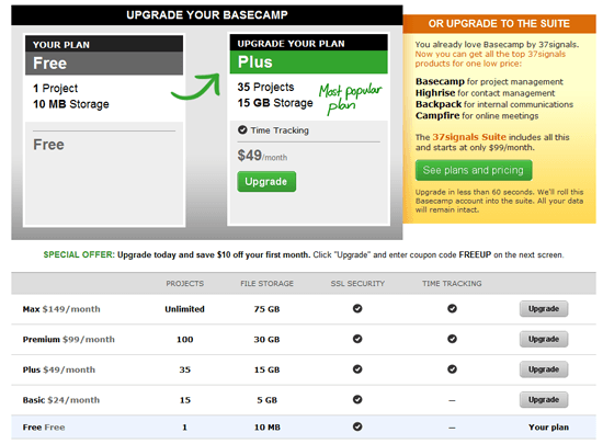 The upgrade screen in Dropbox is clear and simple, as shown below.
 On my app, CompVersions, here’s what the upgrade screen looks like.
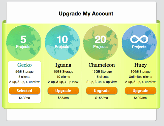
States of UI Elements
Elements such as buttons, text areas, input fields, and so on can have several states. Normal, hover, disabled, active, inactive, focused states, etc.
help users determine what possible actions they can perform on a given element. It gives them visual cues as to what they’re interfacing with, and what they aren’t. These states are very important considerations.
They add a tactile look and feel to your UI, and give your app a sense of being alive. States are obvious on things like navigation menus and buttons because these are standard user interface elements, but what about on sections that you want to draw attention to or what about uncommon UI elements? In CompVersions’ case, I wanted to guide the user through the four boxes with as many subtle visual cues as I could.
One way was to have the outlined box change color when they hovered over a box (i.e. the box lights up) to indicate that it’s an interface-able UI element. 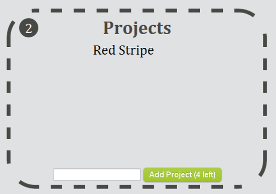 When the cursor leaves the box, it dims back down.
 They all seem so seamless, but I had to make a conscious decision and write CSS rules for each state. Here’s an example of different states of UI elements on Fitbit when you’re logging food. The inactive state is compact, but has clear instructions on how to interface with the element (an Add a note text control).
When you click the Add a note text control, it switches to the active state featuring a text area (a standard text input UI element) with in-line instructions that says, “Write a new note…” which simultaneously deals with the blank state scenario (i.e. no note has been added yet). 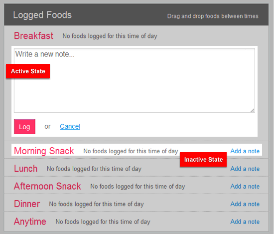 Let’s look at an example of a hover state on Basecamp’s pricing table.
When you hover over a pricing plan, the plan becomes highlighted and displays a tool tip with more information. 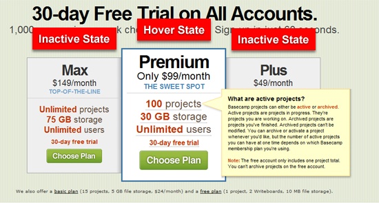
Keep the User Interface Simple and Intuitive
This is something that all UI designers will tell you but is a difficult concept to grasp until you’ve had to design your own UI: Keep it simple. Making decisions on what goes and what stays is tough.
How do you present the user interface of your web app as simply as possible, while still making it powerfully feature-rich? How do you design 30 different possible user actions in one screen without making it look like the cockpit of a fighter jet? One thing you should practice when applicable is progressive disclosure.
If the user doesn’t need a button, menu, or link — hide it. Get out of the user’s way and allow them to do what they want to do without having to wade through a ton of choices. For example, on Dropbox, there are multiple contextual commands you can perform on your files.
Here’s the inactive state of files in your Dropbox:  When you hover over a file, a contextual menu is progressively disclosed showing additional tasks you can perform on the targeted file or sub-folder, such as Delete or Move.
 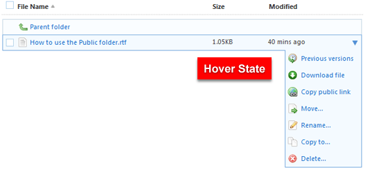 This concept sounds very easy to do in theory, but it’s surprisingly hard especially if your app has a lot of features. Do you have to have an Edit command on every editable item at all times, or do you just progressively disclose this command when the user hovers over an editable item?
If it’s the latter, how do you indicate that there are possible commands that can be performed, if the user hasn’t hovered over the item yet? Do you use an icon to save some space or do just use a text command that says Edit or do you have both an icon and a text command? If you use an icon, what would be an intuitive symbol for it?
Does the symbol conflict with other icons already existing in the interface? If you use a text command, should it say Edit or Edit item? And that’s just one element out of the many that you’ll have to be making constant micro-decisions on; decisions that are often going to be hard to reverse after users have taken on your app because even slight changes in user interfaces require retraining and recalibration from your users, which hinders their workflow.
Keeping things simple, intuitive and consistent really makes the UI easy to use, and this all takes a lot more work than many would think.
Use Visuals Smartly
Images and icons can help ease-of-use. Using visuals such as icons, graphs, charts, photos, etc.
can replace long blocks of text and data tables altogether. It can make the readability of data easier and they can be used to provide visual cues as to what a certain command does. Visuals are powerful elements in a graphical user interface.
Let’s look at some examples of how visual elements are used in some web apps. Below, a trash can icon, which is a recognizable and ubiquitous symbol for a Delete command, is progressively disclosed as a possible action when you hover over a to-do item on Basecamp.  Below, you can see a trash can icon, an icon that allows you to drag-and-drop the to-do item, and, at the far right, a chat bubble icon that when clicked, allows you to comment on the to-do item.
 Think about the reasons for the design choices made in the above contextual menu. Why is the Edit command a text link? Perhaps because it’s the primary task a user would be performing the most, and the UI designer wanted it to have a more distinct visual appearance (using the inverse of Gestalt psychology’s Law of Similarity).
Why are the icons arranged the way they are? Why is the comment bubble icon separated from the other icons?
Provide Instructions and Information at the Proper Places
There are times when you’ll need a callout box or notification area that tells the user something specific that they need to know to most effectively use the UI to its fullest potential.
Provide as many of these helpful information as much as you can, at the right places, and make sure they’re integrated in the interface in such a way that they don’t pose as a hindrance to the user’s workflow. For example, if you use icons for commands, you can use the alt and title HTML attribute to give the user a quick summary of what the icon will do when they hover over the icon. Don’t overdo it.
The key is to identify the places where more information and instructions are needed. If there are too many tooltips, hints, callout boxes, etc. the user can become desensitized to them and they can interfere with the use of the app because they constantly distract the user.
Optimize UI Speed
A web app should be responsive and fast. When there’s huge delays between sequential tasks, the user may develop an unconscious resistance to using the app. Apps are tools to accomplish specific jobs, and if it’s not fast, then it’s not a very effective tool.
For the most part, using best practices for optimizing page response times will help ensure you’re giving your users as fast and as efficient as an experience as possible. Most of these best practices are commonsense and, for maximum bang for your buck, you should focus on front-end web page performance first (e.g. reducing the file sizes of your page assets and reducing the number of HTTP requests needed to render a web page).
Use CSS when you can. Reduce your need for JavaScript. Don’t use Flash if there’s another comparable option (as it can be a resource hog).
Design using data to help you make informed decisions and to help you see if you can start using CSS3 to save on having to load CSS background images for rounded corners and color gradients. Use CSS3 as much as you can. Avoid using images if you don’t have to — rounded corners, text shadows, box shadows and a whole host of other popular aesthetic elements render much quicker than images in web browsers that support them.
Educate yourself on practical CSS3 by using this slideshow presentation created by Lea Veroukeep; refer to it constantly as you develop your app. Designing with progressive enhancement in mind can help you optimize front-end performance. Allow yourself to make some sacrifices in aesthetics for users using older browser like IE6 for the overall good of your entire user base (if data suggests old browser usage is relatively low).
Use the Appropriate Cursor Pointer and Alt Attributes
This is a mini-tip that many of us forget. JavaScript DOM manipulation can make any element clickable. However, sometimes we forget to style clickable elements appropriately.
Styling clickable elements by changing the cursor to a pointer helps indicate that an element is interactive. This is one of those things that you don’t notice until it’s not there. Let’s say that you created span elements that are clickable using a web development library like jQuery.
HTML
... <td><span class="delete-row">Delete this record</span></td> ...
jQuery
$('span.delete-row') .click(function() { $(this).parent('tr').remove(); });Although the HTML element is interactive, it doesn’t change the mouse pointer to a cursor. To do so, you can use either CSS or jQuery.
CSS
span.delete-row { cursor: pointer; }jQuery
$('span.delete-row') .click(function() { $(this).parent('tr').remove(); }) .css('cursor', 'pointer'); Also, use alt attributes on images, which can assist people in determining what icons are for if you’re using them in the UI. For example, even though you’re using a trash can icon instead of the word “Delete”, let the alt attribute of the icon say “Delete”. Not only do alt and title attributes help screen readers for visually impaired users, it also helps remove ambiguities for users that aren’t visually impaired.
Finished State
You need to consider what the app will look like when data has been entered. In the case of CompVersions, I wanted to show (in chronological order) a particular flow — client information, project names, stage names and image names — in one view.
 With Basecamp, this is the dashboard view. The user gets a quick snapshot of all of their projects and the activity associated with that project.
 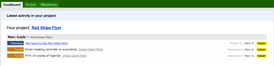 For Dropbox, this is just a listing of all the files and folders in your account.
 This state tends to be the first screen that’s designed/mocked up when designing our app because this will be the most frequently seen/visited state once a user starts using our product.
Conclusion
There are many other examples of web apps that have successfully done all of the above. Once I went through this process and discovered these things, I started to notice of them in other apps — it becomes a natural habit, I suppose.
In my experience, it was surprising to realize how many little things you had to really think about, consider, and decide on when crafting an interface. It’s easy to gloss the details over when you want to ship a product as quickly as possible, but if you take some time to really polish the little things, your interface will be as awesome as possible and your users will enjoy using it. The best compliment you can get when designing interfaces is that they’re easy to use.
I hope the things I shared with you here get you a step closer to that praise.
Related Content
-
 President of WebFX. Bill has over 25 years of experience in the Internet marketing industry specializing in SEO, UX, information architecture, marketing automation and more. William’s background in scientific computing and education from Shippensburg and MIT provided the foundation for MarketingCloudFX and other key research and development projects at WebFX.
 -

WebFX is a full-service marketing agency with 1,100+ client reviews and a 4.9-star rating on Clutch! Find out how our expert team and revenue-accelerating tech can drive results for you! Learn more
Make estimating web design costs easy
Website design costs can be tricky to nail down. Get an instant estimate for a custom web design with our free website design cost calculator!
Try Our Free Web Design Cost Calculator
Share this article


Web Design Calculator
Use our free tool to get a free, instant quote in under 60 seconds.
View Web Design CalculatorMake estimating web design costs easy
Website design costs can be tricky to nail down. Get an instant estimate for a custom web design with our free website design cost calculator!
Try Our Free Web Design Cost Calculator


