

 Everyone develops opinions regarding how things should look, how things should behave, and what things should be called. These cognitive biases make up the filter between what actually exists, and what we perceive to be true. The field of experience design attempts to realize a user’s cognitive biases, or opinions, and rationalizes design decisions that make use of those biases.
If a UX designer or UX strategist does not go through the process of identifying and incorporating users’ cognitive biases into their work, it stands to be misinterpreted, and site goals stand to be unachieved. What many UX professionals tend to forget is that they also develop cognitive biases that influence the work they produce. If these biases aren’t recognized and accounted for, the produced experience could be optimized for the designer, rather than the user.
A common issue in agency life involves catering an experience to the cognitive biases present in the room (the stakeholders), rather than those identified through research and ethnography. What follows are examples of cognitive biases of site users as well as stakeholders.
Users’ Cognitive Biases
Let’s discuss some cognitive biases our users bring with them when they use our site.
“I know where it should be located”
Users tend to have a preconceived understanding about where certain page elements are likely to be located. For example, many users will look for a sign-in button in the upper right corner of page.
 Mint sign-in/login and sign-up buttons are at the top right of the web page, where users expect them to be. Consideration: Placement of key/common page elements that are crucial to completing critical user flows should be handled with care and purpose.
“I know how it should look”
Users develop preconceived ideas regarding how many page elements should look. For example, a beveled edge on a graphic can give the impression that the element functions as a button. 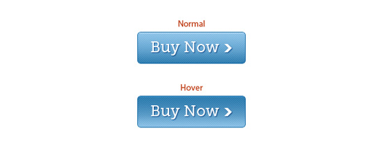 A call-to-action button with a hover state.
Learn how to make it by reading the tutorial. Consideration: Visual appearance of key elements and groupings of content is important to the user experience. Analogies to physical objects should be adhered to, but should not be taken literally. Principles of Gestalt psychology should be applied in order to compose logical visual hierarchies and content groups.
“I know how it should behave”
Interactions with everyday things — both online and offline — influence a user’s cognitive biases when performing site actions.
For example, users will tend to expect linked content to appear in the same format and location as the origin, unless explicitly told otherwise. This applies to PDFs and pop-up windows. If content will appear as a PDF or within a pop-up window, an explicit label should be associated with the call-to-action.
Consideration: Interaction design should be well thought out. Interaction design is often given a back seat to information architecture, but the two must work in unison for an effective site experience. It’s often the job of the web developer to interpret the interaction design.
However, the UX professional can create prototypes that illustrate the desired interactions or create a set of interaction design flows and storyboards.
“I know what it should be called”
It’s widely known that Internet users tend to scan web pages for information, rather than reading and evaluating all information offered on the page. This scanning pattern causes users to seek out a keyword or a set of keywords. For example, users often associate the term “contact us” with all forms of contact information.
If the user is looking for a phone number, address, or email address, they’ll be scanning your site for the keyword phrase “contact us”. 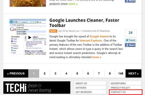 Techi, a technology news site, has a “contact us” link at the footer of all web pages. Consideration: Taxonomy and nomenclature is important for taking advantage of this cognitive bias. Using common/recognizable nomenclature and categorization labels is one of the most important parts of UX design. Often, taxonomy and nomenclature is given a back seat to visual design.
Although visual design is very important, it’s not as important as creating the proper SEO taxonomy and nomenclature.
Cognitive Biases of Stakeholders
Clients and project team members also have preconceived notions concerning the user experience. The following are some of them.
“I know what the user wants”
Stakeholders often transfer their own opinions to the user. If the stakeholder behaves a certain way, they often believe it’s a common way for others to behave.
Consideration: How was this bias established? Was it through reason/logic, experience, testing, research or secondhand knowledge?
“I know what the business wants”
It is the job of stakeholders to interpret (and prioritize) the wants and needs of the business. Aligning business needs with customer needs is where a UX professional is required to rely on creativity and social sciences.
There are many different ways (and timelines) for achieving what the business wants. The majority of businesses want their users to be happy, so balancing this with specific use cases will be important. Consideration: What makes a user happy?
Creating a pleasing experience is second only to a usable experience. If you have to sacrifice the experience of 10 people to improve the experience for 1, you’ll need to consider the value of that 1 user.
“I know what’s technically possible”
Stakeholders are often inhibited by their IT or technical team. Redesigns are often undertaken without thinking about “re-platforming” or new technological advances that could support the redesign.
Broken or mismanaged IT systems often inhibit user experiences. This should be much rarer than it is. (See Adaptive Path’s Cake/Cupcake Model.) Consideration: Which systems govern the core functionality of the user experience?
Are there system integration issues across digital properties? What could prevent future scalability?
“I know what best practices are”
UX professionals tend to be egotistical in terms of understanding the fundamental best practices in web design. Understanding that there are multiple ways to solve a problem, and that the most innovative design patterns require out-of-the-box thinking, a UX professional can make recommendations without ignoring the possibility of improving a standard convention.
Consideration: Although there are some fundamental best practices, there are always new conventions being established. They can be used as guidelines, but should not discourage the creation of innovative user experiences.
Summary
With this framework, you can quickly identify key areas you can target for user research and ethnographic activities to derive cognitive bias insights from. These insights should influence your design decisions and help guide your overarching experience plan.
Related Content
-
 President of WebFX. Bill has over 25 years of experience in the Internet marketing industry specializing in SEO, UX, information architecture, marketing automation and more. William’s background in scientific computing and education from Shippensburg and MIT provided the foundation for MarketingCloudFX and other key research and development projects at WebFX.
 -

WebFX is a full-service marketing agency with 1,100+ client reviews and a 4.9-star rating on Clutch! Find out how our expert team and revenue-accelerating tech can drive results for you! Learn more
Make estimating web design costs easy
Website design costs can be tricky to nail down. Get an instant estimate for a custom web design with our free website design cost calculator!
Try Our Free Web Design Cost Calculator
Share this article


Web Design Calculator
Use our free tool to get a free, instant quote in under 60 seconds.
View Web Design CalculatorMake estimating web design costs easy
Website design costs can be tricky to nail down. Get an instant estimate for a custom web design with our free website design cost calculator!
Try Our Free Web Design Cost Calculator


