
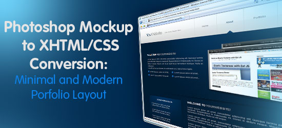 In this web design tutorial, you’ll see a process for converting a Photoshop mockup to working HTML/CSS template. This is Part 2 of a tutorial series that will show you how to create the design, and then convert it to an HTML/CSS template.
Minimal and Modern Portfolio Layout Tutorial Series
- Part 1: Design a Minimal and Modern Portfolio Layout in Photoshop
- Part 2: Minimal and Modern Layout: PSD to XHTML/CSS Conversion
Demo
Click on the image preview below to launch the demo of what we’ll be creating today. 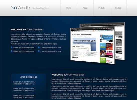
Before you begin
If you haven’t already, you’re highly encouraged to do the Part 1: Design a Minimal and Modern Portfolio Layout in Photoshop of this tutorial series before you go any further. This is because the following will require the Photoshop mockup file from the first part.
If you’ve done the first part, get your PSD mockup ready as we’ll be using it here. If you want to skip the creation of the Photoshop mockup, you should go back to Part 1 and download the source files, as we’ll need it in this tutorial.
Creating the file structure and preparing the files
1 Create a new empty folder on your desktop called portfolio. 2 Inside the empty portfolio folder, create another folder called images that will contain our CSS background images and other image assets.
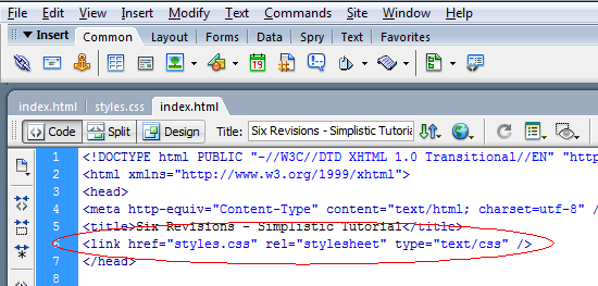
3 Next, create an empty CSS document called styles.css and an empty HTML file called index.html. 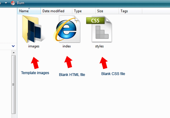 4 Open up your index.html file in your favorite source code editor; I’ll be using Adobe Dreamweaver in this tutorial. 5 At the top of your document inside the
 <head> tags, link to your style sheet (styles.css) so that it’s ready to go.
You can use the code below.
Code block 1
<link href="styles.css" rel="stylesheet" type="text/css" />
Coding the layout sections
Below, you can see the basic structure of our web template. We’ll start our conversion by creating the basic sections of our minimal and modern web page template. 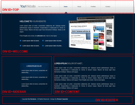 6 We are going to start with a main container (also commonly referred to as a wrapper), which will hold our document in place, centered on the web browser.
Inside the container were going to have five div’s which will make up the sections of our website: the sections are #top, #welcome, #sidebar, #content and #footer. The HTML code looks like this.
Code block 2
<!--CONTAINER STARTS--> <div id="container"> <!--HEADER/NAVIGATION STARTS--> <div id="top"> </div> <!--HEADER/NAVIGATION ENDS--> <!--WELCOME AREA STARTS--> <div id="welcome"> </div> <!--WELCOME AREA ENDS--> <!--SIDEBAR STARTS--> <div id="sidebar"> </div> <!--SIDEBAR ENDS--> <!--CONTENT STARTS--> <div id="content"> </div> <!--CONTENT ENDS--> <!--FOOTER STARTS--> <div id="footer"> </div> <!--FOOTER ENDS--> </div> <!--CONTAINER ENDS-->
Slicing the template’s body background
7 Before we start diving into coding each section, let us first add our web page’s background. Open up your PSD file in Photoshop, select the Rectangular Marquee Tool (M) and then make a small selection covering the header/navigation and a bit of the background; the selection can be as little as 1px wide (because we’ll repeat it horizontally using CSS).
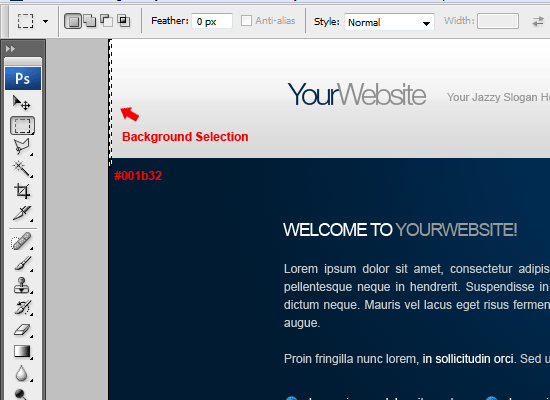 8 At the bottom of the selection, take note of the hexadecimal color code by using Eye Dropper Tool (I). 9 Once you’ve made the selection, go to Edit > Copy Merged, create a new Photoshop document (Ctrl + N), and then paste the selection to a new document. Usually, Photoshop will automatically fill in the width and height dimensions with the item on your clipboard, but in case it doesn’t, make sure that the dimensions of the new Photoshop document matches that of your rectangular marquee selection.
10 Once you’ve copied the selection into the new Photoshop document, go to File Save for Web & Devices (Alt + Shift + Ctrl + S), choose PNG-8 as the file format, and then save it as background.png inside the images folder.
Coding the template’s body background
11 Now that we have our background image sliced out of the Photoshop document, we can begin to code it nto our template. Open up your CSS file (styles.css) in your source code editor, and then use the following code.
Code block 3
* { margin: 0px; padding: 0px; border: none; } body { background-image: url(images/background.png); background-repeat: repeat-x; background-color: #001b32; font-family: Arial, Helvetica, sans-serif; font-size: 12px; color: #c8c8c8; } #container { margin: auto; width: 850px; }Explanation of Code block 3
Let’s go over the styles in more detail. First, we reset all of our elements’ margins, paddings, and borders to 0 to avoid cross-browser inconsistencies.
We do this with the * selector. Next, we style the body element; we set background.png as it’s background property and we repeat it horizontally (repeat-x). We also set our background color to a dark blue (#001b32).
Finally, we style the #container margins to auto to center the layout, and set a fixed width of 850px.
Slicing the logo/site name
12 We’ll move on to our web template’s logo/site title. Using the Rectangular Marquee Tool (M), make a selection around the website’s title and slogan (look at the following figure for guidance). 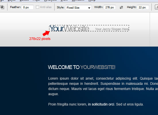 13 Just like with the background.png, copy the marquee selection into a new document, and save it for the web as a transparent PNG called title.png inside the images folder.
Coding the logo/site name
14 With our logo/site name all ready to go, switch back to your HTML document.
Inside the #top div, create a new div with an ID of title. 15 Then, inside the newly created #title div, add an <h1> element with the name of your website; we’ll also create a hyperlink element (<a>) that will link back to the home page of our website. For the template, we’ve simply assigned the href property of the a element a value of #, but if you’ll use this on a live website, you can use a backslash (/) instead to link them back to your home page.
The HTML code looks like this:
Code block 4
<!--HEADER/NAVIGATION STARTS--> <div id="top"> <!--WEBSITE TITLE STARTS--> <div id="title"> <h1><a href="#" title="Your Website Name">Your Website Name</a></h1> </div> <!--WEBSITE TITLE ENDS--> </div> <!--HEADER/NAVIGATION ENDS-->
16 Now, let’s move over to the stylesheet. To style our #top section elements. Here is the CSS code.
Code block 5
#top { float: left; width: 850px; height: 119px; } #title { float: left; width: 278px; height: 74px; padding-top: 45px; } #title h1 { display: block; float: left; width: 278px; height: 74px; text-indent: -9999px; } #title h1 a { display: block; width: 100%; height: 100%; background-image: url(images/title.png); background-repeat: no-repeat; background-position: 0 0; }Explanation of Code block 5
Let’s look at the above code in more detail.
Firstly we need to float the #top div to the left and give it a fixed width and height. The width should be 850px, identical to the #container and the height is the same as the light gray area on the web layout mockup. 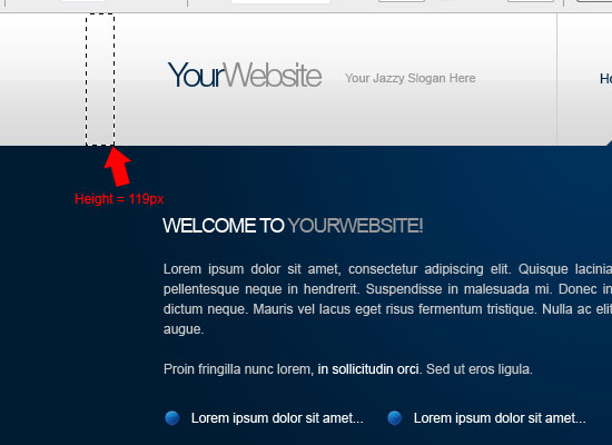 Next, we use a technique called CSS background image replacement using the
 text-indent method.
We indent the text inside #title h1 by -9999px to the left, which essentially pushes it out of the browser view port. This is a good technique for screen reader accessibility and search engine optimization.
Coding the Navigation
17 Still inside the #top, create another div with an ID of navigation right after the #title div. Inside the #navigation div, add a simple unordered list containing your navigation links and give it a class of nav-links.
Here’s the code block for the #navigation div.
Code block 6
<!--NAVIGATION STARTS--> <div id="navigation"> <ul class="nav-links"> <li><a href="#" title="home">home</a></li> <li><a href="#" title="about">about</a></li> <li><a href="#" title="portfolio">portfolio</a></li> <li class="borderx2"><a href="#" title="contact">contact</a></li> </ul> </div> <!--NAVIGATION ENDS-->
Explanation of Code block 6
Giving the unordered list a class of nav-links allows us to target it with CSS and not have other unordered lists in the web page affected. Note that the last list item has a class of borderx2, which basically means “border times two”; this is because our PSD web layout mockup had separators in between each navigation link and when we add our CSS styles later on, we’ll give the last item a 1px border on the left and the right (hence border x 2).
Slicing the hover indicator
18 Before we add the CSS styles for our navigation, we must first slice our little hover triangle. Head over to your PSD file and make a selection around the triangle using the Rectangular Marquee Tool (M).
Copy and paste the little triangle to a new document with a transparent background then save it as nav_hover.png in the images folder. 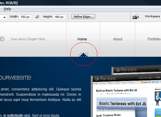
Styling the navigation
19 Now, it’s time to add the CSS code for the navigation of the web template. Head on over to your stylesheet and use the following CSS:
Code block 7
.nav-links li a { float: left; width: 120px; height: 68px; text-decoration: none; text-transform: capitalize; color: #666666; font-size: 12px; text-align: center; padding-top: 51px; border-left-width: 1px; border-left-style: solid; border-left-color: #cecece; } .nav-links li a:hover { color: #00284a; background-image: url(images/nav_hover.png); background-repeat: no-repeat; background-position: center bottom; } li.borderx2 { border-right-width: 1px; border-right-style: solid; border-right-color: #cecece; }Explanation of Code block 7
First, to display the list items side by side, we float them to the left.
We give them a fixed width and height so that they’re evenly spaced. Then we remove the default underline on hyperlinks by giving it a text-decoration attribute of none (browser default is underline). We give each list item a 1px gray border on its left.
We then style hover states with the :hover psuedo-selector. When hovered on, we give the list item the CSS background of nav_hover.png. Finally, to deal with the situation that the last list item doesn’t have a 1px gray border on the right, we declare border attributes for the .borderx2 class.
Creating the Welcome Area
The welcome area will be split into two parts, the left side (#welcome-text) and the right side (#welcome-image).
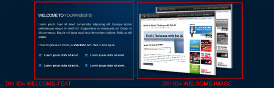 20 To start, go back to your HTML document (index.html). Inside the
 #welcome div we created earlier, create two new divs: give the first one an ID of welcome-text and the second one an ID of welcome-image. We’ll continue to filling in these two new divs after we slice out the things we need for the welcome are.
Slicing the Welcome Images
21 Head over to the PSD file, inside the layers window hide all your layers (click on the eye icons beside each layer to turn off the visibility) apart from the dark blue background which has the radial gradient applied to it.
22 Select the Rectangular Marquee Tool(M) and make a selection around it. The width should be no wider than 850 pixels, so use the Photoshop guides that we set up in the first part – Design a Minimal and Modern Portfolio Layout in Photoshop – of the this tutorial series. 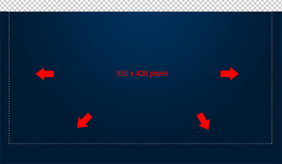 23 Copy and paste the dark blue background to a new document and save it as content_background.png inside the images folder.
Using the same method explained above, turn the visibility of the respective layers back on and then slice the welcome image and bullet point (see the figures below for reference). 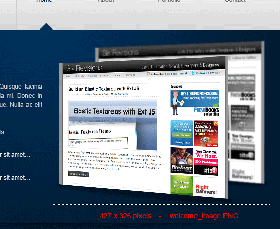
 The HTML for the new sections look like this.
Code block 8
<!--WELCOME AREA STARTS--> <div id="welcome"> <!--WELCOME TEXT STARTS--> <div id="welcome-text"> </div> <!--WELCOME TEXT ENDS--> <!--WELCOME IMAGE STARTS--> <div id="welcome-image"> <img src="images/welcome_image.png" alt="Welcome..." /> </div> <!--WELCOME IMAGE ENDS--> </div> <!--WELCOME AREA ENDS-->
24 Inside the #welcome-text div, we add some welcome text like that shown in our Photoshop mockup. Use an <h2> element for the heading of the welcome text, and then add a simple unordered list underneath.
25 Inside the #welcome-image div, add your welcome image (in this case, the Six Revisions screen shot). All together, the the HTML code should now look like this.
Code block 9
<!--WELCOME AREA STARTS--> <div id="welcome"> <!--WELCOME TEXT STARTS--> <div id="welcome-text"> <h2>welcome to <span class="heading-color2">yourwebsite!</span></h2> <p>Lorem ipsum dolor sit amet, consectetur[...]</p> <p>Proin fringilla nunc lorem, in sollicitudin orci. Sed ut eros ligula.</p> <ul class="list"> <li>Lorem ipsum dolor sit amet...</li> <li>Lorem ipsum dolor sit amet...</li> <li>Lorem ipsum dolor sit amet...</li> <li>Lorem ipsum dolor sit amet...</li> </ul> </div> <!--WELCOME TEXT ENDS--> <!--WELCOME IMAGE STARTS--> <div id="welcome-image"> <img src="images/welcome_image.png" alt="Welcome..." /> </div> <!--WELCOME IMAGE ENDS--> </div> <!--WELCOME AREA ENDS-->
Styling the Welcome Area with CSS
26 We can now start to style our elements within the welcome area.
Copy and paste the following code into your style sheet and read the explanation of the code block that follows.
Code block 10
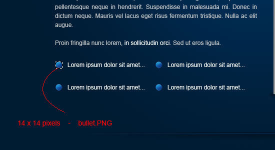
#welcome { float: left; width: 850px; background-image: url(images/content_background.png); background-repeat: no-repeat; height: 326px; padding-top: 40px; } h2 { text-transform: uppercase; color: #ffffff; font-size: 16px; margin-bottom: 15px; } .heading-color2 { color: #9a9a9a; } #welcome-text { width: 406px; line-height: 18px; padding-top: 50px; float: left; text-align: justify; } #welcome-text { margin-bottom:10px; } .list li { text-decoration: none; background-image: url(images/bullet.png); background-repeat: no-repeat; list-style-type: none; float: left; width: 180px; padding-left: 20px; margin-top: 10px; background-position: left center; } #welcome-image { float: right; height: 326px; width: 427px; }Explanation of Code block 10
Let’s look at the important CSS declarations in more detail. Firstly, we give the #welcome div the radial gradient as a background attribute (content_background.png). The image is added as a background that doesn’t repeat (repeat: no-repeat).
We’ve then given the div a set a fixed width and height; the width should span the width of our web template (850px) and the height is as high as the welcome image (236px). We then have our <h2> elements. We make it all caps by using the text-transform property.
We wrap the second ‘yourwebsite’ text inside a span with a class of heading-color2 to give it a different color. For our unordered list that has a class of list, we give its list items a background image property set to bullet.png and remove the default rounded bullets of list items by declaring a list-style-type property of none. Finally, so that our #welcome-image div displays on the left of #welcome-text, we float it to the right and give it a fixed width (which is good practice when floating elements).
We also give it a width and height equal to welcome_image.png that we sliced out of our PSD file.
Slicing the 3D Separator
27 For the 3D separator, I’ve decided to use an empty div element with a class of separator so that it can be used numerous times very easily. To start creating the 3D separator, head over to your PSD file and make a selection around the 3D separator using the Rectangular Marquee Tool (M); the selection should be no bigger than 850 pixels wide and no higher than the separator itself, but make sure you get it all in. 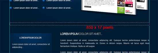 28 Copy and paste the separator to new document with a transparent background and save the file for the web as
 separator.png inside the images folder.
Coding the 3D Separator
29 The HTML and CSS for the separator is quite easy.
In your HTML document, pleace the following code right after where the {#welcome} div ends. We use a non-breaking space ( ), to put something inside our .separator div.
Code block 11
<!--WELCOME AREA ENDS--> <!--SEPARATOR STARTS--> <div class="separator"> </div> <!--SEPARATOR ENDS-->
30 Head on over to your CSS file and use the following code.
Code block 12
.separator { background-image: url(images/separator.png); background-repeat: no-repeat; float: left; height: 17px; width: 850px; margin-top: 20px; margin-bottom: 20px; }Explanation of Code block 12
We give .separator a background-image property equal to the separator.png we obtained from the PSD mockup. We give it a fixed width of 850px, equal to the width of our layout and float it to the left.
The height property is set equal to separator.png. We give it some top and bottom margin so that there’s always a 20px gutter on top and at the bottom of the elements that it separates.
Slicing the Sidebar
31 For the sidebar, all we will need is the sidebar box. The sidebar box will have fixed dimensions for this tutorial, but it can be easily expandable later on if you desire (we’ll leave that part up to you).
In your PSD file chose the Rectangular Marquee Tool (M) from the Tools Panel and make a selection around the box; my selection is 259 x 259px. 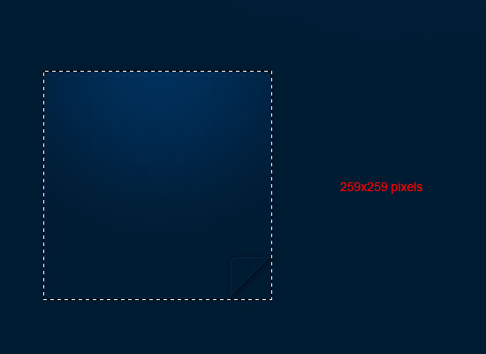 32 Copy and paste the sidebar box to new Photoshop document with a transparent background and save the image for the web as contentbox.png inside the images folder. 33 Once you’ve saved your image, head back to the PSD file and make a 1px wide by 2px high rectangular marquee selection around the small separators in between each dummy list text (see the following figure).
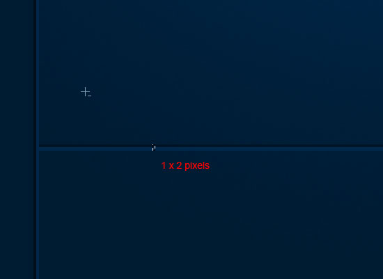 34 As per usual, copy it into a new Photoshop document and save it for the web with the filename of divider.png inside the images folder. The selection only has to be small for the separators as it will be repeated horizontally using CSS.
Marking up the Sidebar box in HTML
35 Lets look at our HTML for our sidebar box. Head on over to your HTML document and use the following HTML markup right after the .separator div.
Notice that we have a third level heading (<h3>) for the sidebar’s heading. Also note that we assign the unordered list a class of sidebar-list so that we can target it easily with CSS and give it its own styles.
Code block 13
<!--SEPARATOR ENDS--> <!--SIDEBAR STARTS--> <div id="sidebar"> <h3>lorem ipsum dolor</h3> <ul class="sidebar-list"> <li>Lorem ipsum dolor sit amet, consectetur sit adipiscding...</li> <li>Lorem ipsum dolor sit amet, consectetur sit adipiscding...</li> <li>Lorem ipsum dolor sit amet, consectetur sit adipiscding...</li> </ul> </div> <!--SIDEBAR ENDS-->
Styling the Sidebar box with CSS
36 Go to your stylesheet and use the following styles (read the code explanation that follows to understand what’s going on).
Code block 14
#sidebar { float: left; height: 209px; width: 219px; background-image: url(images/contentbox.png); background-repeat: no-repeat; padding-top: 20px; padding-right: 20px; padding-bottom: 30px; padding-left: 20px; } h3 { text-transform: uppercase; color: #ffffff; text-align: center; margin-bottom: 20px; font-size: 12px; } .sidebar-list li { list-style-type: none; margin-top: 10px; padding-bottom: 10px; background-image: url(images/divider.png); background-repeat: repeat-x; background-position: bottom; }Explanation of Code block 14
We give the #sidebar div a fixed width and height equal to the width and height of contentbox.png. We float it to the left so that it will display to the left of the content section (which we’ll tackle next).
Also, we set the background-image property to the contentbox.png. We transform the text of our h3 elements of our web page to all uppercase letters with the text-transform property and center it using the text-align property. Finally, remove the default bullets from the .sidebar-list list items by setting the list-style-type property to none, as well as set their background-image to divider.png and repeat it horizontally (repeat-x).
We then give them some margins and paddings to give them some space in between each other.
Coding the Content Area
37 The content area is really simple as it only contains a couple of paragraphs and headings. Inside our #content div, just add a second-level heading element (<h2>) and wrap the second part of the text with span.heading-color2 to give it a different color. To fill out the content area, just insert some paragraph elements with lorem ipsum text.
The HTML looks like this.
Code block 15
<!--CONTENT STARTS--> <div id="content"> <h2>welcome to <span class="heading-color2">yourwebsite!</span></h2> <p>Lorem ipsum dolor sit amet, consectetur adipiscing elit. Quisque.</p> <p>Lorem ipsum dolor sit amet, consectetur adipiscing elit. Quisque.</p> <p>Lorem ipsum dolor sit amet, consectetur adipiscing elit. Quisque.</p> </div> <!--CONTENT ENDS-->
Styling the Content Area with CSS
38 Head on over to your stylesheet and use the following style declaration for the #content div elements.
Code block 16
#content { float: right; width: 550px; text-align: justify; } #content p { margin-bottom: 10px; }Explanation of Code block 16
The #content div is floated to the right and with a fixed width so that it displays on the right of the sidebar box. We don’t give it a fixed height because we want the text inside it to control the height. We give the paragraph (<p>) elements a margin at the bottom to give them some space in between one another (since we’ve reset our margins and paddings earlier on, this needs to be done).
Slicing the Footer
39 We’re coming close to the end, so let’s keep going and finish this bad boy up!
Switch to your Photoshop file and make a rectangular marquee selection with dimensions of 850px x 60px around your footer background image (see the following figure as a reference). 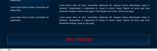
Coding the Footer
40 Once again, the footer is really simple to code: we just use the {#footer} div that we already created earlier on in the tutorial. Inside the #footer div, we add our copyright text embedded using a <p> element.
The HTML looks like this:
Code block 17
<!--FOOTER STARTS--> <div id="footer"> <p>Copyright © Six Revisions - Design By Richard Carpenter</p> </div> <!--FOOTER ENDS-->
Styling the Footer with CSS
41 We then style our footer using the following styles (go to your stylesheet and place this code block in there).
Code block 18
#footer { float: left; width: 850px; background-image: url(images/footer.png); background-repeat: no-repeat; height: 60px; margin-top: 40px; padding-top: 25px; text-align: center; }Explanation of Code block 18
We use footer.png as the background-image property value of the #footer div; floated to the left and making sure that the CSS background image doesn’t repeat with the no-repeat property value. The #footer div has a fixed width and height equal to the dimensions of the footer background in our Photoshop file. We give it a top margin to give it a bit of space from the div’s on top of it.
Finito!
We are done!
Thank you for reading this tutorial and following along. Remember, CSS is the backbone of a website and that if done effectively and well it will help your clients reputation whether they are a law firm or a restaurant because it affects a ton of important factors of user experience such as site speed. I look forward to your comments and questions!
If everything went well, you should have ended up with something like this: (click on the image to launch the working demo)
Download
The source files for this tutorial is released under the Creative Commons license; you can use it for commercial and personal use, as long as you leave the copyright information in the source file.
- minimal-modern-portfolio-demo.zip (ZIP, 0.29MB)
Related Content
-
 President of WebFX. Bill has over 25 years of experience in the Internet marketing industry specializing in SEO, UX, information architecture, marketing automation and more. William’s background in scientific computing and education from Shippensburg and MIT provided the foundation for MarketingCloudFX and other key research and development projects at WebFX.
 -

WebFX is a full-service marketing agency with 1,100+ client reviews and a 4.9-star rating on Clutch! Find out how our expert team and revenue-accelerating tech can drive results for you! Learn more
Make estimating web design costs easy
Website design costs can be tricky to nail down. Get an instant estimate for a custom web design with our free website design cost calculator!
Try Our Free Web Design Cost Calculator
Share this article


Web Design Calculator
Use our free tool to get a free, instant quote in under 60 seconds.
View Web Design CalculatorMake estimating web design costs easy
Website design costs can be tricky to nail down. Get an instant estimate for a custom web design with our free website design cost calculator!
Try Our Free Web Design Cost Calculator