
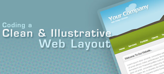 In this comprehensive and step-by-step web development tutorial, you will learn how to convert a Photoshop mockup of a professional web layout design that features an illustrative landscape header into a standards-compliant XHTML/CSS template. This is a follow-up tutorial requested by you, the readers of Six Revisions. To learn how to create the Photoshop web layout mockup, head on over to the tutorial called How to Create an Illustrative Web Design in Photoshop.
Live Demonstration
Click on the following image to check out the live demo of what we’ll be building. 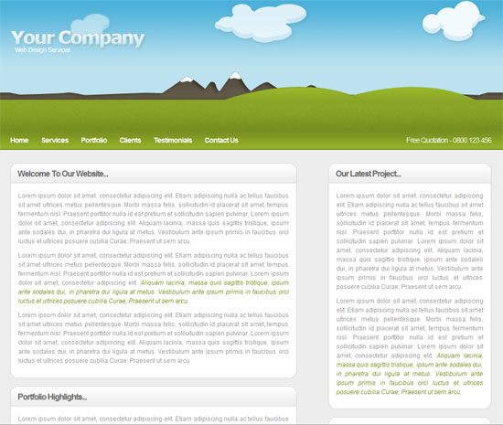
Download the source files and use them as your website template
We’re releasing the source files of this tutorial under the GNU General Public License we only ask that you retain the copyright information in the source code (which aren’t visible in the design).
If you’re not interested in reading the tutorial, you can use for your website or web template. So this post is a tutorial and a freebie.
- illustrative_web_design_template.zip (ZIP file, 0.98 MB)
Let’s get the show started, shall we? Make sure you have a pot of coffee or your favorite caffeinated drink handy because you’re in for a long ride!
Setting up our work area and files
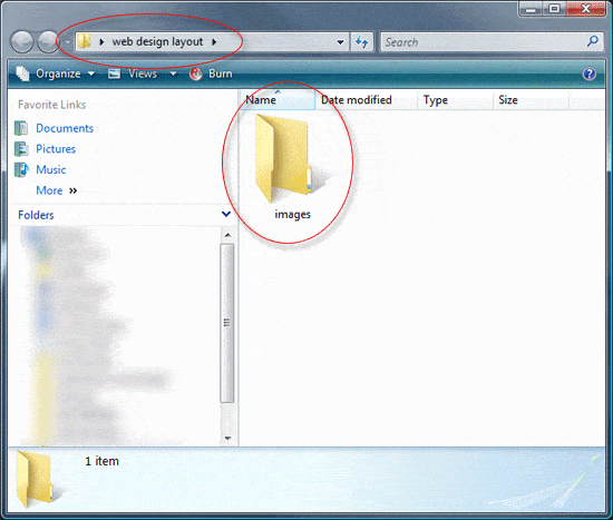
1 Create a new folder somewhere on your desktop called web design layout. 2 Within the web design layout folder, create another folder called images.
 3 Create a new blank HTML file using your favorite code editor and save it inside your web design layout folder with a filename of index.html. 4 Create a blank CSS file called styles.css and save this inside the web design layout folder.
 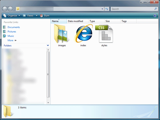 You should now have an ideal working setup for our template.
Setting up the HTML file
5 Open up your index.html file and your styles.css file in your code editor.
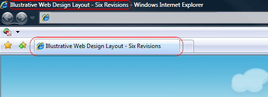
6 At the top of your HTML file, locate the <title> tag. Inside the <title> tag, add your website title. The information you input into the <title> tag will determine what is displayed in the browser window.
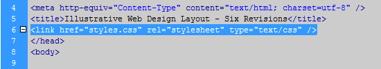
 7 Underneath your
 <title> tag, you need to link to your stylesheet using the code below.
<link href="styles.css" rel="stylesheet" type="text/css" />
 We can now start to mock-up some of the HTML code for our layout. There are many ways to convert a Photoshop file (PSD) into a working template. Some people slice all the images first, then start coding the template and some people prefer to code, then slice afterwards.
I find it best to code and slice as you go along starting from the header and working your way down the design.
Mocking up the header
8 We’ll start off with a simple container div with an ID of #container. Use the HTML markup below.
<div id="container"> </div>
9 Inside the #container div, we’ll add another div called #header.
<div id="container"> <div id="header"> </div> </div>
Preparing header slices
10 Now that we have a basic foundation, we can slice our background image and our header image. Open up the PSD file called illustrative_web_design_psd.psd in Adobe Photoshop which is freely available for download in the the first part of this tutorial series called How to Create an Illustrative Web Design in Photoshop.
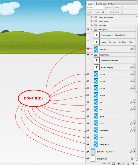
Download the source files from that tutorial, then head on back over here. 11 Once the PSD file is opened in Photoshop, make sure that the Layers Panel is open by choosing the Window menu and making sure Layers is checked (alternatively, F7 toggles the Layers Panel). 12 Turn off all of your layers’ visibility as shown in the following figure.
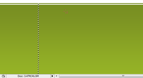
 13 Select the Rectangular Marquee Tool (M) and make a selection around your header area similar to the following figure; don’t forget to include 2px of the background (as shown).
 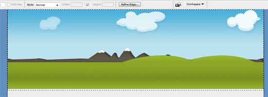 14 Once you’ve made the selection, go to Image > Crop. Important: Don’t save your PSD file!
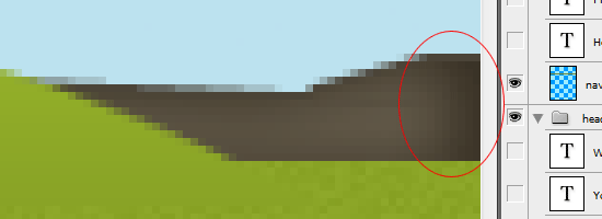
15 Save the cropped file for the web by choosing File > Save for Web & Devices (Alt + Shift + Ctrl + S). Save the file with the name header.gif inside your images folder. 16 Close your PSD file and when prompt to save, choose “No“. 17 Now, open up header.gif inside Photoshop. 18 Using the Zoom Tool (Z), zoom in to the right hand side where the mountain on the illustration ends. You will notice the mountain has a darkly shaded area where the inner shadow was added.
 19 We need to carefully erase the shaded bit so it matches the color of the mountains. Use the Rectangular Marquee Tool (M) to make a selection on header.gif just like the figure below.
 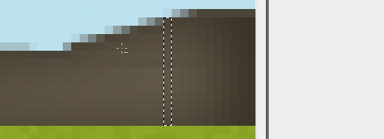 20 Once you’ve made the selection, we’ll transform the selection.
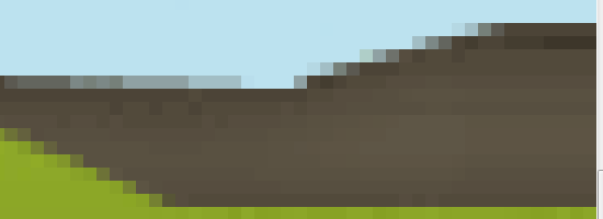
Choose Edit > Free Transform (Ctrl + T) to free transform the selection. Select the middle right transform control and drag towards the right edge. You should have something like the following figure.
 21 Resave your file (header.gif) by going to File > Save for Web & Devices (Alt + Shift + Ctrl + S). Leave your header.gif open in Photoshop. 22 Use the Rectangular Marquee Tool (M) to make a selection from the top to the bottom of the header area and as wide as the flat part of the mountain.
Use the following figure as a guide. 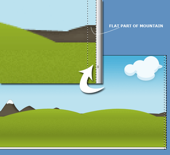 23 Once you’ve made the selection, crop the image again using Image > Crop. 24 Save the cropped image as bg.gif inside your images folder using File > Save for Web & Devices (Alt + Shift + Ctrl + S).
Resetting margins and paddings of all elements
25 Head back over to your code editor and open up styles.css.
26 Before we start adding our header styles, we need to add a small CSS reset to reset all of the page elements’ margins and paddings. There are many methods to do this, but for the sake of succinctness, we’ve chosen to use the following method. If, however, you would like to learn more about better methods for resetting your styles, read the article called “CSS Tip #1: Resetting Your Styles with CSS Reset“. The CSS reset looks like this:
* { margin: 0; padding: 0; }Styling for the body background
Once you’ve added the CSS reset at the top of your styles.css file, we can begin to style the body of our HTML document. 27 The bg.gif file will be incorporated as a CSS background and it will be repeated horizontally along the x-axis. We then finish off the body styles by adding a background color which matches our design’s background.
We can also remove some of the default styling from our paragraphs by styling the paragraph (<p>) tags. Inspect the following block of code.
body { background: #ededed url(images/bg.gif) repeat-x; } p { color: #999; padding: 0; margin: 10px 0; font: 12px/18px Arial, Helvetica, sans-serif; }Centering the page content
28 The width of the design mockup is 950px. To set the width of our page template and to center it in the browser, we style the #container div using margin:auto technique and assign it a 950px width attribute.
#container { margin: auto;width: 950px; }Adding the illustrated header background image
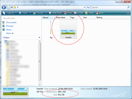
29 Before we style our #header div, we must first determine what the height of our header image is.
If you’re using Windows Vista, you can simply click the image file and it will tell in the status bar what the dimensions are. Feel free to use your own method on finding out the height of the image. As you can see from the figure below, the height is 302px.
 30 We can start styling our
 #header div by assigning a fixed width of 950px and a fixed height of 302px. We also float our image to the left. We add the header.gif image as a background.
We set the background-repeat atrribute to “no-repeat” to stop our header image from repeating horizontally, which is the default behavior in most web browsers. See the following code block.
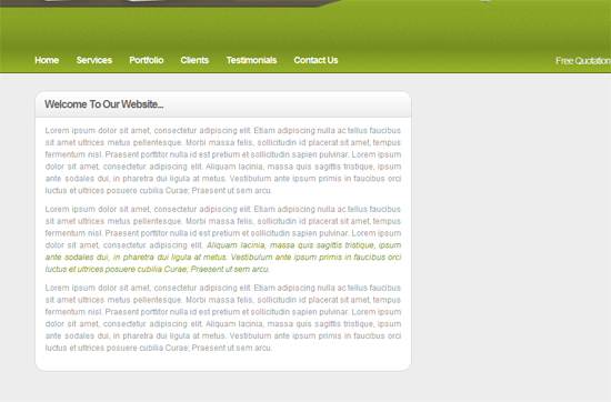
#header { height: 302px; width: 950px; float: left; background: url(images/header.gif) no-repeat; }31 Test the index.html file by opening it in your web browser, you should have something that looks like the following figure. 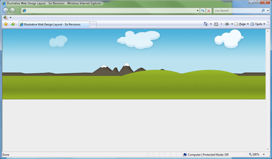
Slicing the logo (website title)
We can’t really insert our logo/website title into our template as pure text because it contains too many layer styles in Photoshop.
We have no option but to include it as an image. 32 To start, open up your PSD file (illustrative_web_design_psd.psd) again. 33 Using the Rectangular Marquee Tool (M), make a selection around your logo/website title.
Utilize the figure below as a guideline on how to make this selection.  34 Once you’ve made the selection, in the Layers Panel, turn off the visibility of all of your layers apart from the layers related to your logo/website title. The background should be transparent.
35 Choose Image > Crop to crop the canvas down to just the logo/website title. 36 Save the cropped image as a PNG file. Use File > Save for Web & Devices (Alt + Shift + Ctrl + S) and save it with the name logo.png into your images folder.
Adding the logo to the HTML document
37 Head over to your HTML document and add a div called #logo as a child of our #header div.
38 Inside the #logo div, add an <h1> element. 39 Inside the <h1> element, add a hyperlink (<a>) with the name of your website. The reason we use an <h1> tag and not an inserted image is because were going to use a CSS background-image text replacement technique.
You can read about this technique on the stopdesign website in an article called Using background-image to replace text. Here is the code block for the above steps:
<div id="header"> <div id="logo"> <h1><a href="#">Your Website Name</a></h1> </div> </div>
Styling the logo/website title
40 We can start styling the logo/website title by adding a top margin to the #logo div which will push our image down to where we want it.
#logo { margin-top: 60px; }41 We then display our <h1> element as a block element and float it to the left. Our logo image had a width of 269px and a height of 45px so we style our <h1> element with those attributes.
We also need to push our <h1> element’s text off the page. We can do this by utilizing the text-indent CSS property with a value of -9999px.
#logo h1 { display: block; float: left; width: 269px; height: 45px; text-indent: -9999px; }42 We then need to style our link that resides inside the <h1> element so it displays a block element or else the user might not be able to click on the logo to go to the home page. We can make the width and height of the link equal to its containing parent, so we simply give them 100% width and height property value.
So that the user doesn’t encounter a gray border when they click on the logo, we set the element’s outline attribute to none. Finally, we add the logo.png as a background image, again making sure that we give the background CSS property value of no-repeat so that it doesn’t tile our logo horizontally.
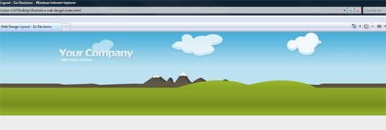
#logo h1 a { display: block; width: 100%; height: 100%; outline: none; background: url(images/logo.png) no-repeat 0 0; }43 Test your work in a web browser. The web layout should now look like the following figure (Oh, and by the way, if this section is new to you, congratulations, you just learned how to pull off a CSS background-image replacement technique).
Determining the height of the template’s primary navigation
44 Before we start with the navigation, we must first find out what the height of it is. Re-open your PSD file and use the Zoom Tool (Z) to zoom in on your navigation area so that you can clearly see where the navigation starts and begins. 45 Make sure that the Info Panel is open by making sure Window > Info is checked (F8 to toggle the panel on or off).
46 Use the Rectangular Marquee Tool (M) to make a selection. Use the following figure as a guide on how to make this selection. 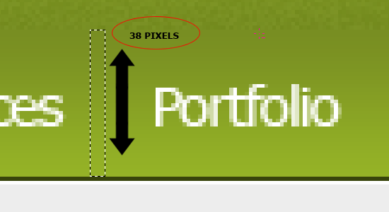 47 Look at the Info Panel to determine the height (H:) value of the selection.
This is the height of our navigation (which I determined to be 38px).
Putting the navigation bar in the HTML document
48 Head back to your HTML file where we’ll now be adding the navigation to our HTML document’s structure. We’ll be using two simple unordered lists inside the #header div. We’ll put these guys inside a div called #navigation.
Inspect the following block of code.
<div id="navigation"> <ul class="nav-links"> <li><a href="#">home</a></li> <li><a href="#">services</a></li> <li><a href="#">portfolio</a></li> <li><a href="#">clients</a></li> <li><a href="#">testimonials</a></li> <li><a href="#">contact us</a></li> </ul> <ul class="phone-number"> <li>free quotation - 0800 123 456</li> </ul> </div>
Styling the navigation
49 We first style our #navigation div. We add a fixed height of 38px which was the height we determined in Photoshop. We give the #navigation div a fixed width of 950px, same as our #container div.
Finally, we place a top margin attribute to push our navigation down away from our logo and then floating it to the left.
#navigation { height: 38px; width: 950px; margin-top: 152px; float: left; }Styling the first navigation list items
50 We style our navigation list items (.nav-links li) by floating them to the left, setting our links inline with each other. We add padding to the top and the right of the list items. The top padding pushes the links down, vertically centering them on navigation bar, whereas the right padding separates each link with a 25px gap.
.nav-links li { display: inline; padding: 9px25px 0 0; float: left; }51 Our actual links (the <a> elements inside the list items) will also need styling.
We give them some visual styles such as font family, color, and size. We also remove the default underlines of hyperlinks and also capitalize the text (using the text-transform attribute). We can also reduce the letter spacing by setting it to -1px.
Also, we change the color of the links to yellow when the user mouses over them (using the :hover psuedo-selector). Inspect the code below to make sure you see how the above description translates to CSS.
.nav-links li a { text-transform: capitalize; color: #fff; text-decoration: none; letter-spacing: -1px; font: bold 14px Arial, Helvetica, sans-serif; } .nav-links li a:hover { color: #ff0; }Styling the phone number navigation list items
52 The .phone-number list is styled in the same way as the .nav-links list but we only really need to style the list items (<li>). The most important style to pay attention to is the float attribute – we float it to the right so the phone number text is on the right of our web layout’s navigation bar.
The rest of the code is pretty self-explanatory.
.phone-number li { float: right; list-style-type: none; text-transform: capitalize; color: #fff; letter-spacing: -1px; padding-top: 12px; font: normal 14px Arial, Helvetica, sans-serif; }53 Test your work in a web browser. Your template should now look something like the following figure. 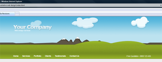
Slicing the content area boxes
There are two ways we can code the content area.
We can either code our boxes as squares and use the border-radius CSS3 property to make them rounded with the downside that not all browsers support this method. The second option is to slice the content boxes up and set them as CSS background images on the box. If it was my personal website, I’d use border-radius, but for this tutorial, I think we’ll slice the content boxes up.
It’s good Photoshop practice, and until CSS3 specs reach W3C final recommendation status, it’s a bit risky to use CSS3 properties unless we code for Progressive Enhancement (which is out of the scope of what we want to do here). 54 Head over to your PSD file again. In the Layers Panel, hide the visibility of all your layers except for the welcome… group which contains layers for our main content box.
55 Use the Rectangular Marquee Tool (M) to make a selection around the top half of the content box where the corners are rounded. Follow the figure below as a guide to making your selection. Note that the reason why I have chosen to make such a big selection is because the actual title area on the content box should actually be big enough inside for our text.
 56 Save the image as a PNG file by going to File > Save for Web & Devices (Alt + Shift + Ctrl + S) and save it as content_box_top.png inside your images folder. Repeat the process for the bottom part of the content box but when saving for the web, use the file name content_box_bottom.png. Check out the following figure to see how to create the marquee selection for the bottom part.
Coding the left content boxes (primary content area)
57 The markup for our left content boxes where our primary content will show up is easier than it looks. First, we need create a div called left-content. Inside the #left-content div, we need to create three divs with distinct classes: .content-top, .content-middle, and .content-bottom.
The .content-top div will contain our top content box image, the .content-middle div will contain our main content, and our .content-bottom div will contain the bottom content box image. Inspect the following block of code.
<div id="left-content"> <div class="content-top"> <h2>welcome to our website...</h2> </div> <div class="content-middle"> <p>Lorem ipsum dolor sit amet, consectetur adipiscing elit [...]</p> </div> <div class="content-bottom"> <!-- bottom content box image goes here. --> </div> </div>
Styling the left content div
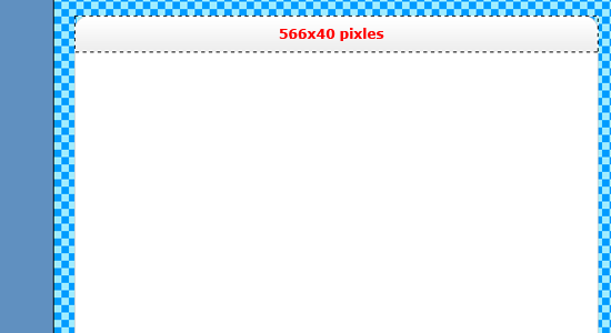
58 We start with our #left-content div: we float it to the left, add a fixed width the same size as our content box images (566px), and then add a 20px top margin which will push the content boxes down away from the navigation.
#left-content { float: left; width: 566px; margin-top: 20px; }Styling the content top class
59 For the .content-top div class, we need to set our content_box_top.png file as a background, float the div to the left, and add a fixed height and width the same as our image.
Remember that the padding also makes up the full amount towards the width so whatever padding you add, you’ll have to deduct it from the width or height. We then need to make sure our <h2> tags (which functions as our content box titles) sit nicely in the middle of the top part of the content box. To do this, we add a small top and bottom margin of 4px on the .content-top style rule and then add a bigger left and right margin to push the text across.
Inspect the following block of code to make sure the description above makes sense.
.content-top { float: left; height: 32px; width: 536px; background: url(images/content_box_top.png) no-repeat; padding: 4px 15px; }Styling the middle content area
60 The .content-middle div will have a few different styles from .content-top, we can achieve the same look in the web layout mockup by using the border CSS property. Inspect the following block of code to see how it works.
.content-middle { float: left; width: 534px; padding: 5px 15px 0 15px; border-right: 1px solid #d3d3d3; border-left: 1px solid #d3d3d3; background: #fff; }Styling the bottom content div
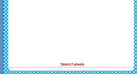
61 The .content-bottom class will be styled in the same way as our .content-top class: we add content_box_bottom.png image as a CSS background, floating it to the left, and then adding a margin to the bottom of the box so it leaves a nice gap in between any other additional content boxes we might add.
.content-bottom { float: left; height: 17px; width: 566px; margin-bottom: 15px; background: url(images/content_box_bottom.png) no-repeat; }62 You may now add some dummy content to the content middle class, I’ve added a couple of paragraphs similar to our PSD file. We give the <h2> elements some visual styles (capitalize them, adjust letter spacing, etc.).
In our PSD file, we had a selection of text which was green and italic, this can be achieved by wrapping the text inside a <span> with a class of .highlight. We align the text inside the content box by styling the <p> elements and giving them a text-align CSS property value of justify. Inspect the following code block to see if the above description makes sense.
h2 { text-transform: capitalize; color: #666; letter-spacing: -1px; padding-top: 7px; font: bold 16px Arial, Helvetica, sans-serif; } .content-middle p { text-align: justify; } .highlight { color: #7b9122; font-style: italic; }63 If you test your template in your browser you should now have something like the following figure.
 64 Create more content boxes by copy and pasting the
 .content-top, .content-middle, and .content-bottom set inside #left-content. 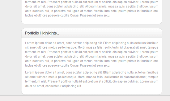
Slicing the sidebar boxes
65 The sidebar boxes will be sliced in exactly the same way as we did our main content boxes, the only difference really is that the slices will just be smaller in width. Start by switching back to our PSD file.
66 Hide all your background layers’s visibility in the Layers Panel so the background is transparent. 67 Make a selection around the top half of your sidebar box using the Rectangular Marquee Tool (M); make sure you get as close as you can to the edge, down to the last pixel. Use the figure below as a guide.
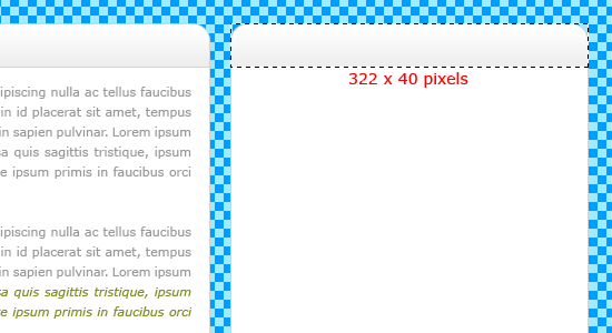 68 Crop the PSD file to the selection using Image > Crop. 69 Save the cropped image as sidebar_top.png inside your images folder. 70 Close your PSD file and choose “No” when you’re prompted to save the changes (VERY important).
71 Re-open your PSD file and repeat the same steps above, just with the bottom part this time. Again, create the selection as close to the edges as possible. 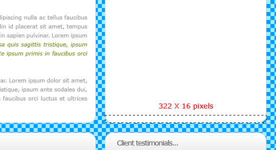 72 Crop the image by using Image > Crop.
73 Save the cropped image as sidebar_bottom.png inside your images folder.
Marking up the sidebar
74 The markup for our sidebar/right content area will be very similar to our main/left content, we’ll start with a div that has an ID of #right-content. Inside this div, we’ll have three classes: .sidebar-top, .sidebar-middle, and .sidebar-bottom. The .sidebar-top class will contain our sidebar box title.
We’ll wrap the titles in <h2> tags exactly like in our left content area. The .sidebar-middle class will contain our sidebar content. Examine the following code block featuring the markup of our sidebar/right content area.
<div id="content-right"> <div class="sidebar-top"> <h2>our latest project...</h2> </div> <div class="sidebar-middle"> <p>Lorem ipsum dolor sit amet, consectetur adipiscing elit. Etiam [...]</p> <p>Lorem [...] <span class="highlight">Aliquam lacinia[...]</span></p> </div> <div class="sidebar-bottom"> <!-- sidebar-bottom content --> </div> </div>
Styling the sidebar
75 We can now style our sidebar using the styles below. All the code is similar as our left content styles except for a couple of things. First, the height and width of our fixed elements.
The other difference is that the #right-content is floated to the right instead of the left. We also use the sidebar_top.png and sidebar_bottom.png we sliced in the previous section as the CSS background images of the .sidebar-top and .sidebar-bottom divs. Take a few moments to examine the code block below.
#content-right { float: right; width: 322px; margin-top: 20px; } .sidebar-top { float: left; height: 32px; width: 292px; background: url(images/sidebar_top.png) no-repeat; padding: 4px 15px; } .sidebar-middle { float: left; width: 290px; padding: 5px 15px 0 15px; border-right: 1px solid #d3d3d3; border-left: 1px solid #d3d3d3; background: #fff; } .sidebar-middle p { text-align: justify; } .sidebar-bottom { float: left; height: 16px; width: 322px; margin-bottom: 15px; background: url(images/sidebar_bottom.png) no-repeat; }76 Add some dummy content into your boxes then give it a whirl in your web browser. 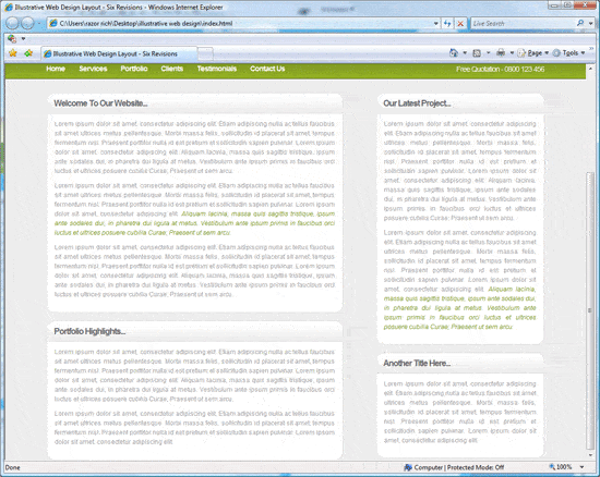
Slicing the footer area
77 Slicing our footer is going to be quick and painless. To start head over to our PSD file.
78 Use the Zoom Tool (Z) to zoom into your footer area. 79 Use the Rectangular Marquee Tool (M) to create a 1px wide selection spanning the height of your footer. Use the following figure as a guide.
 80 Crop the canvas to the selection using Image > Crop. 81 Save the file inside your images folder as a GIF called footer.gif.
Coding the footer’s HTML markup
82 The div for the footer will sit outside of our #container div. The reasoning behind this is that we want the footer to span the entire width of the web browser: if you created the footer inside the #container div, it would have a max width of 950px.
We’ll start off using a div with an ID of #footer. Inside the #container div, create another div called #footer-content. Inside #footer-content, add your footer content inside <p> tags. Study the markup below.
<div id="footer"> <div id="footer-content"> <p>[...] Design & Coded By Richard Carpenter</p> </div> </div>
Styling the footer div
83 We’ll style the #footer by first adding our footer.gif as a CSS background.
We’ll want to repeat this background horizontally (along the x-axis). We need to clear both floats so the #footer remains underneath the #container div. We also use a fixed height of 111px which is 20px bigger than our actual footer image that we created in Photoshop because when you add padding or a top margin to move the footer down away from the content, the gap tends to always be bigger or smaller in other browsers.
This way, the gap will always remain the same. Study our #footer div’s style rule below.
#footer { clear: both; height: 111px; background: url(images/footer.gif) repeat-x bottom; }Styling the footer’s content
84 Our #footer-content div will have a fixed width of 950px – equivalent to our #container div so that the content is flushed to the left and right of the page’s container. We set the margin CSS property to auto which will center our #footer-content div in the same way #container div is centered.
We’ll add 20px padding to the top which will then bring our footer area level with our footer image. Check out the style rule to accomplish the things above.
#footer-content { height: 91px; width: 950px; padding-top: 20px; margin: auto; }Styling the footer’s paragraph text
85 Our footer text inside a <p> tag can also be styled. The top padding of 35px will push our text down into the middle of our footer.
#footer-content p { color: #fff; text-align: center; padding-top: 35px; }Congratulations, you’re done!
That’s it – all done!
If you followed the steps, you should now have a working template. Click on the following image to check out the live demo of what we’ve made together.
Final notes
The template has been checked in both Firefox and Internet Explorer 7. The only minor issue is a slight alignment difference within the height of the footer text. This can easily be fixed with a Internet Explorer 7 specific stylesheet. The template has also been validated through W3C auto-validators with no errors.
Questions?
We’ll try to help you through all of your questions, so pose them in the comments.
Remember that Six Revisions is beginner-friendly so don’t be afraid to ask any questions with the tutorial – the community here is friendly and we love helping each other out.
Real Advice
WebFX is a full-service digital marketing agency that offers everything from personalized web content to social media marketing, all with a motive of being as transparent as possible and providing our clients with high-quality custom reporting. We have provided numerous clients with knowledge about web design and online marketing. These clients range from boat dealers to family-owned electrician companies.
Check us out for your website’s needs.
Related content
- How to Create an Illustrative Web Design in Photoshop
- How to Create a Dark and Sleek Web Design from Photoshop
- Coding a Clean Web 2.0 Style Web Design from Photoshop
- Related categories: Tutorials and Web Development
-
 President of WebFX. Bill has over 25 years of experience in the Internet marketing industry specializing in SEO, UX, information architecture, marketing automation and more. William’s background in scientific computing and education from Shippensburg and MIT provided the foundation for MarketingCloudFX and other key research and development projects at WebFX.
 -

WebFX is a full-service marketing agency with 1,100+ client reviews and a 4.9-star rating on Clutch! Find out how our expert team and revenue-accelerating tech can drive results for you! Learn more
Make estimating web design costs easy
Website design costs can be tricky to nail down. Get an instant estimate for a custom web design with our free website design cost calculator!
Try Our Free Web Design Cost Calculator
Share this article


Web Design Calculator
Use our free tool to get a free, instant quote in under 60 seconds.
View Web Design CalculatorMake estimating web design costs easy
Website design costs can be tricky to nail down. Get an instant estimate for a custom web design with our free website design cost calculator!
Try Our Free Web Design Cost Calculator


