
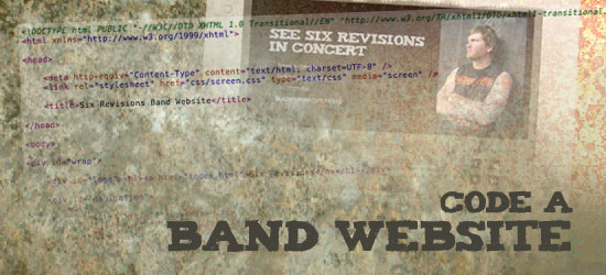
In Part 1 of this tutorial, you learned step-by-step how to design an awesome band website in Photoshop. Now in Part 2, you’ll learn how to take that PSD and turn it into clean, working XHTML/CSS code.
Band Website Series:
- Part 1: How to Design a Band Website Layout in Photoshop
- Part 2: Coding a Band Website Created in Photoshop
Working Proof
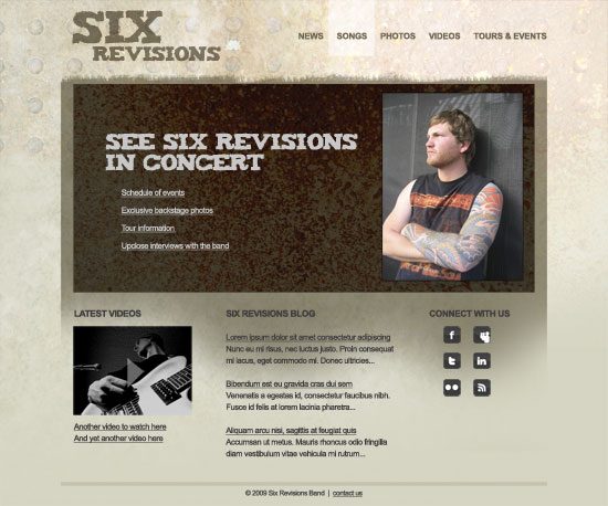
If you follow along with the tutorial, you should end up with the following live demonstration.
Setting up the files
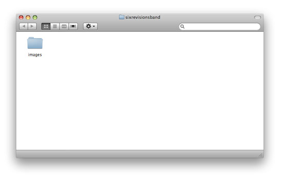
1 Start out by creating a new folder on your computer to put all of the site files in; I titled my folder sixrevisionsband. Create another folder in your working folder you just created and call it images; it will contain all the images, including CSS background images, for the site.
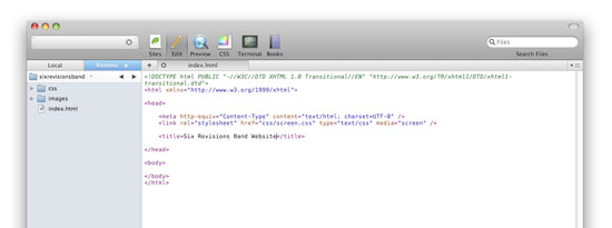
2 Now open up your favorite code editor (I use Coda.) Create a new HTML file titled index.html in the root of the folder -this will be our main page template. I like to keep all of my stylesheets in one folder in case I need to add a few different stylesheets.
That way they are all kept together neatly. So we’ll add a folder titled css, and a CSS file inside it titled screen.css. screen.css will be the main stylesheet for our template.
I start out the HTML with some basic stuff, making sure to add a title and a link to the stylesheet:
<!DOCTYPE html> <html > <head> <meta http-equiv="Content-Type" content="text/html; charset=UTF-8" /> <link rel="stylesheet" href="css/screen.css" type="text/css" media="screen" /> <title>Six Revisions Band Website</title> </head> <body> </body> </html>
My stylesheet also starts out with a few basic styles such as a border, margin, padding reset for all elements and some style declarations for common elements such as headings, lists, paragraphs, and hyperlinks.
Then to organize, I break the stylesheet into several logical parts so that when I maintain the stylesheet later on, things will be easier to find:
/***** Global Settings *****/ html, body { border:0; margin:0; padding:0; } body { font:.9em/1.3em arial, helvetica, sans-serif; color:#403d3d; } /***** Common Formatting *****/ h1, h2, h3, h4, h5, h6 { margin:0; padding:0; font-weight:normal; } h1 { padding:30px 0 25px 0; letter-spacing:-1px; font:2em arial, helvetica, sans-serif; } h2 { padding:20px 0; letter-spacing:-1px; font:1.5em arial, helvetica, sans-serif; } h3 { font:1em arial, helvetica, sans-serif; font-weight:bold; padding:5px 0 10px 0; } p, ul, ol { margin:0; padding:0 0 18px 0; } ul, ol { list-style:disc; padding:0 0 18px 40px; } img { border:0; margin: 0 0 5px 0; } /***** Links *****/ a, a:visited { text-decoration:underline; color:#403d3d; } a:hover { text-decoration: none; } /***** Wrapper *****/ /***** Header Area *****/ /***** Homepage Content *****/ /***** Footer *****/ /***** Global Classes *****/ .clear { clear:both; }Starting with the background (in Photoshop)
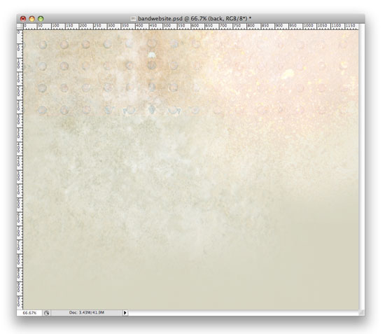
3 I like to start out from the back and work my way forward (towards the screen). If you downloaded the PSD file from Part 1, you’ll notice the layers are organized into folders: header, home, footer, and back. This helps for the coding process.
You’ll want to turn off all of the groups except for back, which contains all of the layers with the background files.
You’ll also want to turn off the content area, and you’ll be left with this:
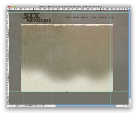
4 You’ll need to change the canvas size (Image > Canvas Size) to 1600px wide so the background will be wide enough to save as a full-width background. Once we do that, we see that the grid texture has harsh lines that we’ll need to get rid of.
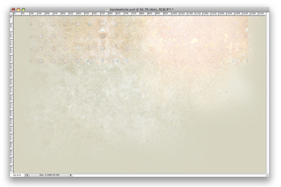
5 We’ll create a mask like we did in Part 1. Select the layer with the grid texture by holding down the Cmd/Ctrl key and clicking on the layer thumbnail in the Layer Panel.
6 Then create the layer mask by clicking on the Add Layer Mask button at the bottom of the Layer Panel.
7 We’ll choose a large soft round brush, like Soft Round 300 and change the Opacity and Flow settings to 50%. Make sure your foreground color is set to black (press D to reset your foreground and background color quickly). Softly brush the sides (not the bottom) a few times until the harsh lines are all gone.
Your background should look like this:
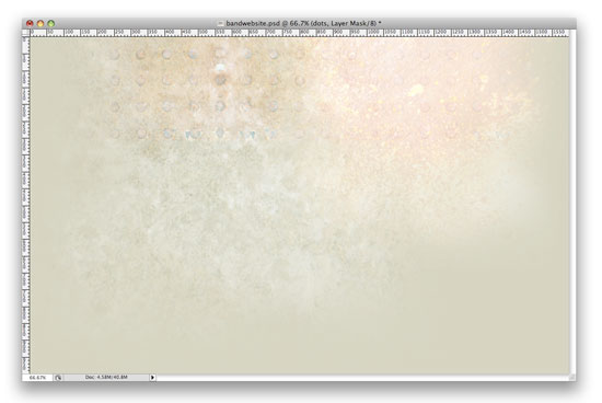
5 Our background is ready to save. Choose File > Save for Web & Devices. I like to experiment in here and find the best settings for the image, while trying to keep the file size as low as possible.
With this image, I found that a JPG at 40% keeps the file size fairly low but the quality good enough so that it’s not pixilated. Save this to the images folder as background.jpg.
Adding the background to the web design
6 To add the background to your design, use the body element’s CSS background attribute. The style declaration below tells the background not to repeat, to be at the top and in the center at all times, and when the picture runs out, use the tan color #d5d4c2.
body { background: url(../images/background.jpg) no-repeat top center #d5d4c2; }Next, we’ll need to make sure all of our other items are centered in a 960-pixel wide wrapper.
I’ll add a wrapper div in HTML:
<div id="wrap"></div>
And then we’ll need to give it some styles to center it:
#wrap { width:960px; margin:0 auto; }Working on the site’s logo
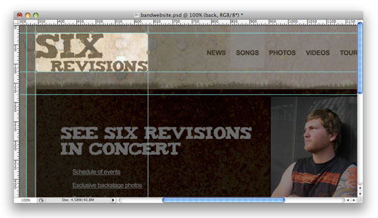
7 Turn all layer folders back on to see what’s next. I like to code in the order the items will be in the HTML, so the logo is next. I add some guides around the logo to make everything precise and then I crop the logo to the guidelines.
I save this out as a JPG at 40% as well.
8 Now we’ll add the logo in with an h1 tag, which tells search engines that this an important element on our page. Then we’ll add an a tag inside of it that will link back to the homepage.
<div id="logo"><h1><a href="index.html">Six Revisions</a></h1></div>
I like to use a negative text-indent which will hide the text from sighted viewers, but will still be visible to search engines and screen-reading technologies.
And then I add the image in as a background in the stylesheet. We’ll also need it to float it left because the navigation will be floating to the right.
Here’s what the CSS looks like:
#logo h1 { float:left; display:block; padding:21px 0 0 23px; text-indent:-2000px; margin: 0; } #logo h1 a { width:293px; height:100px; display:block; background:url(../images/logo.jpg) no-repeat; }Coding the navigation
9 Moving on to the navigation. First we’ll go in and crop out the hover background, cropping it at 1px wide by 110px tall. We can save it out as a PNG-24. The transparency will work everywhere except in Internet Explorer 6 and below, but it’ll appear as a light grey background there, which I’m fine with.
As a quick note, I do test and make sure my sites are functioning in Internet Explorer, but as you may know, IE6 has several issues, like not supporting certain image types (like PNG-24s) and misinterpreting certain CSS specs. So I find ways to make it work but according to browsers stats by w3 schools in October 2009, only 10.6% of internet users are still using IE6 and it appears to be dropping quickly. So, although the light grey hover background isn’t as classy as the transparent PNG-24, it gets the job done, which is my method for taking care of IE6. Period. Ok let’s move on.
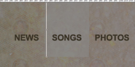
We’ll use a straightforward unordered list, and the HTML will look like this:
<div id="navigation"> <ul> <li><a href="#">News</a></li> <li><a href="#">Songs</a></li> <li><a href="#">Photos</a></li> <li><a href="#">Videos</a></li> <li><a href="#">Tours & Events</a></li> </ul> </div>
I’ll show you the CSS and then I’ll break it all down:
#navigation { float: right; display: block; text-transform: uppercase; font-weight: bold; font-size: 1.1em; } #navigation a { color: #706752; text-decoration: none; } #navigation ul { list-style: none; margin: 0; padding: 0; float: right; display: block; } #navigation li { float: left; display: block; padding: 64px 0 33px 0; } #navigation li a { padding: 64px 14px 33px 14px; } #navigation li a:hover { background: url(../images/hover.png) repeat-x; }First, I floated the navigation to the right to get it into place. Then I added some styles to get the look of the text to be uppercase and bold with a 1.1em font size.
Also, I changed the link color to #706752 and told it not to have any underline.
#navigation { float: right; display: block; text-transform: uppercase; font-weight: bold; font-size: 1.1em; } #navigation a { color: #706752; text-decoration: none; }Now onto our unordered list. First, I took away any list-style and zeroed out the padding and margins, and then added another float right to get it placed correctly.
#navigation ul { list-style: none; margin: 0; padding: 0; float: right; display: block; }Next, I floated the li to the left to get each link to sit next to each other, because the default is to line up vertically. If you float the li right, then your links will be listed backwards.
Then, I added padding to the top and bottom of the li with #navigation li to get the links in the right place.
#navigation li { float: left; display: block; padding: 64px 0 33px 0; }This padding spaces the li‘s out from side to side and also tells the hover action the height.
#navigation li a { padding: 64px 14px 33px 14px; }And finally we add in our hover background, which will repeat horizontally.
#navigation li a:hover { background: url(../images/hover.png) repeat-x; }Coding the content area
10 Moving on to the content area. Back in Photoshop, we’ll turn off these groups: home and footer, leaving back and header group on. We’ll add guides to the top and the bottom of the content area to decide where we’d like to crop it.
I find that 960 pixels wide by 710 pixels tall will be a good size and plenty tall enough. Crop it and save it for the web. And again, a JPG at 40% will do the trick.
We’ll clear the float above with:
<br class="clear" />
Then we’ll add a div called #contentarea for the content area and then style it.
A simple hack was added here, as IE6 doesn’t recognize min-height. The two lines beneath min-height (height and _height) allow IE6 to recognize the fact that we’d like the #contentarea div to be at least 830px tall. I also added in padding to push all the content inside in the right place easily.
#contentarea { background: url(../images/contentarea.jpg) no-repeat top center; width: 908px; min-height: 684px; height: auto; _height: 684px; margin: 18px 0 0 0; padding: 26px 26px 0 26px; }11 Next, inside the content area is the feature.
You can place a slider here using this tutorial called Create a Slick and Accessible Slideshow Using jQuery or use a flash component. To keep things simple for the code and for the purposes of this tutorial, we’ll just simulate the look of the an animated feature with a simple image for now.
I’ll keep call this section #flash:
<div id="flash"><img src="images3/flash.jpg" alt="flash" /></div>
And the CSS is basic dimensions and margin definitions:
#flash { width: 908px; height: 411px; margin: 0 0 35px 0; }The margin on bottom accounts for the space between the #flash div and the 3 columns that will be below.
Creating the columns
12 Now we’ll crop out the next couple photos to get everything ready for the 3 columns of content below the flash. We’ll need to crop the video (which we’ll simulate with an image for this tutorial, just like we did with the #flash image), and the 6 social media icons.
13 Next we’ll set up the HTML for the columns.
The br tag clears the float for the footer that will be below these columns.
<div id="column1"></div> <div id="column2"></div> <div id="column3"></div> <br class="clear" />
Some simple CSS gets the columns all set up and in place:
#column1 { float: left; display: block; width: 233px; margin: 0 68px 0 0; } #column2 { float: left; display: block; width: 335px; margin: 0; } #column3 { float: right; display: block; width: 207px; margin: 0; }14 We’ll add the content to the first column and your html should look like this:
<div id="column1"> <h3>Latest Videos</h3> <p><img src="images3/video.jpg" alt="video" /><br /> <a href="#">Another video to watch here</a><br /> <a href="#">And yet another video here</a></p> </div>
15 For the blog posts in column 2, I could use simple pie or some php script to call in the 3 most recent blog post titles and a couple lines, but for now we’ll just add some simple HTML to column 2 to simulate the look of the blog posts:
<div id="column2"> <h3>Six Revisions blog</h3> <p><a href="#">Lorem ipsum dolor sit amet consectetur adipiscing</a><br /> Nunc eu mi risus, nec luctus justo.[...]</p> <p><a href="#">Bibendum est eu gravida cras dui sem</a><br /> Venenatis a egestas id, consectetur faucibus nibh.[...]</p> <p><a href="#">Aliquam arcu nisi, sagittis at feugiat quis</a><br /> Accumsan ut metus. Mauris rhoncus[...]</p> </div>
16 The third column will be set up using some unordered lists, to get the indent without having to use another div. Here’s our HTML:
<div id="column3"> <h3>Connect with us</h3> <ul> <li><a href="#"><img src="images3/facebook.png" alt="facebook" /></a></li> <li><a href="#"><img src="images3/myspace.png" alt="myspace" /></a></li> </ul> <ul> <li><a href="#"><img src="images3/twitter.png" alt="twitter" /></a></li> <li><a href="#"><img src="images3/linkedin.png" alt="linked in" /></a></li> </ul> <ul> <li><a href="#"><img src="images3/flickr.png" alt="flickr" /></a></li> <li><a href="#"><img src="images3/rss.png" alt="rss" /></a></li> </ul> </div>
I also had to add some CSS to control the unordered list properly:
#column3 ul { list-style: none; } #column3 li { float: left; display: block; padding: 0 27px 10px 0; }The finale: the footer
17 Almost there!
Moving onto the final piece, the footer. Add some simple HTML:
<div id="footer"> copy; 2009 Six Revisions Band | <a href="#">contact us</a> </div>
And the CSS is pretty simple as well. The line was added with a 6px border at the top and I needed some space above the line (which I created with margins) and some space below the line and above the text (which I created with padding).
I also wanted some space below the text and before the edge of the browser window, which I created with padding as well. And the font size needed to be slightly smaller than the other body copy, so I made it .9em.
#footer { width: 960px; border-top: 6px solid #c4c2af; padding: 10px 0 30px 0; text-align: center; margin: 30px 0 0 0; font-size: .9em; }And we’re all finished!
Thanks for following along through the full tutorial. I hope you learned some coding techniques and PSD to XHTML/CSS tricks.
Feel free to ask any questions and definitely let me know what you think in the comments area.
Download the source files
- band-website-html-css (ZIP, 0.22MB)
Related Content
- How to Design a Band Website Layout in Photoshop
- Minimal and Modern Layout: PSD to XHTML/CSS Conversion
- How to Make a Light and Sleek Web Layout in Photoshop
-
 President of WebFX. Bill has over 25 years of experience in the Internet marketing industry specializing in SEO, UX, information architecture, marketing automation and more. William’s background in scientific computing and education from Shippensburg and MIT provided the foundation for MarketingCloudFX and other key research and development projects at WebFX.
 -

WebFX is a full-service marketing agency with 1,100+ client reviews and a 4.9-star rating on Clutch! Find out how our expert team and revenue-accelerating tech can drive results for you! Learn more
Make estimating web design costs easy
Website design costs can be tricky to nail down. Get an instant estimate for a custom web design with our free website design cost calculator!
Try Our Free Web Design Cost Calculator
Share this article


Web Design Calculator
Use our free tool to get a free, instant quote in under 60 seconds.
View Web Design CalculatorMake estimating web design costs easy
Website design costs can be tricky to nail down. Get an instant estimate for a custom web design with our free website design cost calculator!
Try Our Free Web Design Cost Calculator


