

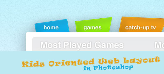
 In this tutorial we will be creating a simple, easy to use and colorful web design layout in Photoshop that is primarily aimed at children. The simple navigation, bright colors and limited content is something that would really appeal to the youngsters. We will be making use of loads of tools in this tutorial, such as the rounded rectangle tool, the Warp Transform tool, the Brush Tool, the built in Stroke Tool and plenty of gradients. We’d love to see your results, so be sure to share them with us!
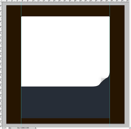
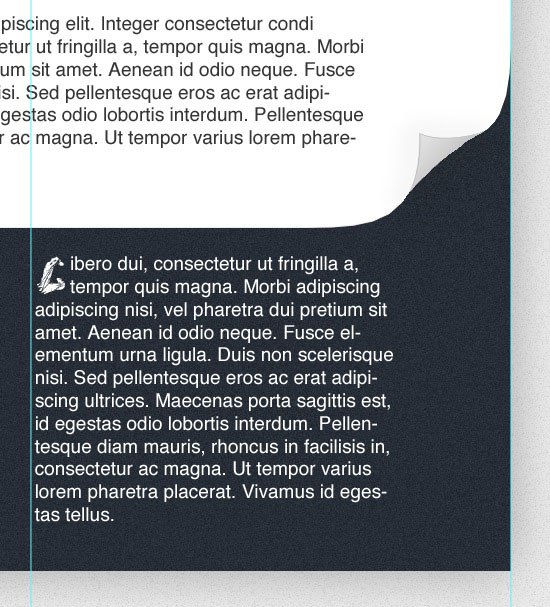
Final Result
Click on the image preview to see the full size version. 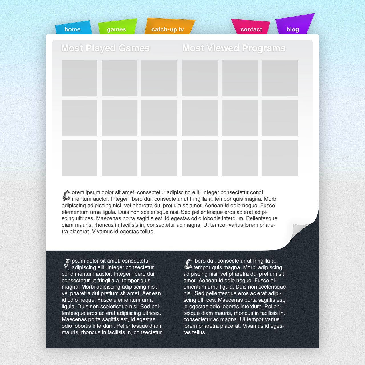
Sketching
1 Before starting work on a web design, I also sketch at least one idea. For this tutorial, I had a pretty good image of the theme I wanted to create, so I only roughed out one sketch.
Heading into Photoshop with a prepared sketch and a rough image of the design you want to create makes things much easier down the line, mainly because you have something to refer to when things get tricky.
Setting up the Photoshop document
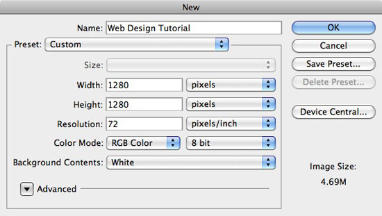
2 Head over to Photoshop and create a new document. Make sure your document uses the RGB color mode at 8 bit, and that the resolution is 72 pixels/inch.
Enter 1280 into both the Width and Height fields. Although the width of the canvas doesn’t really need to be this large, it’s a good size to work with because it allows us to see what the design would look like on a bigger monitor. Click OK to create your document.
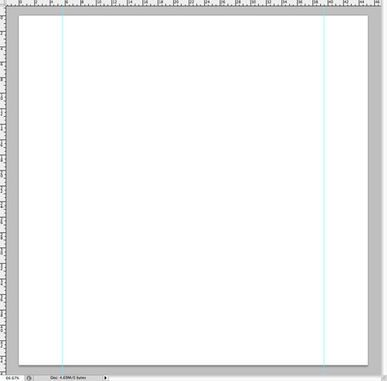
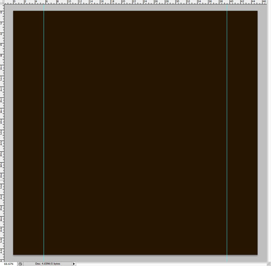
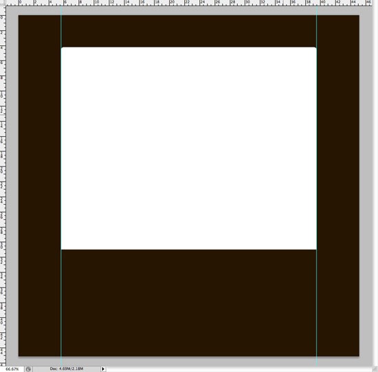
 3 It’s time to set up some guides, which are always very important when designing for the web. Go to View > New Guide and with Vertical selected, type in 160px and hit OK. Repeat the step again, but this time insert 1120px into the field.
 That’s all there is to setting up the canvas for the web. We’ll be adding more guides throughout the tutorial, but for the time being, there’s no need!
Creating the initial stucture
4 With our document and guides set up, it’s time to work on the main structure of our design.
Using the Paint Bucket Tool (G), fill the background with a color other than white. You won’t be sticking with this color but it just makes things a little easier whilst we’re designing the rest of our theme! I’m using a dark brown.
 5 Select the Rounded Rectangle Tool (U). Use a Radius of 10px and drag out a new shape. Make sure you drag to and from the edges of your guides that we set up in the previous step!
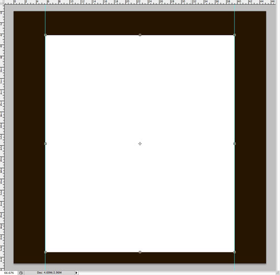
Change the color of your new shape to white if you haven’t already. Change the name of your new shape layer to ‘Main Body‘. 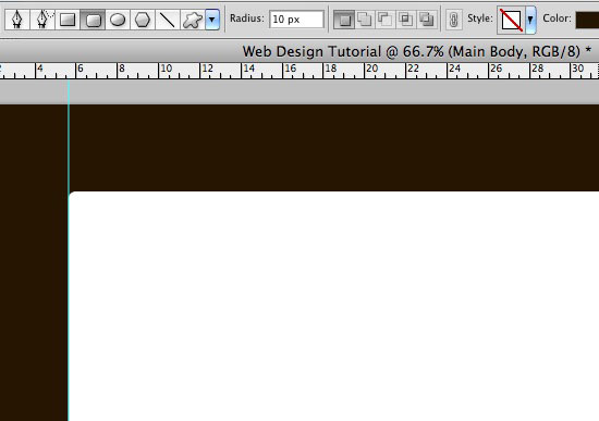 6 Rasterize your shape layer by going to Layer > Rasterize > Shape.
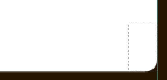
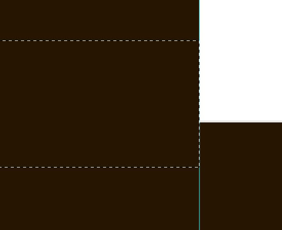
This turns your shape into pixels from a vector image and makes it much easier to work with in the following step. 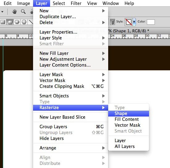 7 Zoom right in to one of the corners at the bottom of your main body shape. With the Rectangluar Marquee Tool, make a selection over the corner of the shape.
 8 Fill the selection with white using the Brush Tool (B). Repeat the process with your other corner.
 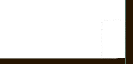 9 Unselect the selection and with the Single Row Marquee Tool, make a selection directly beneath your main bodies shape.
Choose a light gray color (I used #e8e8e8) and fill your selection, making sure you are still on the main body shape layer. 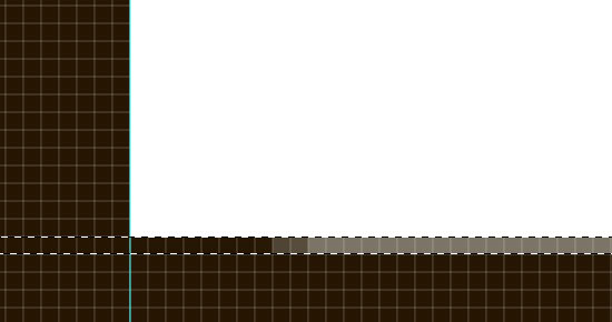
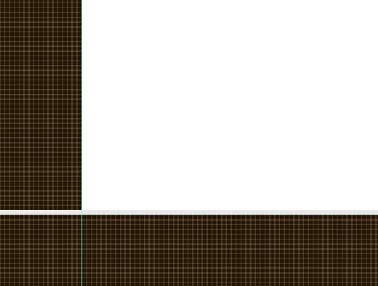 10 You now may notice that you have a 1px line going completely through our canvas. To fix this, we just need to delete the excess of the line by using the Rectangular Marquee Tool (M).
Make a selection over the area you want to delete and then press the Delete or Backspace key. Repeat the step again to remove the excess line on the other side of our document. 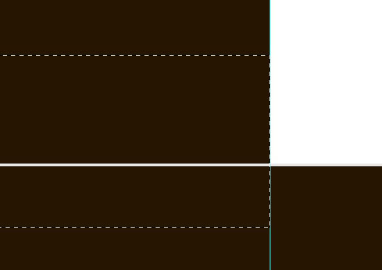
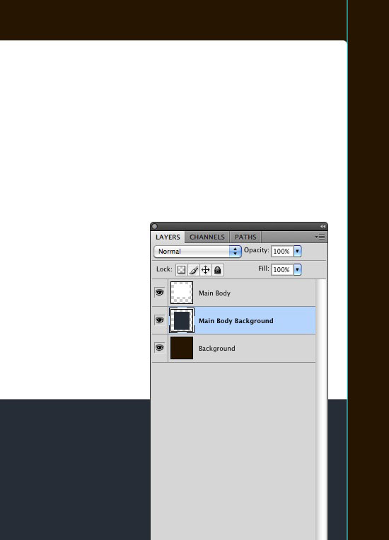
 11 Duplicate the main body layer by going to Layer > Duplicate Layer or by dragging the layer down to the New Layer symbol at the bottom of the Layers Panel.
You can rename the new layer to Main Body Background. With the new layer selected, go to Edit > Free Transform, and drag the bottom point down. 
 12 Move the layer (Main Body Background) beneath our Main Body background and change the color: I’m going to use #262d35.
 That’s pretty much the main structure of our body. We’ll obviously be adding more elements throughout the remainder of the tutorial!
Adding some of the appealing elements!
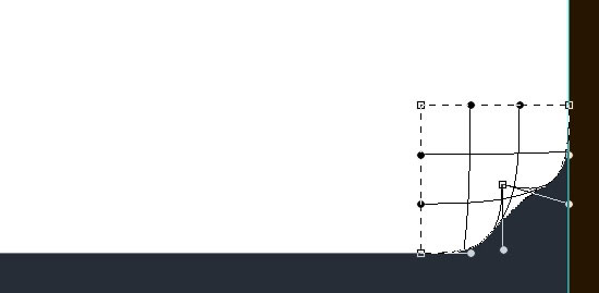
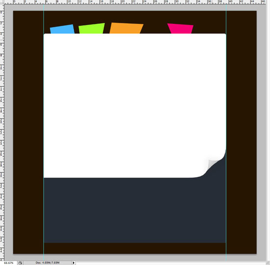
13 With the main body layer selected, select the Rectangular Marquee Tool (M) and make a selection of the bottom right corner whilst holding Shift to keep it in proportion.
When you have a suitable sized selection, go to Edit > Transform > Warp. Drag the right bottom corner towards the center of your selection to make it look like a curved corner. 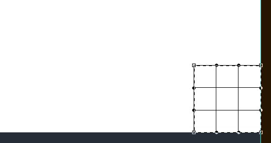
 14 Select the Pen Tool (P) and zoom right into your corner.
Make a selection to represent the other side of the ‘paper’ – it might take a few attempts to get right! Once you have a suitable selection, fill the path with a medium gray color on a new layer. 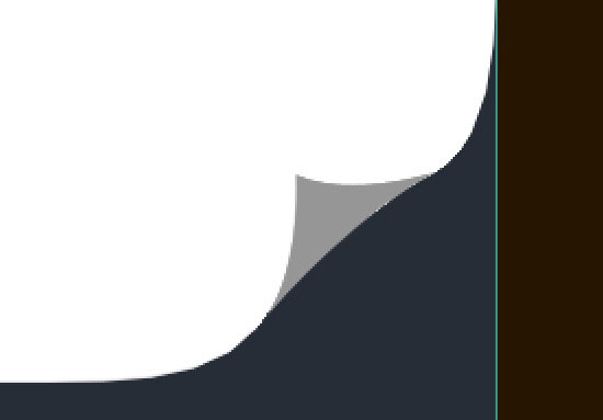 15 You may have noticed that it’s very difficult to get the shape the exact same size that what we need it.
I managed to get it pretty close, but in some places you can still see unwanted white pixels. To fix this, zoom right into your canvas and replace them with our gray color using the Pencil Tool (B). 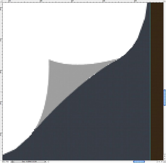
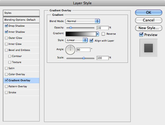
 16 Call this new layer ‘Page Curl‘.
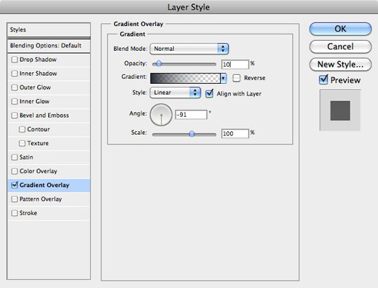
With the page curl layer selected, go to Layer > Layer Style > Blending Options. Add a Gradient Overlay using the settings that can be found in the screenshot below. 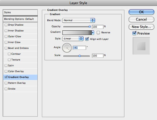 17 Make a new layer beneath our page curl and call it ‘Page Curl Shadow‘.
Select the Brush Tool (B) and select a soft, medium-sized brush. Make sure you have black selected and paint an area of black on your canvas. Go to Filter > Blur > Gaussian Blur and blur the selection by about 3px.
Set the layers Opacity to about 3%. 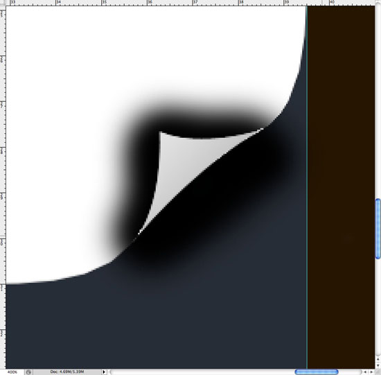
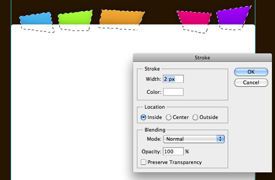
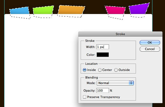
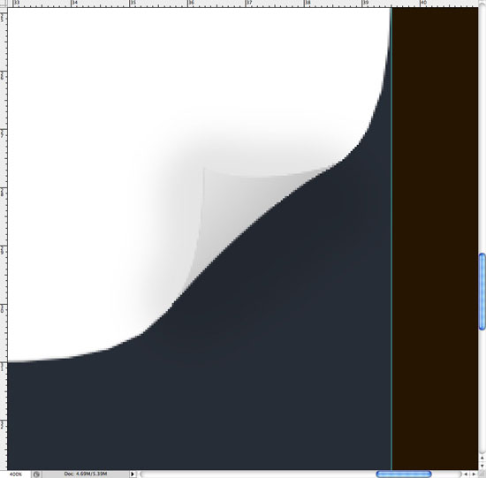 18 Our page curl is now a little bit too hard to see. To fix this, we’re going to add a 1px stroke.
Re-open the Layer Styles on our page curl layer and click on Stroke. Use the options in the screenshot below. 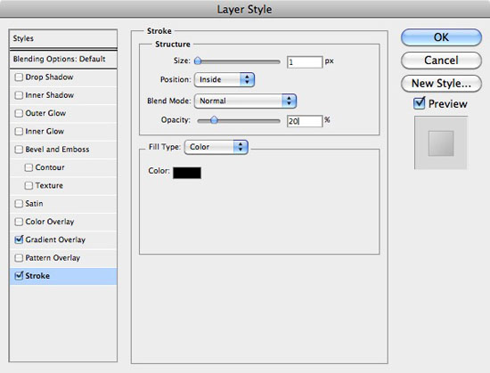

Concentrating on Navigation!
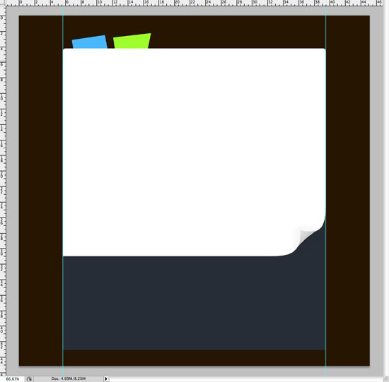
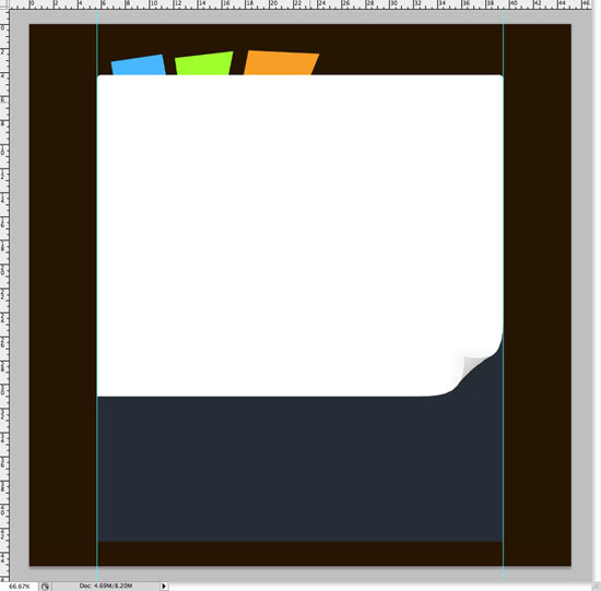
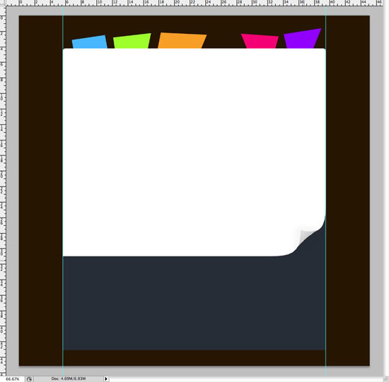
19 Select the Polygonal Lasso Tool (L) and zoom into our design at 100%.
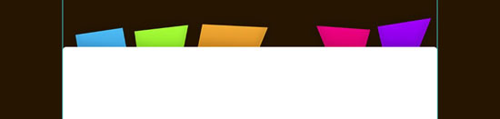
Make a new layer below all other layers but the background, and call it ‘Navigation Background‘. Make a random selection and fill it with blue. 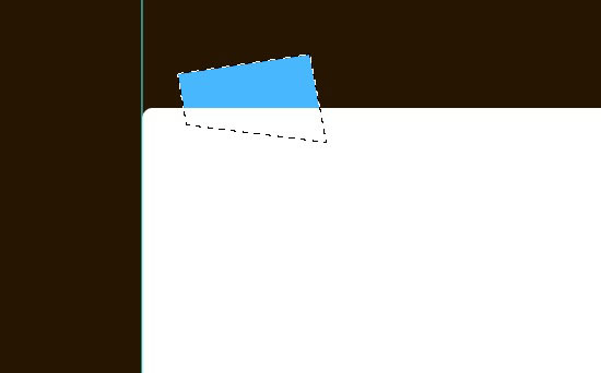 Repeat the step again several times, each time filling the shape with a different color.
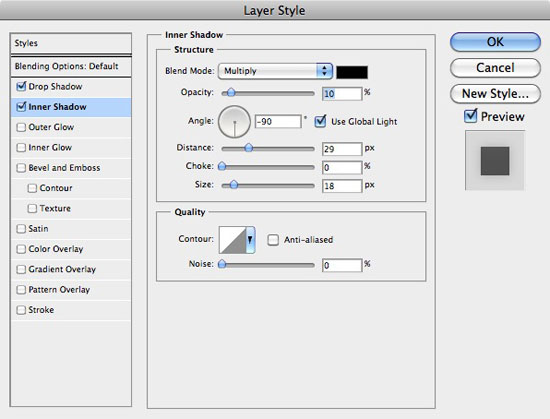
 20 Open up the Layer Styles window for our navigation background layer. Add the following Drop Shadow, Inner Shadow and Gradient Overlay.
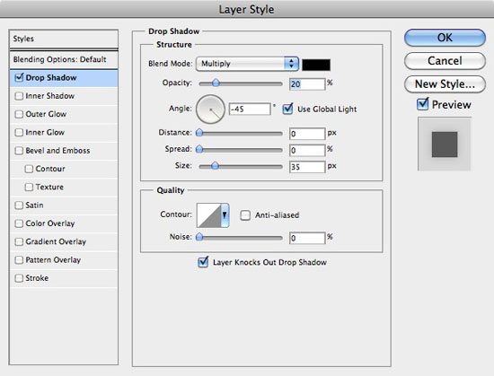
 21 Hold Cmd (or Ctrl) and click on the thumbnail image of the navigation background layer in the Layers Panel.
This should make a selection of all your buttons. Make a new layer above your navigation background layer and go to Edit > Stroke and add a white 2px stroke. Do the same again, but this time make it a black 1px stroke.
Set the stroke layers Blending Mode to Overlay and the Opacity to 50%. 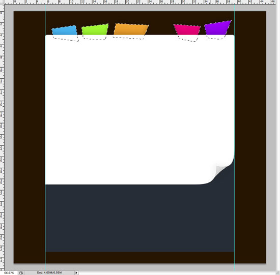
 22 Select the Type Tool, and with the typeface ‘Helvetica Neue‘ selected, create some dummy text on your navigation buttons. Make sure you keep your text straight, this way when it comes to coding the design we can use actual text instead of images, much more browser and search engine friendly!
When your dummy text is finished, open the Layer Styles for your type layer and use the following Drop Shadow settings. 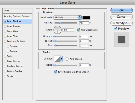

Concentrating on the Main Content!
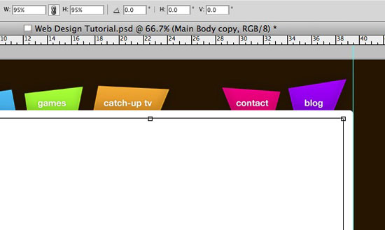
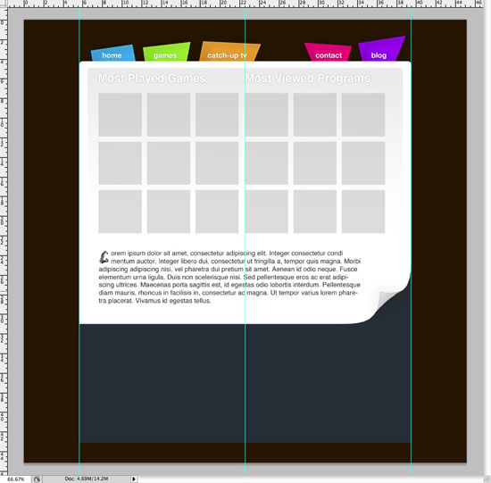
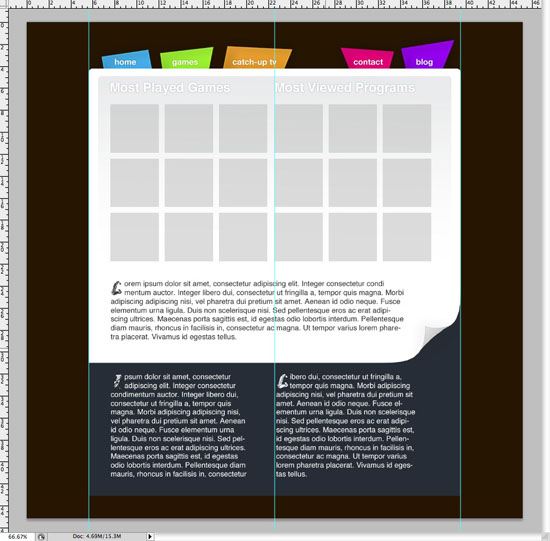
23 It’s time now to start concentrating on the main content area of the theme. Locate your first layer (Main Body) and duplicate it once again.
Go to Edit > Free Transform and in the top settings bar change the width and height to 95%. This should shrink the layer, making it fit nicely in our main content body. Apply the changes.
 24 You may notice the 1px line and curved corner on the duplicate layer – we don’t want this, so we need to delete it. Select the Rectangular Marquee Tool (M) and chop the bottom of the layer of by making a selection and pressing the Delete or Backspace key.
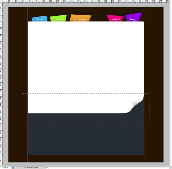
 25 Open the Layer Styles for our new duplicated layer and select Gradient Overlay.
Select the White to Transparent gradient, and change the white color to #262d36 which is the same color we used in our footer. Drop the Opacity of the Gradient Overlay to 10%. You can see the settings in the screenshot below.
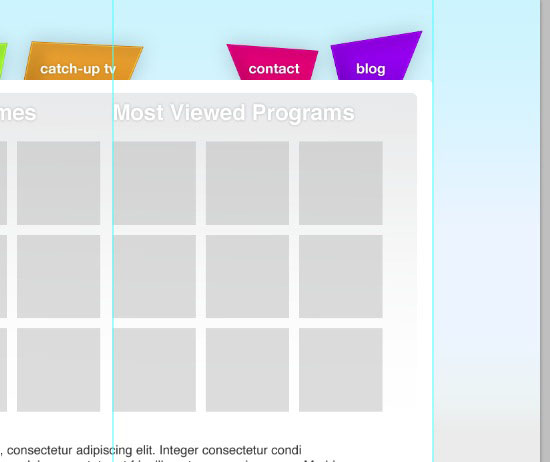
 26 Go to View > New Guide. With vertical selected, enter 640px; this will find the center of the canvas. Select the Horizontal Type Tool (T) and enter a couple of lines of text, such as ‘Most Played Games‘ and ‘Most Viewed Programs‘.
Leave the text white.  27 Open the Layer Styles for your new type layer and apply a Drop Shadow using the following settings.
 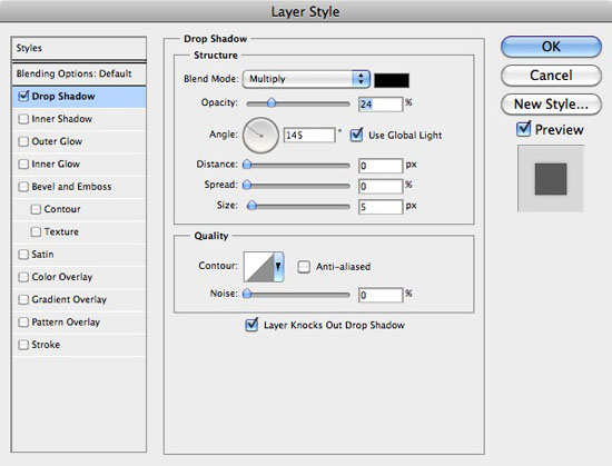 28 Select the Rectangular Marquee Tool (M).
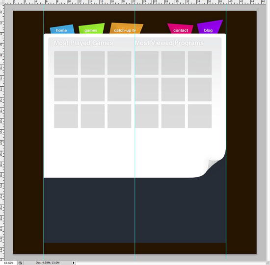
Then, in the Options bar, change the style to Fixed, and set the width and height to 125px. 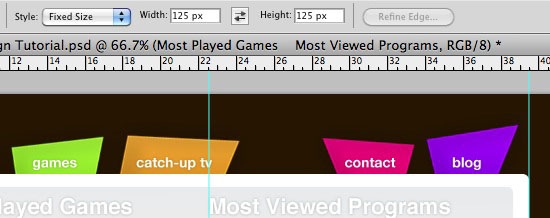 29 Make a new layer above all others and call it ‘Placeholder Thumbs‘. On this layer we’re basically going to make several place holders for the most played games and most viewed programs.
The idea of this is so when the design is coded, the placeholders can be replaced with thumbnails of the games and TV programs. Click on the screen to produce a selection of 125px x 125px. Use the mouse or cursor keys to move the selection in to the correct place.
Fill the selection, and then using the Shift + Cursor keys, move the selection to the right, fill the selection, and then repeat again. When you’ve done one row, duplicate the layer and move it down with the Move Tool (V). When it is in position you can press Cmd + E (or Ctrl + E on Windows) to merge the two layers together.
 30 Create some more dummy text beneath your placeholders. Try to jazz things up a little bit here to add some interest; I hit the Tab key a couple of times on the first two lines and entered a fancy letter.
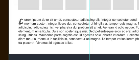
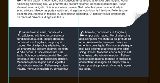
 31 Repeat the step again, this time adding two paragraphs of dummy text in the footer of your design.
Concentrating on the background!
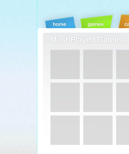
32 As I mentioned earlier, our background isn’t staying dark brown, it was simply a temporary fix! Change the color of our background layer to #ebebeb. Make a new layer above the background and call it ‘Background Gradient‘.
Select the Rectangular Marquee Tool (M) and select the top half of our design. Fill the selection with black – make sure your new layer is selected! 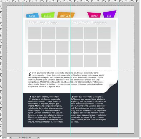
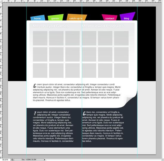 33 Open the layer’s Layer Style window and click on Gradient Overlay.
Have the bottom of the gradient merge into the same color as the rest of our background, and a color of your choice at the top of the gradient. I used #c6f4ff. 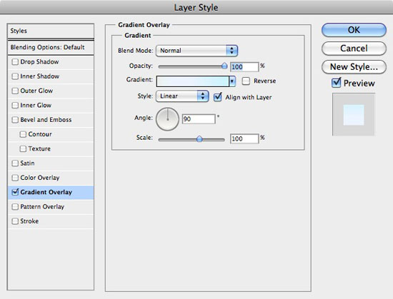
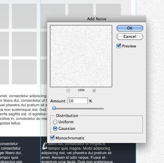
 34 Make another new layer and call it ‘Background Noise‘, fill the layer with white.
Go to Filter > Noise > Add Noise. With Gaussian and Monochromatic selected, enter the 10% in the amount and click OK. Change the layer’s Blending Mode to Multiply and the Opacity to 35%.
 35 Put all your main body layers and dummy layers into folders. Locate the main body and footer layers, using the Cmd + click (or Ctrl + Click) trick, make a selection of the layer’s content. You can do this by Cmd + clicking on the first layer, and then Cmd + Shift + clicking on the second.
With the selection made, hide the main body content folder by unclicking the eye next to the folders thumbnail in the Layers Panel. With your selection still active, make a new layer and call it ‘Background Shadow‘. Fill your selection with black and then go to Filter > Blur Gaussian Blur.
Enter 25 into the field and click OK. Reduce your new layer’s opacity to about 30%, and then make all your other folders visible again. 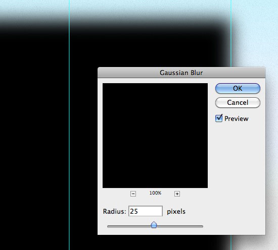
 36 To finish things off, I added 2% of Noise to the footer by going to Filter > Noise > Add Noise.
All done!
Related Content
-
 President of WebFX. Bill has over 25 years of experience in the Internet marketing industry specializing in SEO, UX, information architecture, marketing automation and more. William’s background in scientific computing and education from Shippensburg and MIT provided the foundation for MarketingCloudFX and other key research and development projects at WebFX.
 -

WebFX is a full-service marketing agency with 1,100+ client reviews and a 4.9-star rating on Clutch! Find out how our expert team and revenue-accelerating tech can drive results for you! Learn more
Make estimating web design costs easy
Website design costs can be tricky to nail down. Get an instant estimate for a custom web design with our free website design cost calculator!
Try Our Free Web Design Cost Calculator
Share this article


Web Design Calculator
Use our free tool to get a free, instant quote in under 60 seconds.
View Web Design CalculatorMake estimating web design costs easy
Website design costs can be tricky to nail down. Get an instant estimate for a custom web design with our free website design cost calculator!
Try Our Free Web Design Cost Calculator


