Simple website designs are easy to create, edit and they cost less. However, simple designs are more useful beyond being practical and manageable. Sometimes less is more, for certain websites, the simpler, the better. This guide will provide simple website examples and take a look at why they work so well.
Minimalistic websites for inspiration
If you’re looking for insight into minimalist website designs or want some simple website examples for inspiration, you’ve come to the right place.
Benjamin Hardman
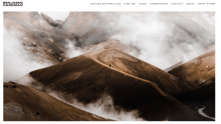
Benjamin Hardman is a photographer whose work truly captures the harsh environments of nature in a collection of gorgeous images. From picturesque landscapes to beautiful animal shots, Benjamin Hardman’s photography portfolio is a great example of photography and minimal web design.
Using a plain white background and small black text in the top menu for website navigation, Benjamin created the perfect place to showcase his striking photography. The emphasis is placed firmly on the work and nothing else. No unnecessary extra features disrupt your viewing, everything is easy to find and the website does exactly what it’s supposed to: show off Benjamin’s photographs.
This look and feel was achieved using Squarespace, one of the most comprehensive and versatile simple website builders. From intricate websites that utilize a variety of features and designed elements to minimalist pages, Squarespace is a handy tool for web design.
Onplace
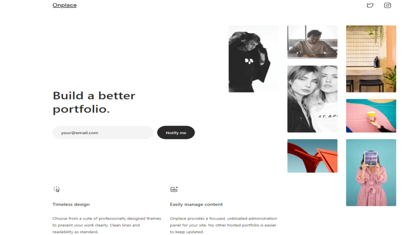
Onplace is an online service used to create portfolios for designs, artists and photographers. It’s interesting how a website about making a well-designed portfolio goes for a simplistic approach for its homepage. This works in their favor because it gives them space to deliver useful information about their services while showcasing examples of what can be done with them.
While there is empty space on the website it always seems busy thanks to the moving example images constantly moving around. It does a good job of showing visitors that the tool is easy to use and how creative people can get with it.
ETQ Amsterdam
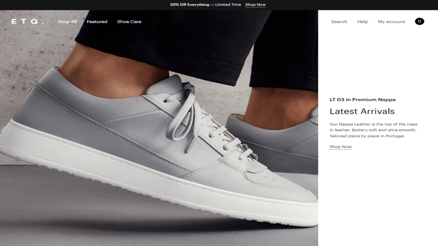
ETQ Amsterdam is an online retail website focusing on clean and stylish design. The website is an online catalog and links viewers to the company’s social media account. Navigation through the website is easy and intuitive. Menus are displayed in the top bar but are so unobtrusive that you can entranced by the stunning visuals and still know where you’re going. Scrolling down the home page also reveals a large amount of crucial information about the company, its products and the site.
Ideas for simple websites can come from more than just portfolios and smaller websites. Huge international companies also use this principle when designing their websites and reaping the benefits a minimalistic approach to web design can bring.
Airbnb
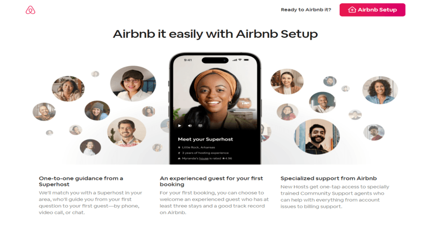
Airbnb is a massively popular tourism service. For those who don’t know about Airbnb, it’s a service that lets travelers choose from a variety of accommodations to stay at in specified areas, within a specific price range and even what type of accommodation you want to stay in. It’s a comprehensive tool that’s accessible to anyone all over the world.
Being such a useful and comprehensive tool, Airbnb’s simple website design makes it incredibly easy to use. Relevant results are displayed on the screen with the price, location and rating listed for every result intuitively. The different types of accommodation options are displayed as designed icons that represent the different places using simple but effective icons. Everything about how this website looks and operates is what you should look for in all great, simple website examples. Straightforward, easy to use yet still charming and useful.
Shopify
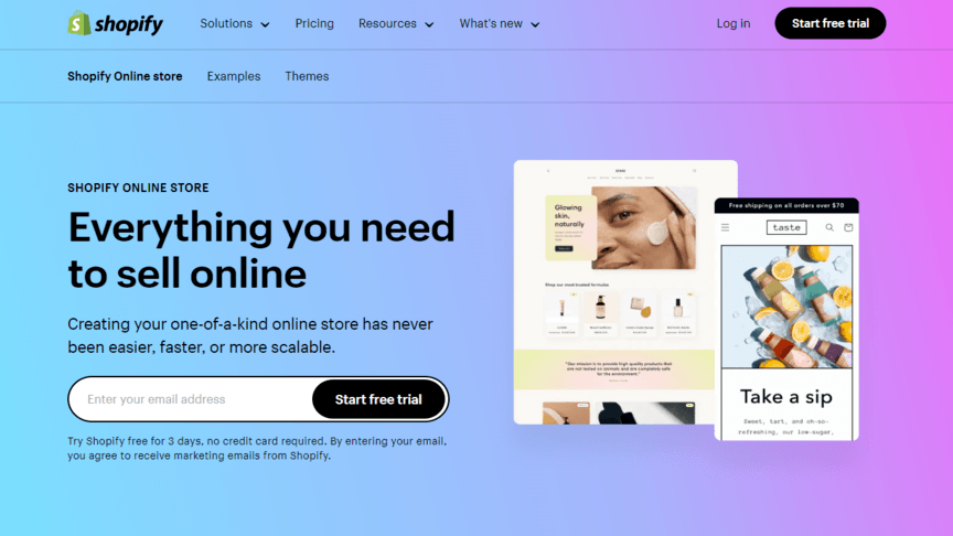
Shopify provides small business owners and website creators the tools they need to build an online store. Detailed dashboards, easy inventory tracking and marketing tools make Shopify an incredibly helpful asset for anyone looking to start up and manage an online store.
Shopify’s simplistic website design and great structure make this tool approachable and easy to understand because everything is broken down and explained well. With eye-catching visuals, relevant images and bright colors, this website grabs the attention of its visitors and does a good job of retaining it. This is a good simple website example that uses bright colors and images to focus more on the text and benefits of its services rather than using a white background and a focus on images.
Nike
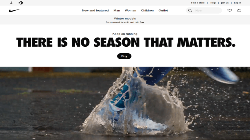
Nike is one of the most famous sports brands in the world and is easily recognized by its simple logo. This simplicity translates into their website and design elements. Using bold black text on a plain white background works well for Nike as a brand. The website’s main function is to serve as an online store, but it also has a newsfeed to keep visitors updated on Nike-related news.
The website is easy to navigate and find the products you are looking for. The top bar menu navigation is straightforward and self-explanatory and finding information. Products are displayed in large image blocks with colorful backgrounds. Despite its minimalist design, this website is an effective online hub for Nike products and content. This is a strong example of how a simple web design can still capture the essence of something as big as Nike.
Start building your simple and attractive website today
If you want a website that captures your brand, grabs the attention of your visitors and delivers an incredible user experience, trust WebFX with your web design needs. Our awesome team of web designers can give you the website of your dreams that does everything you need and more. Your website’s design can improve your conversion rates and generate more revenue for you. WebFX has mastered all things relating to the internet and online marketing so when we make you a website, you know it’ll deliver.
To find out more about our services and what we can offer, contact us today or call us at 888-601-5359.
-
 President of WebFX. Bill has over 25 years of experience in the Internet marketing industry specializing in SEO, UX, information architecture, marketing automation and more. William’s background in scientific computing and education from Shippensburg and MIT provided the foundation for MarketingCloudFX and other key research and development projects at WebFX.
 -

WebFX is a full-service marketing agency with 1,100+ client reviews and a 4.9-star rating on Clutch! Find out how our expert team and revenue-accelerating tech can drive results for you! Learn more
Make estimating web design costs easy
Website design costs can be tricky to nail down. Get an instant estimate for a custom web design with our free website design cost calculator!
Try Our Free Web Design Cost Calculator
Share this article


Web Design Calculator
Use our free tool to get a free, instant quote in under 60 seconds.
View Web Design CalculatorMake estimating web design costs easy
Website design costs can be tricky to nail down. Get an instant estimate for a custom web design with our free website design cost calculator!
Try Our Free Web Design Cost Calculator