

What are responsive images? These types of images change in size to adapt to different screen sizes, like on a desktop, tablet or different cell phones. With the infinite types of screen displays and sizes, it’s essential that you have responsive images. In this tutorial, you will learn the simplest technique to learn how to make images responsive.
There are many responsive image techniques, and they vary in complexity and level of browser support.
An example of a complicated way of implementing responsive images is using the srcset attribute, which requires multiple images, more markup, and the reliance on a new HTML attribute that’s not well-supported outside of modern browsers. In contrast, the method covered in this tutorial is simple and relies only on the CSS width and height properties, which means the method will work on virtually all browsers and devices. It will, however, require that the web design’s layout is a fluid/responsive layout.
You’ll get to see several variations of the responsive image technique discussed in this tutorial, but the foundational concept is the same: Using CSS, give images a percentage-length unit (or any relative-length unit, e.g. ems) for their width property and then give their height property a value of auto.
img { width: 100%; height: auto; }Basic Responsive Image
Let’s start with a basic example. We have a div that acts as the container of an <img> element.
HTML
<div class="container"> <img src="image01.jpg" width="960" height="640" /> </div>The container has a width property of 96% so that it has left and right margins. It has a max-width of 960px so that the layout is not too wide on large screens. The <img> element within the container has a width property of 100% so that its width is always equal to its container regardless of the viewport’s size, thus making it responsive.
The height is set to auto so that the image proportionally scales. CSS
div.container { width: 96%; max-width: 960px; margin: 0 auto; /* to center the container */ } img { width: 100%; height: auto; }View example Note that the <img> element will be responsive even if it was given fixed width and height HTML attributes in the markup (i.e. width="960" height="640").
This is great because it means that this technique is suitable for legacy content that have fixed dimensions set via HTML.
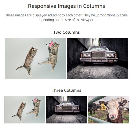
Responsive Images in Columns
Sometimes we want images to display side-by-side in columns. For example, image galleries often display thumbnails on a grid. To achieve responsive images in columns, the only change we have to do is lower the CSS width property and give <img> elements a display property value of inline-block.
Let’s discuss a couple of layout schemes: A two-column image layout and a three-column image layout.
Two-column Responsive Image Layout
For a two-column responsive image layout, we can set the CSS width property to 48%, or roughly one-half of the container. The reason it’s not set to 50% is to give the images margins on their sides. HTML
<div class="container"> <img src="image01.jpg" width="960" height="640" /> <img src="image02.jpg" width="960" height="640" /> </div>CSS
img { width: 48%; display: inline-block; }Three-column Responsive Image Layout
For a three-column responsive image layout, the concept is the same, we just need to set the width property to about one-third of the container’s width: 32%.
HTML
<div class="container"> <img src="image01.jpg" width="960" height="640" /> <img src="image02.jpg" width="960" height="640" /> <img src="image03.jpg" width="960" height="640" /> </div>CSS
.three-columns { width: 32%; display: inline-block; }Images with Conditional Breakpoints
It’s a good idea to have conditional breakpoints for responsive images that are displayed in columns so that when the images get too small, the columns will collapse. We’ll need media queries to make this happen. In the following example, the images will display in one column on smartphones, two columns on tablets, and four columns on larger screens.
HTML
<div class="container"> <img src="image01.jpg" width="960" height="640" /> <img src="image02.jpg" width="960" height="640" /> <img src="image03.jpg" width="960" height="640" /> <img src="image04.jpg" width="960" height="640" /> </div>CSS
/* For small devices (e.g. smartphones) */ img { max-width: 100%; display: inline-block; } /* For medium devices (e.g. tablets) */ @media (min-width: 420px) { img { max-width: 48%; } } /* For large devices (e.g. desktops) */ @media (min-width: 760px) { img { max-width: 24%; } }View example Note: It’s a good idea to set the appropriate media queries for each design you work on. In the demo page, the media query parameters that were chosen worked well for the layout, but they might not work so well in other designs.
Full-width Responsive Image
To have responsive images that are always 100% of the viewport’s size, we just need to remove the container’s max-width property (which is 960px) and give it a width of 100%.
.container { width: 100%; } img { width: 100%; }Caveat
Even though this responsive image technique is easy to use and has good browser support, its downside is that it will always serve the full size of the images. This means large, high-res images will still be served to the user even if he/she is on a small mobile device that can’t take advantage of the full dimension and resolution of the images.
If you’d like to conditionally serve different versions of the same image (e.g. smaller sizes for mobile devices and larger versions for desktops) to improve mobile web performance, check out the srcset attribute and/or the picture element. If you would like a polyfill to be able to support today’s browsers, see Scott Jehl’s Picturefill.
Related Content
-
 President of WebFX. Bill has over 25 years of experience in the Internet marketing industry specializing in SEO, UX, information architecture, marketing automation and more. William’s background in scientific computing and education from Shippensburg and MIT provided the foundation for MarketingCloudFX and other key research and development projects at WebFX.
 -

WebFX is a full-service marketing agency with 1,100+ client reviews and a 4.9-star rating on Clutch! Find out how our expert team and revenue-accelerating tech can drive results for you! Learn more
Make estimating web design costs easy
Website design costs can be tricky to nail down. Get an instant estimate for a custom web design with our free website design cost calculator!
Try Our Free Web Design Cost Calculator
Share this article


Web Design Calculator
Use our free tool to get a free, instant quote in under 60 seconds.
View Web Design CalculatorMake estimating web design costs easy
Website design costs can be tricky to nail down. Get an instant estimate for a custom web design with our free website design cost calculator!
Try Our Free Web Design Cost Calculator